We know — it’s a busy month at MyFonts, with newsletters landing in your mailbox in quick succession. Don’t panic! It happens only once a year, and last week’s Most Popular Fonts of 2014 is a newsletter many of you devour — literally, if such a thing is possible. With this edition of Rising Stars, it’s back to the future: here are some of the most successful fonts of this month, and the next. Enjoy! |
|
|
This Month’s Rising Stars
|
|
|
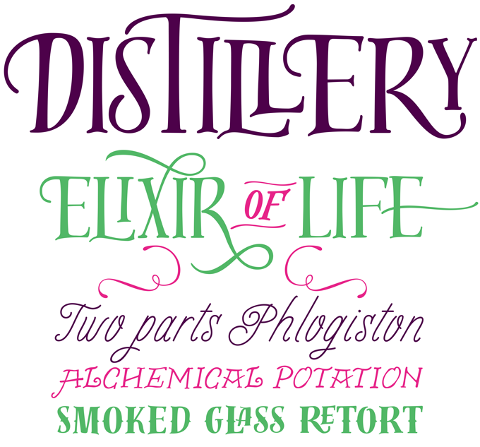
In our Most Popular Fonts newsletter we featured several examples of what must be the trend of the moment: heterogeneous packages of combinable fonts in contrasting styles. We had not seen much in this vein yet from Argentina’s Sudtipos, so we’re pleased to welcome Distillery. Drawn by youthful talent Carolina Marando with production work by Alejandro Paul, Distillery is a fresh take on the genre. The family’s influences come from different eras and styles, ranging from Roman capitals and shapes found in the Arts & Crafts movement to traditional tattoo styles, mid-century showcards and contemporary chalkboard lettering. The result is a tasty minestrone of cheerful ingredients; it comes with alternates, ligatures, icons, ornaments, and more. The possibilities for personalized layouts are endless. Distillery is 35% off until January 22, 2015. |
|
|
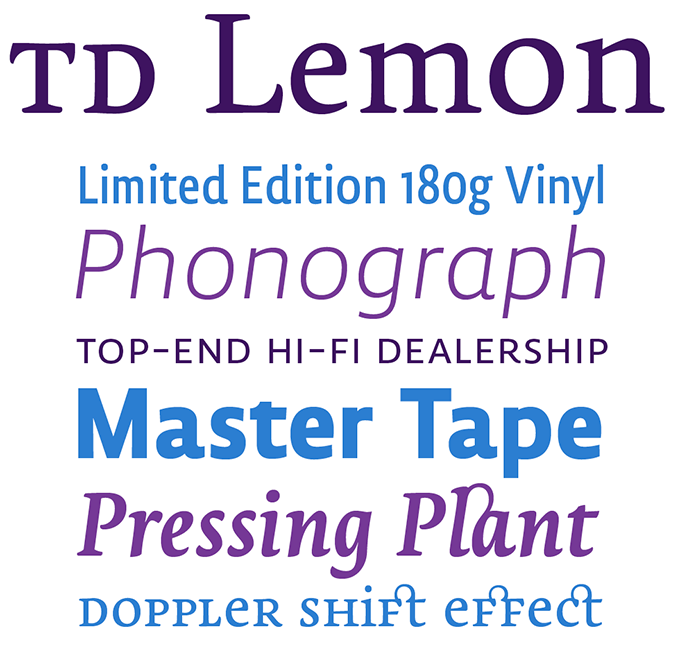
Featured as one of December’s Text Faces of the Month, TD Lemon from Type Department has continued to do extremely well. It’s one of the most extraordinary text typeface releases of the past few months. The Lemon Serif family is small — only a Regular and Bold weight, with Italics — but beautifully drawn and very well-equipped. Lemon Sans is big: six weights with italics, plus an equally extensive Condensed version. Both Lemon Sans and Lemon Serif come with a complete Unicase set (lowercase mixed with small caps). In short, Lemon is a versatile suite for striking text and headline settings. The Lemon family is 66% off until January 30, 2015. |
|
|
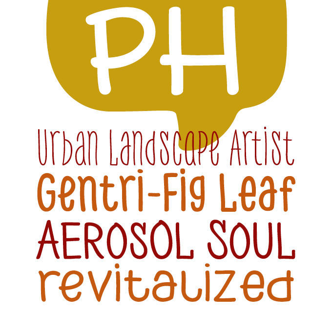
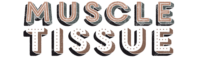
PH from Fontfabric is huge, flexible, playful, and a little crazy. Designers Ani Petrova and Asen Petrov have taken a simple concept — clear, hand-drawn, monolinear shapes in a consistent, somewhat child-like style — and gone all the way in making something quite unique. The end result is a kind of hand-drawn superfamily: a type system in nine weights and five widths, with separate caps fonts, plus icons and catchwords. The enormous range of options may be overwhelming to some users, but a godsend for others: when designing children’s books, packaging or branding, the ample choice of subtle variations may be just what you hoped for. PH is 83% off until January 28th, 2015. |
|
|
Trend Rough
|
Thirsty Soft
|
Core Circus Rough
|
|
Rough and rounded display faces have become wildly popular; and because it’s a relatively small step for a foundry to give an existing family a treatment with one of these special effects, they are often very affordable. Three of these processed families ended up in top spots on our Hot New Fonts list simultaneously, and we decided to feature them together here.
Like its siblings Trend and Trend Hand Made, Trend Rough contains Sans and Slab subfamilies, each made up of layerable styles, allowing the user to combine the styles and stack them with fills, shadows and 3D effects. A set of ornaments is the icing on the cake.
Thirsty Soft from Yellow Design Studio is the rounder, warmer, extra-vintage version of Thirsty Script. While the original has a caffeinated demeanor with sharp edges and pointed terminals, Thirsty Soft is warm and buttery smooth, adding friendliness and retro appeal.
With its complex fills and 3D effects, Core Circus Rough is a champion of layering — a complete and sophisticatedly textured version of the cleaner Core Circus. The basic shapes are simple but the combinations of special effects are impressive.
A friendly warning: rough fonts are often fairly large files, and as such can impact webpage loading time significantly if used as webfonts.
|
|
|
Text fonts of the month
Typesetting for books, magazines or annual reports requires font families with special qualities: excellent readability, a generous range of weights with italics and small caps, multiple figure sets (lining, oldstyle, table) and ample language coverage. Here is a selection of recent, high-quality text typefaces.
|
|
|
|
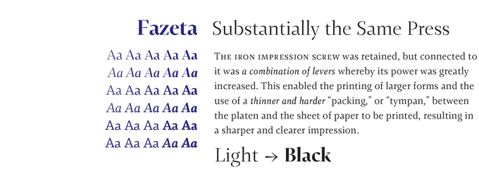
Possibly the most unusual and striking text family of recent times is Fazeta by Slovakia’s Andrej Dieneš. It is an ambitious project, offering three optically optimized versions for use in different sizes — captions, body text, and headlines. With its vertical thick-thin contrast it is a sort of contemporary Didone (in Dieneš’ Central European terms: a “modern static antiqua”) but manages to steer clear of the usual rigid look of this type category. Inspired by typefaces from 1960s Czechoslovakia — from Týfa, Preissig and others — the typeface has sharply-cut shapes and utterly rational optical solutions, combined with classical proportions. The designer speaks of a “naked cold expression without emotions”, but don’t be fooled: it’s not all sternness. In spite of its willful character its effect is not at all unfriendly. With 1140 glyphs per font (including mathematical symbols, arrows and borders) the family is marvelously versatile.
|
|
|
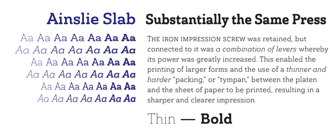
In 2013 Jeremy Dooley designed Ainslie, a supple sans-serif inspired by Australian influences. Its new companion is Ainslie Slab: following similar principles of geometric simplicity with a hint of aboriginal flair, the new serif face is a jovial, readable text and display face full of character. Check out the trendy alternates (accessible in any OpenType-enabled application). Alternates, swashes and alternate titling caps allow you to customize the face’s look and feel. Download the PDF brochure to get a feel of all the possibilities. |
|
|
|
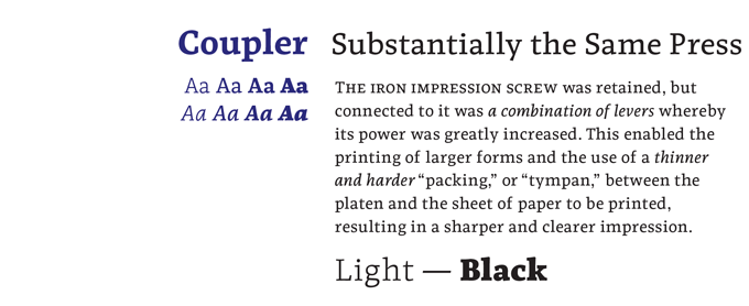
Coupler from the prolific Washington, DC-based District foundry is a well-drawn, sturdy new text face. Its low contrast, airy counters, and strong baseline make it perfect for smaller sizes and extended reading. Lightly bracketed serifs and pleasantly conspicuous italics temper Coupler’s formal tone and make it well suited for anything from fiction, essays and academic journals to financial reports, magazines and catalogs. Four weights with italics and advanced typographical support provide design flexibility in any layout.
|
|
|
News Round-Up
In this section we pick out interesting news snippets from MyFonts’ own kitchen and from the greater world of fonts, lettering and typography.
|
|
The Fountain legacy
Still from the video by Rui Abreu for Abreu’s own Gira typeface, made for Fountain with music by Peter Bruhn.
In early 2014 the type world was shocked to learn of the untimely passing, at a mere 45 years old, of Swedish type designer Peter Bruhn. The multi-talented, energetic and amiable Bruhn left behind the foundry of which he had been the initiator and curator — Fountain. For twenty years he had been working with an international group of type designers, building an interesting, high-quality library. As the foundry is being discontinued, the respective designers must now find independent ways of distributing their fonts. Those designers who already had their own independent foundry are gradually adding their former Fountain typefaces to their own collections. To mention a few: Nordic Narrow Pro by Dutchman René Verkaart; Heroine Pro, Meadow Pro and Flieger Pro by Göran Söderström (Letters from Sweden ) and the recent additions from Rui Abreu: Orbe Pro, Foral Pro, Gira Sans, and Aria Pro.
|
|
MyFonts on Facebook, Tumblr, Twitter & Pinterest
Your opinions matter to us! Join the MyFonts community on Facebook, Tumblr, Twitter and Pinterest — feel free to share your thoughts and read other people’s comments. Plus, get tips, news, interesting links, personal favorites and more from MyFonts’ staff.
|
|
|
|
|
|
Subscription info
It is never our intention to send unwanted e-mail.
Want to get future MyFonts newsletters sent to your inbox? Subscribe at:
MyFonts News Mailing List
|
|
|
Comments?
We’d love to hear from you! Please send any questions or comments about this newsletter to [email protected]
|
|
|
|
|
|
MyFonts Inc. 500 Unicorn Park Drive, Woburn, MA 01801, USA
MyFonts and MyFonts.com are registered service marks of MyFonts Inc. Other technologies, font names, and brand names are used for information only and remain trademarks or registered trademarks of their respective holders.
© 2015 MyFonts Inc
|
|
|
|