Some months we have more of a smile on our faces than others, and this has been a very good month for classy text and display faces. Several of them are introduced in the Text Fonts section below. We open this newsletter with the revival of a mythical modern classic. For those who can appreciate quality in type, this is truly exciting stuff. |
|
|
This Month’s Rising Stars
|
|
|
|
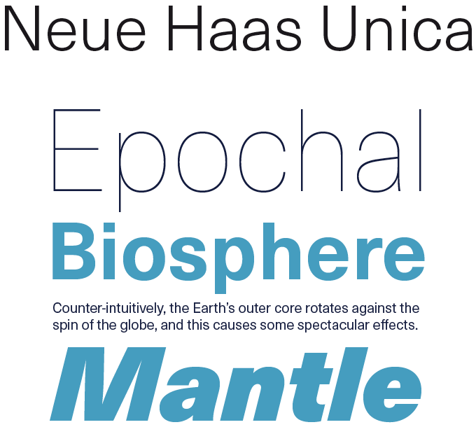
The Neue Haas Unica™ type family is a long-awaited revival: the typeface has been unavailable for decades. Designed in the late 1970s for Haas Type Foundry in Switzerland, the original Haas Unica® was a masterpiece of Swiss precision. Three designers known as Team ’77 combined the best of the Helvetica® and Univers® type families, both owned by Haas at the time, in an attempt to create the ultimate sans-serif. The family was released to great acclaim in 1980, but was only available as a proprietary typeface for photo-typesetting. After the advent of PostScript the typeface vanished into obscurity. When Monotype’s type director Dan Rhatigan discovered the original film masters for Unica in late 2012 (read the full story on Wired) staff designer Toshi Omagari set to work to develop Neue Haas Unica. He gave this modern classic a fresh, digital facelift with more weights, more languages and more letters to meet the needs of today’s designers. On sale until May 22, 2015.
|
|
|
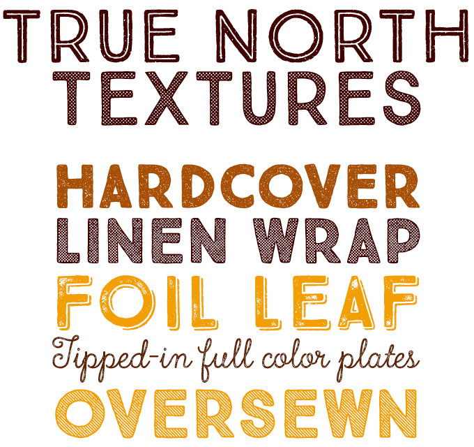
Our list of Most Popular Fonts of 2014 featured quite a few of those hotchpotch families we label “shabby-chic suites”, and True North by Cindy Kinash and Charles Gibbons was one of the most elegant. Their foundry Cultivated Mind has now released True North Textures — a new, distressed version with additional new styles. The family now consists of 18 styles of textured caps, a monoline script, distressed labels, and free banners, plus an Extras font that includes animals, catchwords, numbers, mountains, symbols, tools, leaves and trees. All of this makes True North Textures another useful toolkit for creating layouts with character, well suited to evoking the great outdoors and rugged lifestyles. |
|
|
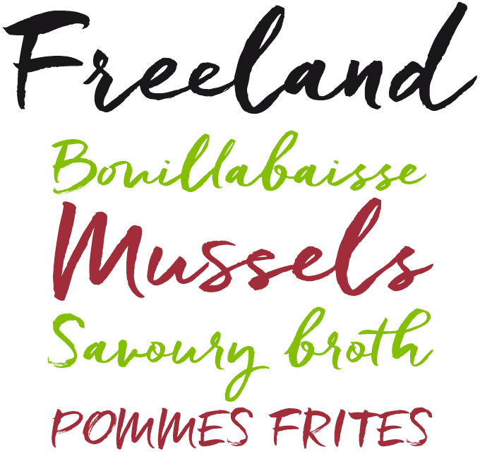
Laura Condouris from Baltimore describes herself as “a calligrapher, illustrator … and occasional comedienne.” The name of her foundry certainly conveys her comedic talent — Trial By Cupcakes is equal parts silly and brilliant. Similarly, her fonts combine whimsy and accuracy, spontaneous energy and typographic savvy. After her delicate Quickpen, featured here exactly a year ago, the new Freeland is proof that Condouris masters quite a broad range of informal scripts, and knows how to make them into flexible fonts. A casual brush typeface with a rich, inky texture, Freeland is modern, bold, and lively. It has, says the designer, “just a bit of a masculine, edgy vibe.” Freeland comes with plenty of ligatures and stylistic alternates for a realistic hand-lettered look. Check out the introductory offer, valid until May 23, 2015. |
|
|
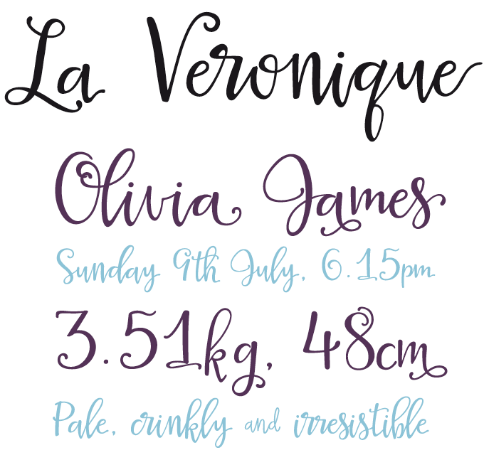
Based in Edinburgh, UK, Elena Genova is an icon designer, Adobe Illustrator wizard and lettering artist. She recently ventured into type design and joined MyFonts with her new type foundry My Creative Land. Specializing in informal scripts, she was immediately successful with her first typeface in the genre, the expressive Veryberry Pro. The recent La Veronique is her sunniest and most energetic script to date. It leaps and bounces, and effectively mimics expert yet playful handwriting thanks to its many alternates, swashes, ligatures and other OpenType features. Some suggestions for use: wedding invitations, thank-you cards, branding, advertising, book covers — and more. |
|
|
Text Fonts of the month
Typesetting for books, magazines or annual reports requires font families with special qualities: excellent readability, a generous range of weights with italics and small caps, multiple figure sets (lining, oldstyle, table) and ample language coverage. Here is a selection of recent, high-quality text typefaces.
|
|
|
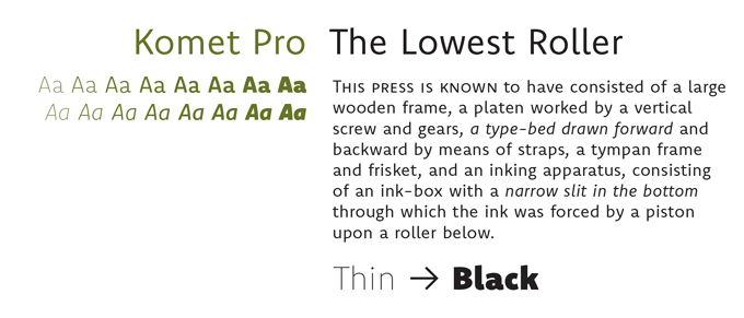
Jan Fromm from Berlin is best known as the designer of Rooney Sans, the text font used throughout MyFonts’ website and newsletters. Fromm is a meticulous worker who spends about a year on a new typeface — and the results are quite remarkable. His new Komet is a sans-serif text and display family inspired by classic English designers such as Eric Gill, but very contemporary and quite original in its detailing. Komet Pro is the version for advanced typography — equipped with small caps, multiple figure sets, arrows, fractions, and more. Both families come in 8 weights plus italics, and are 50% off until May 27, 2015. |
|
|
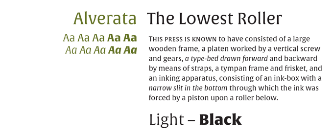
Now in his seventies, Gerard Unger is one of the elder statesmen of Dutch type. Only a few years ago, Unger completed his doctoral thesis, a study of Romanesque inscriptions of the eleventh and twelfth centuries. Unger’s historical research invariably leads to highly original, contemporary typeface designs. The Romanesque lettershapes became Alverata, a lively text face with a unique personality. Like other recent Unger fonts, it was published by TypeTogether, the foundry run by his former students Veronika Burian and José Scaglione. The Paneuropean version has wide language coverage and includes Greek and Cyrillic character sets. |
|
|
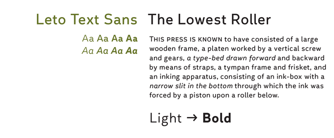
Leto Text Sans is the latest sans-serif by Russian type designer Elena Kowalski. For the past three years, Kowalski has gradually built up a collection of text and display faces with her foundry Glen Jan; the Leto family is one of her most successful. While Leto Slab is a highly idiosyncratic family with very usual serifs, its sans companion Leto Text is definitely more conventional while retaining much of the family’s personable, round silhouette. The italic is rather wide and highly readable. This well-equipped family includes Cyrillics, making it a versatile, original and very affordable alternative to more rigid sans-serif text families. |
|
|
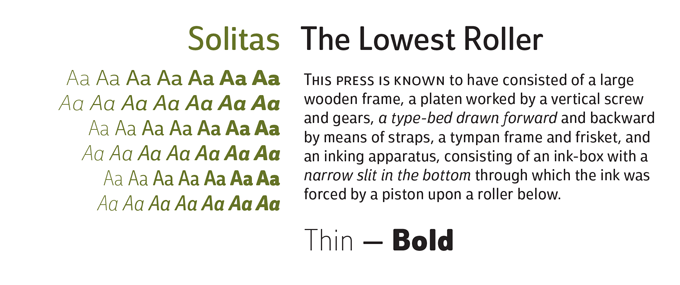
Jeremy Dooley’s latest is Solitas — a rather informal but highly readable sans. It comes in seven weights plus italics, and a Condensed version of the entire family — 42 styles in all. Its typographic features include ligatures, fractions, alternate unicase, upright italics, and titling caps. The result is a practical workhorse typeface with a surprisingly friendly look, well-suited for the headlines and shorter texts of promotions, packaging, editorials and branding, both in print and on the web. Check out the introduction promo — until June 5, 2015. |
|
|
News Round-Up
In this section we pick out interesting news snippets from MyFonts’ own kitchen and from the greater world of fonts, lettering and typography.
|
|
TYPO Berlin 2015: Character
The 2015 edition of TYPO Berlin takes place from the 21st to the 23rd May, and dives into the theme of “Character”. Talks by prestigious international experts in design, communications, typography and psychology will tackle strategies for creating “character”, while a tempting array of forums, demos, workshops and social events completes the weekend’s program. For tickets and more information, visit typotalks.com/berlin/2015/tickets/.
|
|
Kerning Typography Conference
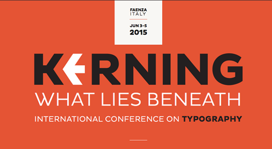
For those of you to whom a last minute trip to Berlin might be too short notice, we suggest the fine attractions of Faenza in northern Italy at the start of June for the Kerning Conference instead. Now in its third year, Kerning offers a day of talks from the likes of Laura Worthington, Tobias Frere-Jones and iA’s Oliver Reichenstein, preceded by two days of workshops — providing unique occasions to learn from Spencerian calligrapher Barbara Calzolari or infographics gurus Nicholas Felton and Francesco Franchi. For tickets and full program details visit the conference website.
|
|
MyFonts on Facebook, Tumblr, Twitter & Pinterest
Your opinions matter to us! Join the MyFonts community on Facebook, Tumblr, Twitter and Pinterest — feel free to share your thoughts and read other people’s comments. Plus, get tips, news, interesting links, personal favorites and more from MyFonts’ staff.
|
|
|
|
|
|
Subscription info
It is never our intention to send unwanted e-mail.
Want to get future MyFonts newsletters sent to your inbox? Subscribe at:
MyFonts News Mailing List
|
|
|
Comments?
We’d love to hear from you! Please send any questions or comments about this newsletter to [email protected]
|
|
|
|
|
|
MyFonts Inc. 600 Unicorn Park Drive, Woburn, MA 01801, USA
MyFonts and MyFonts.com are registered service marks of MyFonts Inc. Unica is a trademark of Monotype Imaging Inc. and may be registered in certain jurisdictions. Haas Unica is a trademark registered at the Office for the Harmonization in the Internal Market and may be registered in certain other jurisdictions. Helvetica and Univers are trademarks of Monotype GmbH registered in the U.S. Patent and Trademark Office and may be registered in certain other jurisdictions. Other technologies, font names, and brand names are used for information only and remain trademarks or registered trademarks of their respective holders.
© 2015 MyFonts Inc
|
|
|
|