|
The ATypI conference is the annual get-together of type designers and typography buffs from all over the world. At this year’s event in São Paulo, Brazil, we were lucky to meet lots of friendly and talented people. One of them was Sabrina Mariela Lopez who opens up our new section “Popular Designer of the Month”, see below. ATypI 2015 is barely over and already we’re looking ahead to the next ATypI in Warsaw, Poland. It just so happens that this month’s Rising Stars features two typeface families by designers from this vibrant city in the heart of Europe. But let’s not wish the year away — seize the day and dive into our excitingly global selection right now!
|
|
|
This Month’s Rising Stars
|
|
|
|
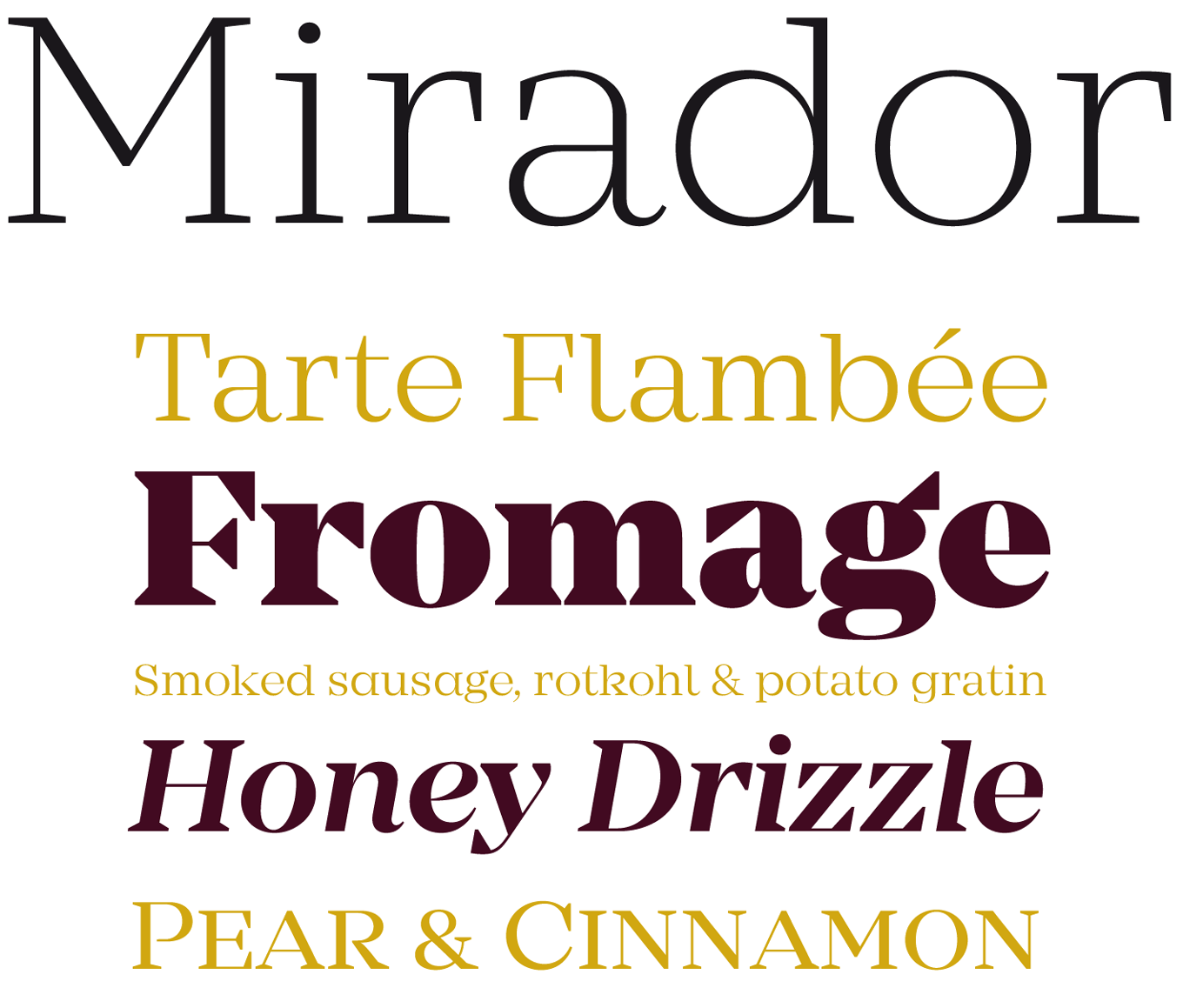
With his new Mirador, René Bieder has left his comfort zone of low-contrast grotesques and slabs. For the first time he has tried his gifted hands at a modulated serif. The outcome is a classy typeface of lavishly wide proportions. Already featured in last month’s Text Fonts section, Mirador continues to do too well to ignore. Its Latin (i.e. triangular) serifs make for a striking impression, especially in the heavier styles — the wedge shape is repeated in other details like the ear in ‘g’ or the terminal in ‘y’ — in this regard, Mirador might pass as an unrestrained descendant of Aldo Novarese’s ITC Fenice. Ten finely graded weights plus tasty italics with cursive forms encourage a wide range of applications. Get your hands on the free Demo version and test-drive two weights with a reduced character set. Mirador is on sale until November 8th, 2015.
|
|
|
|
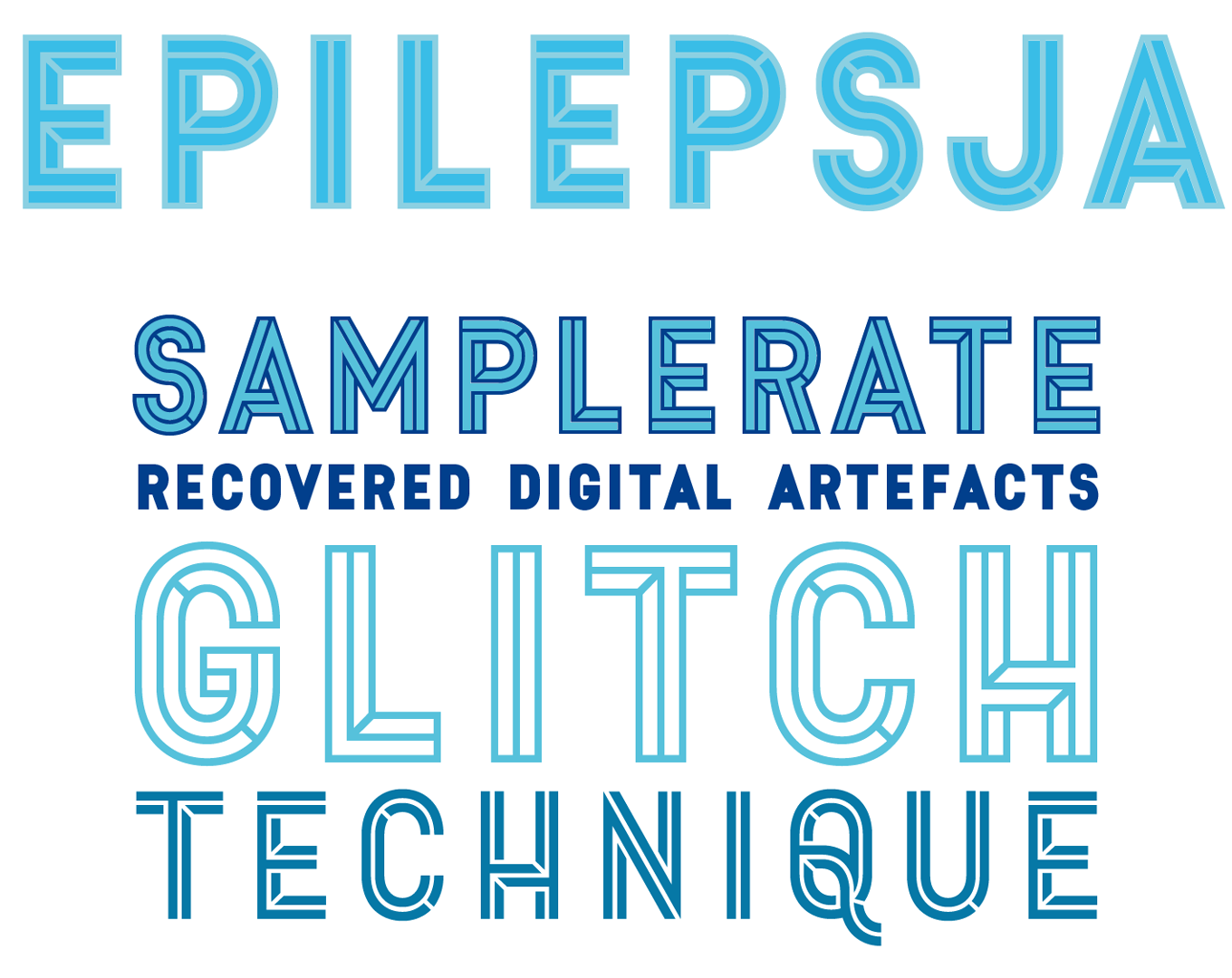
Mikołaj Grabowski has been in love with typography ever since he attended Matteo Bologna’s workshop “Type design for non-type designers”. Now this Warsaw-based student has finished his first font and can proudly call himself a real type designer, and a successful one to boot: his debut Epilepsja has made it right onto the list of Hot New Fonts. The product of Grabowski’s fascination with stenciled street art, this all-caps font family combines straightforward constructed letterforms with impossible 3D effects as popularized in the illusionistic works of Dutch artist M.C. Escher. Epilepsja comes in three styles, Outline, Fill and Solid, that can — and should — be combined in multicolored layers. Tip: When using Adobe Illustrator, make sure to use “Point type” instead of “Area type”, so that your layers align properly.
|
|
|
|
|
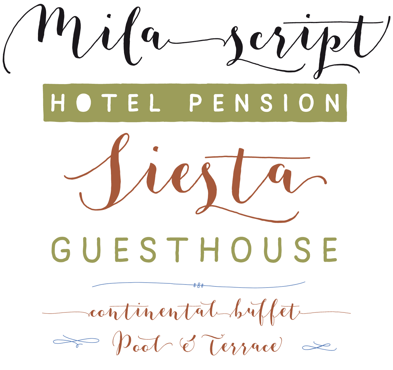
Austrian foundry FaceType has made its mark by closely observing trends and then adding a refined response to the mix. Mila Script is their take on the current rage for squiggly-wiggly scripts, setting itself apart with almost-upright, contrasty letterforms and a highly sophisticated suite of OpenType-powered features. While the happily bouncing glyphs may look naïve, the underlying engineering is not: Georg Herold-Wildfellner has rigged the fonts with all kinds of technical extras, including numerous stylistic and contextual alternates. Intelligent OpenType features can automatically insert swashes depending on the available space, or extend the swashes before and after words. Mila Script lets you choose whether you like your letters joined up or not, and even offers connecting lines between words. The perky script is accompanied by the demure Mila Script Sans. These hand-drawn looking caps come in three weights and can be reversed to white on black, with optional eye-catching missing counters. This comprehensive toolkit is completed by a set of ornaments and a thorough user manual. Mila Script’s introductory offer ends November 7, 2015.
|
|
|
|
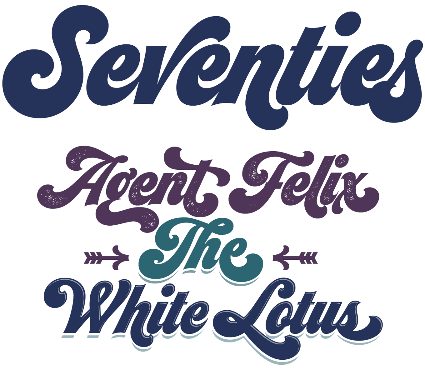
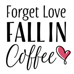
Maximiliano Sproviero of Lián Types follows up on his bottom-heavy Beatle with the aptly named Seventies, invoking that decade and its famous voluptuous scripts. Exploring the groovy fonts reminiscent of the era of Soul, Funk and Disco, Seventies draws on period lettering as seen on record covers or posters, and echoes forgotten pre-digital typefaces like Ed Benguiat’s Charisma Script. Seventies comes in one chubby weight only, and still it spans six fonts: In addition to the basic style and a pre-weathered Printed variation, there are Shade and Shine cuts that can be used to further pump up the volume. These embellishments are provided both as ready-made styles and as separate fonts; the latter can be stacked in layers for chromatic effect. Each font comes with 500 glyphs, packed with juicy swash alternates for maximum disco-era chic.
|
|
|
Popular Designer of the Month
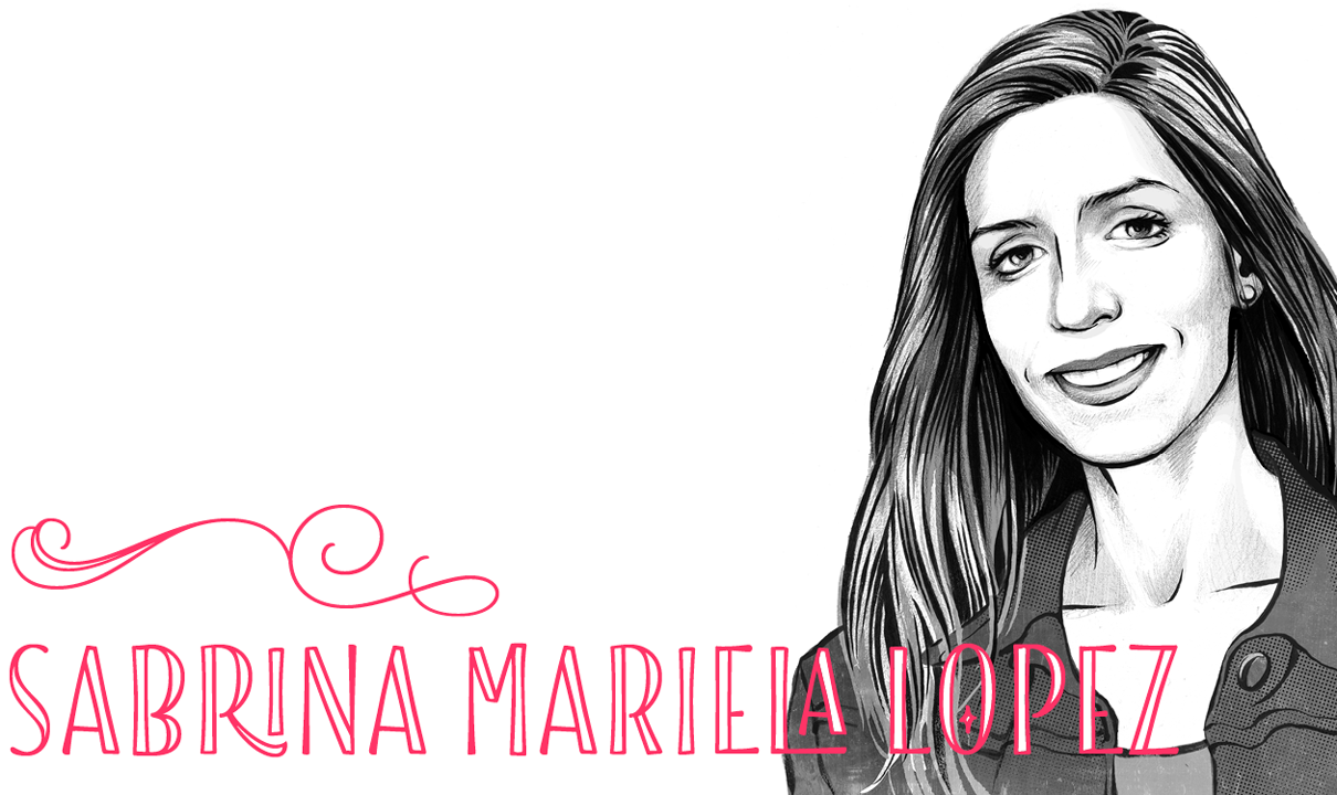
Each month, we add a new designer to the sidebar of popular designers on our homepage, based on their popularity with customers. This month, our new addition is Sabrina Mariela Lopez of Typesenses. |
|
|
|
Sabrina Mariela Lopez is an Argentinian calligrapher, type designer and graphic designer. Her first release on MyFonts was Aphrodite Pro, a collaboration with Maximiliano Sproviero that was an instant hit, and made our Rising Stars newsletter in June 2009. Since then she’s gone on to release several more elaborate, confident calligraphic or ornamental scripts such as Wishes Script and Parfumerie. Her eye-catching latest font, Blend, has been particularly successful, and is something of a stylistic departure. As well as a casual brush script, Blend includes a range of hand-drawn display alphabets with incised and fill effects, making for a well equipped designer’s toolkit.
|
|
|
Text Fonts of the month
Typesetting for books, magazines or annual reports requires font families with special qualities: excellent readability, a generous range of weights with italics and small caps, multiple figure sets (lining, oldstyle, table) and ample language coverage. A rare event in the history of this series: this month’s selection is dominated by sans-serif families — as if more evidence was needed that serifless fonts have long become a viable option also for complex editorial tasks.
|
|
|
|
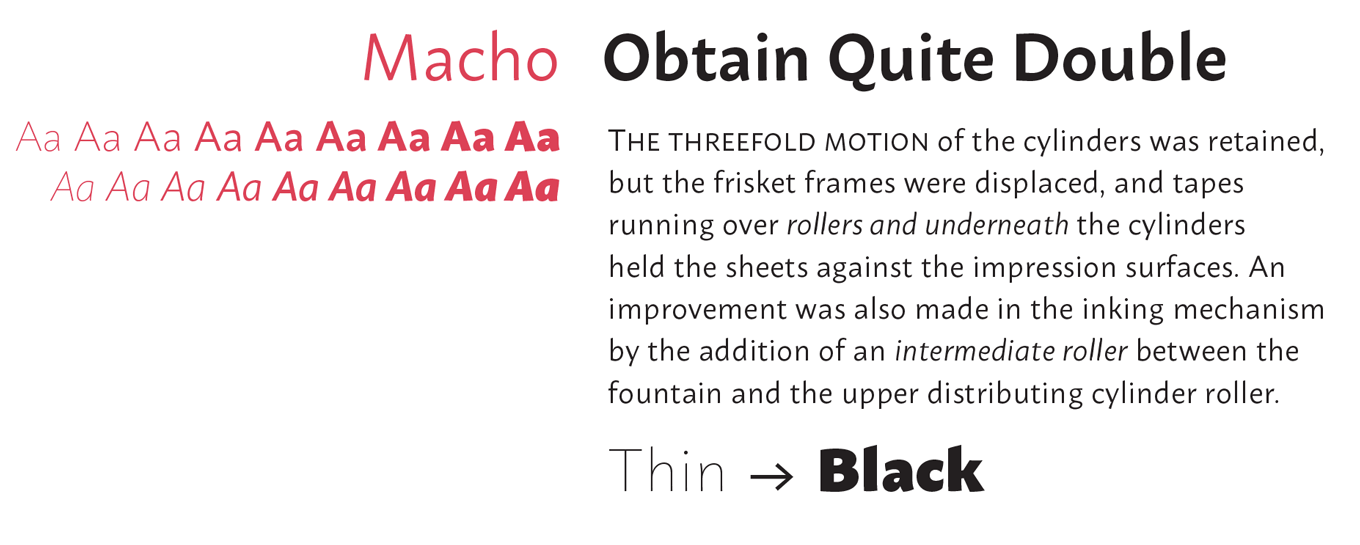
Despite the name, Macho is not importunate at all, but rather a well-mannered and helpful fellow. Its neatly drawn letters have a soft, brush-like quality, with angled stroke endings that become more noticeable towards the bolder styles. Michał Jarociński’s friendly sans-serif family spans a whopping nine weights plus italics, all endowed with small caps, various sets of numerals and more. Macho goes well together with the popular Clavo, a serif of similar structure. Being based in Warsaw, it is not too surprising that Dada Studio threw in Cyrillic characters as used in some of Poland’s neighboring countries. The whole family is on sale at a very attractive price until November 30, 2015.
|
|
|
|
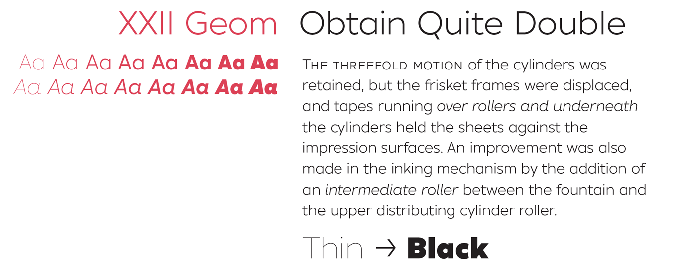
The oeuvre of Lecter Johnson of Doubletwo Studios is diverse: it varies from the trendy and upbeat YeahScript to Gory Bastard, a truly horrific face intended for heavy metal band logos. His newest release is less edgy — and more versatile. XXII Geom is a geometric sans-serif designed with functionality and legibility in mind. Its wide proportions and relatively tight spacing make it ideal for medium-length texts (think magazines or brochures rather than novels or text books), and with eight weights, small caps, all kinds of figures, and a few alternates and ligatures, Geom comes well-prepared for any editorial design brief. The introductory offer is valid until November 9, 2015. Still not convinced? Give it a test — the Regular is for free.
|
|
|
|
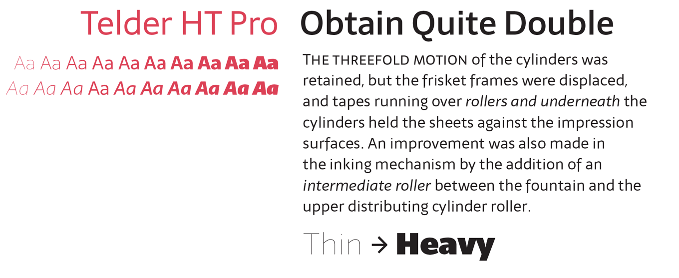
The four members of Huerta Tipográfica are divided between two hot spots of contemporary type design; Berlin and Latin America. Telder HT Pro is the debut of Andrés Torresi who works in Rosario, Argentina. Originally conceived as a screen font with grid-friendly shapes, it evolved into a multi-purpose typeface with low contrast and open forms. The humanist sans serif is equally recommended for paragraph text on blogs or news websites as well as for printed matter, with the extreme weights being serviceable for display sizes. All ten weights and their italics are equipped with small caps and support a great number of languages, including Vietnamese. Thanks to Telder’s playful ligatures and the alternate glyphs that come organized in several stylistic sets, you can quickly customize the look of the text to your own liking. Telder is 25% off until November 11, 2015.
|
|
|
|
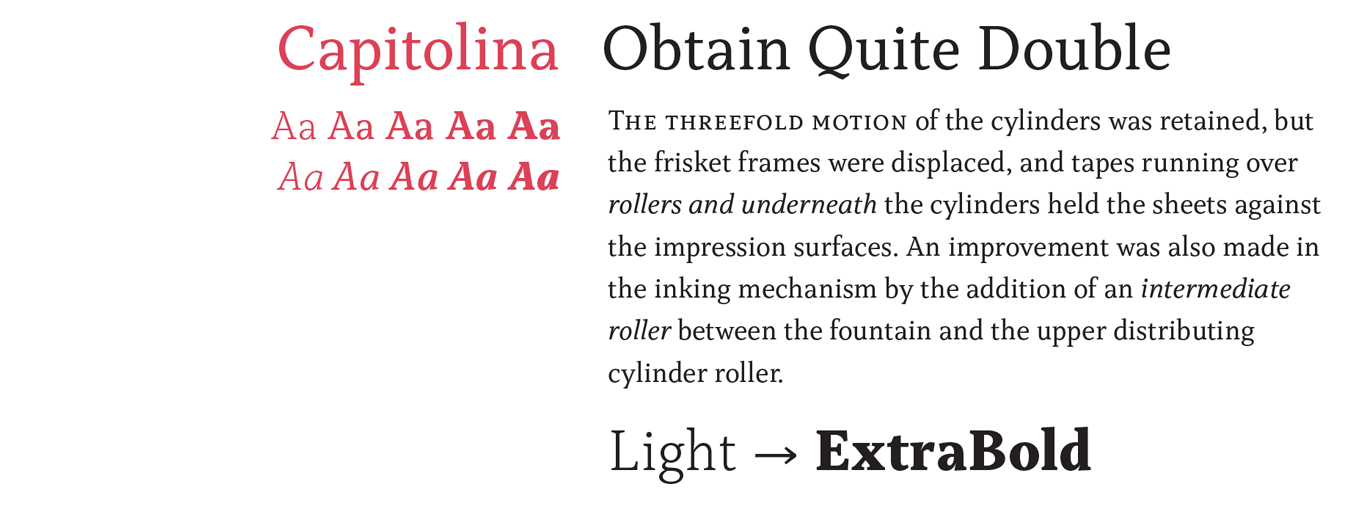
Typefolio is the microfoundry run by designer Marconi Lima from Macapá in the far north of Brazil. A self-taught type designer, Lima has produced a small but exquisite body of work, including the splendid Stevie Sans and the elegant Adriane Text. His latest is Capitolina, produced in collaboration with Christopher Hammerschmidt. It’s a sturdy text family, optimized for editorial design, and referencing 19th-century Clarendon models as well as calligraphic influences. The result is a typeface that combines humanist roots with a ‘constructed’ look — an unusual approach that lends the text family a distinct appearance and excellent legibility. The family comes in five weights plus matching italics; with small caps, all kinds of figures, and a few extra ligatures, it comes well-prepared for any editorial design brief. The introductory offer is valid until November 14, 2015.
|
|
|
News Round-Up
In this section we pick out interesting news snippets from MyFonts’ own kitchen and from the greater world of fonts, lettering and typography.
|
|
Follow your favorite designers on MyFonts!
You can now follow your favorite designers
Fall has brought a brand new look and new features for our home page. Lots of you have asked for a way to know when your favorite designer publishes a new font, and we’re happy to announce that we’ve made it easy for you to do just that. Follow your favorite designers and foundries and learn when they release a new font or put one on promotion. If you’re not sure who to follow, start with some of the popular designers we’ve featured in the sidebar. We’ve also highlighted some new and notable fonts on the home page for your inspiration.
Our latest blog post has the full lowdown on the whole home page redesign!
|
|
The Eric Gill Series launch exhibition
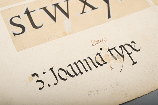
Details from 1931 drawings by Eric Gill for Joanna Italic, used to help Monotype adapt the first version cut for Gill by the Caslon foundry
For any Londoners or anyone visiting the British capital in the first week of November, an exhibition is being held at The Old Truman Brewery to launch a new Eric Gill Series of three typefaces, offering designers and type enthusiasts a chance to learn about the past, present and future of the type design craft.
Visitors can expect to see some of the historic materials that inspired the development of the series, such as test prints for display weights that were never digitized, correspondence and hand-drawings documenting the development of the Gill Sans family and copper plates that reveal the production process of early letterpress typefaces.
The Eric Gill Series Exhibition, Nov. 4–10 at The Old Truman Brewery, Brick Lane, London. More information, tickets and opening times are on the exhibition’s Eventbrite page.
|
|
FontScout — Explore the MyFonts collection on iPad
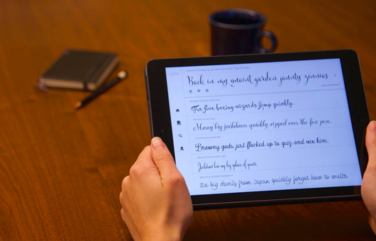
FontScout is the brand new iPad app from MyFonts that gives you a new and different way to explore the world’s largest collection of fonts. Browse the MyFonts collection to narrow down your search to the perfect typeface using our new “More Fonts Like This” technology. Hit the heart button to Fave fonts as you go and add them to albums — everything syncs automatically to your MyFonts account, making it easy to go back to view your top picks later. How much, you ask? It’s free!
|
|
|
|
MyFonts on Facebook, Tumblr, Twitter & Pinterest
Your opinions matter to us! Join the MyFonts community on Facebook, Tumblr, Twitter and Pinterest — feel free to share your thoughts and read other people’s comments. Plus, get tips, news, interesting links, personal favorites and more from MyFonts’ staff.
|
|
|
|
|
|
Subscription info
It is never our intention to send unwanted e-mail.
Want to get future MyFonts newsletters sent to your inbox? Subscribe at:
MyFonts News Mailing List
|
|
|
Comments?
We’d love to hear from you! Please send any questions or comments about this newsletter to [email protected]
|
|
|
|
|
|
MyFonts Inc. 600 Unicorn Park Drive, Woburn, MA 01801, USA
MyFonts and MyFonts.com are registered service marks of MyFonts Inc. Other technologies, font names, and brand names are used for information only and remain trademarks or registered trademarks of their respective holders.
© 2015 MyFonts Inc
|
|
|
|