|
February is the month where partners profess their love for each other. Yet many agree that this shouldn’t be restricted to that one day on February 14th — Valentine’s Day. No, they feel we must show that we care every single day of the year. We couldn’t agree more, and that is why we at MyFonts profess our love for beautiful type every month with our Rising Stars newsletters. And just like every month, we offer you attractive display fonts and desirable text fonts. The only thing these hot new fonts want to know is — can they be your Valentine? Can you resist…?
|
|
|
This Month’s Rising Stars
|
|
|
|
|
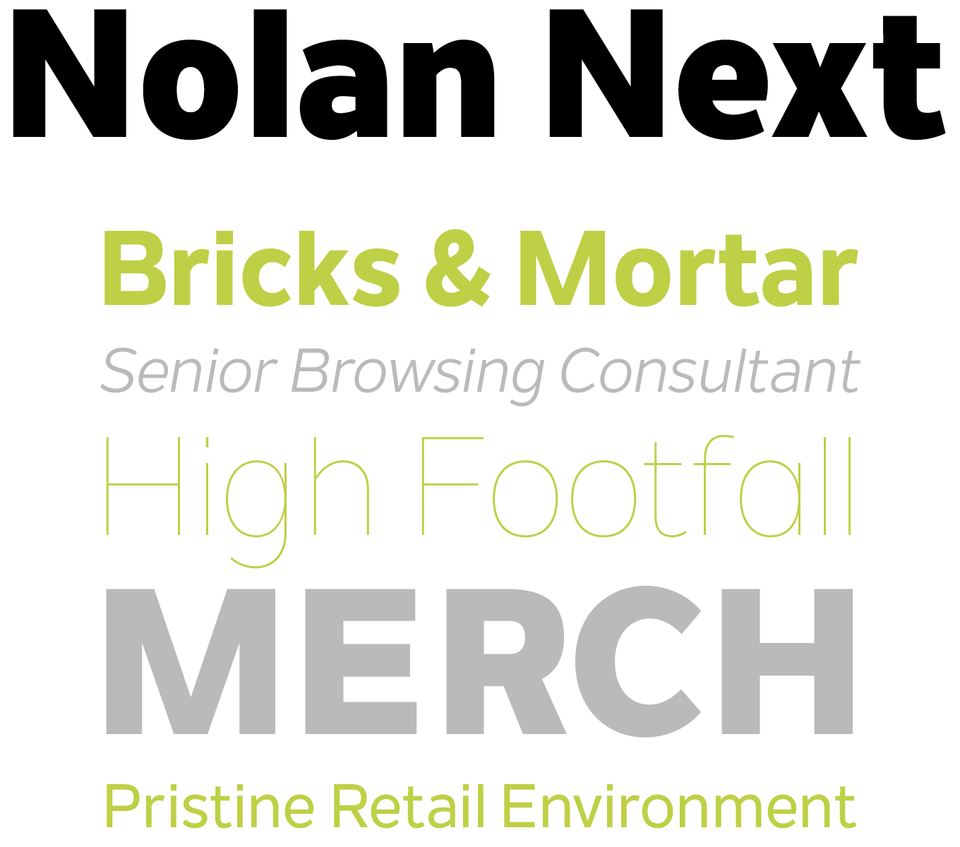
Barely five months after his MyFonts debut, Bulgarian designer Galin Kastelov has already reached the coveted top spot in the Hot New Fonts list with his second type family. As its name implies, his sophomore effort is based on Kastelov’s inaugural release, the humanist sans serif Nolan. Nolan Next shares its low contrast and generous x-height, but has more compact letter forms than its sibling. Nolan Next’s streamlined features, designed primarily for display use, will appeal to a broader audience looking for a typeface that performs in a wide range of applications — from branding and corporate identity to editorial and web design. Its clear structure, narrower proportions and extended character set make Nolan Next suitable for text setting as well. Add to that a nice sequence of eight weights with carefully drawn obliques, and you have a versatile family that will accommodate all your typographic needs. The Nolan Next introductory offer ends on February 15, 2016… just after Valentine’s Day.
|
|
|
|
|
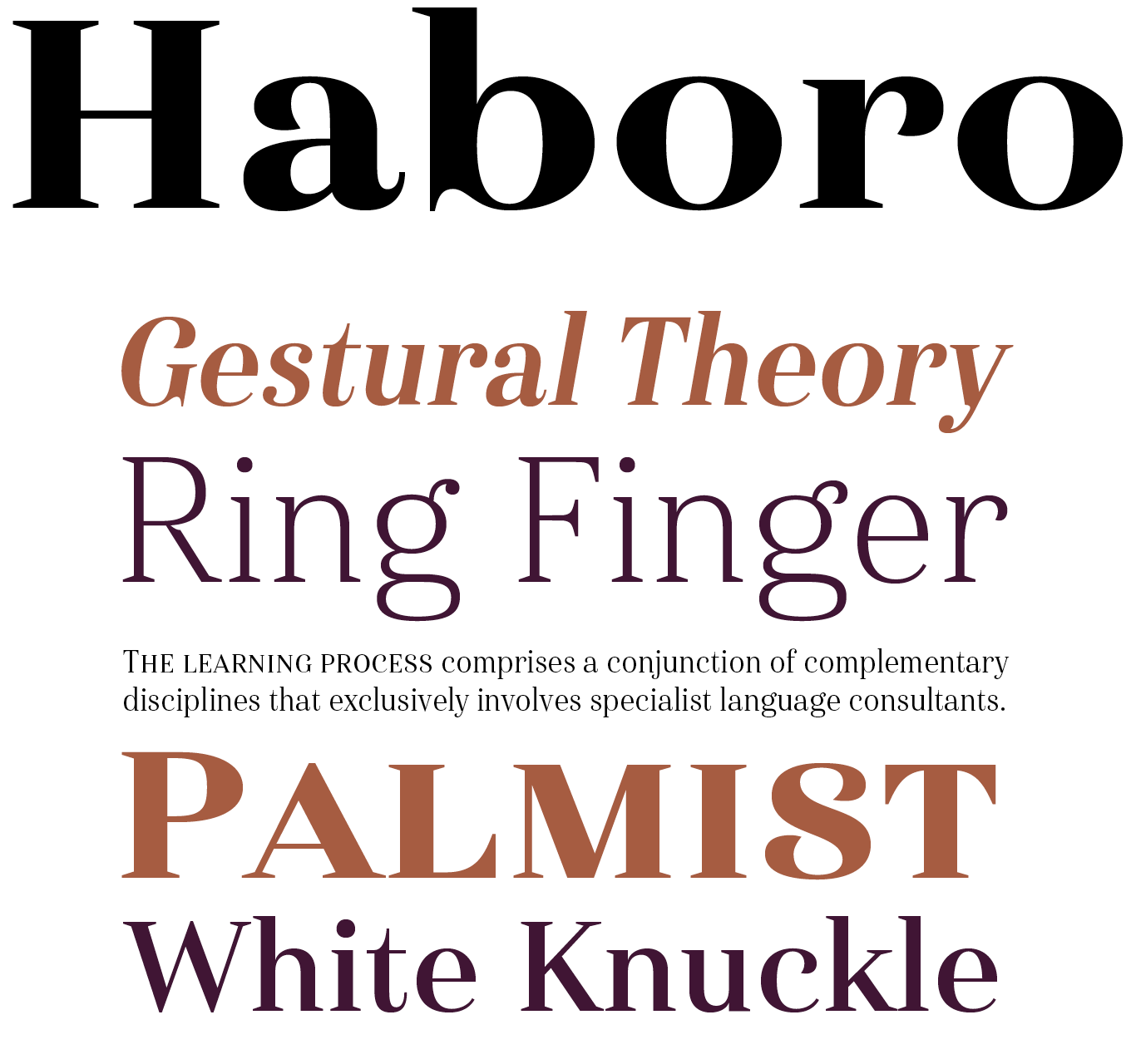
Since making his name with the Aviano series of wide display families (no less than a dozen variants!), Jeremy Dooley’s one-man type foundry Insigne has become a true self-made success story. His latest release Haboro sees him explore the neoclassical genre of the Didones, beloved by editorial designers and the fashion industry for their elegance and refinement. Haboro puts a modern twist on the high-contrast style, with slightly wedge-shaped serifs and leaf-shaped terminals that give the typeface a unique look. OpenType features allow the user to switch between these default terminals and the more traditional ball-shaped ones, as well as between sharp and blunt points on the capital ‘A’, ‘M’, ‘V’ and ‘W’. The type family comes in an impressive 54 styles: 9 weights in three widths — Normal, Condensed and Extended — all with matching italics. Every member of the type family has an extended character set including small caps, numerous ligatures and alternates, and several figure styles. Haboro’s introductory discount ends on February 19, 2016.
|
|
|
|
|
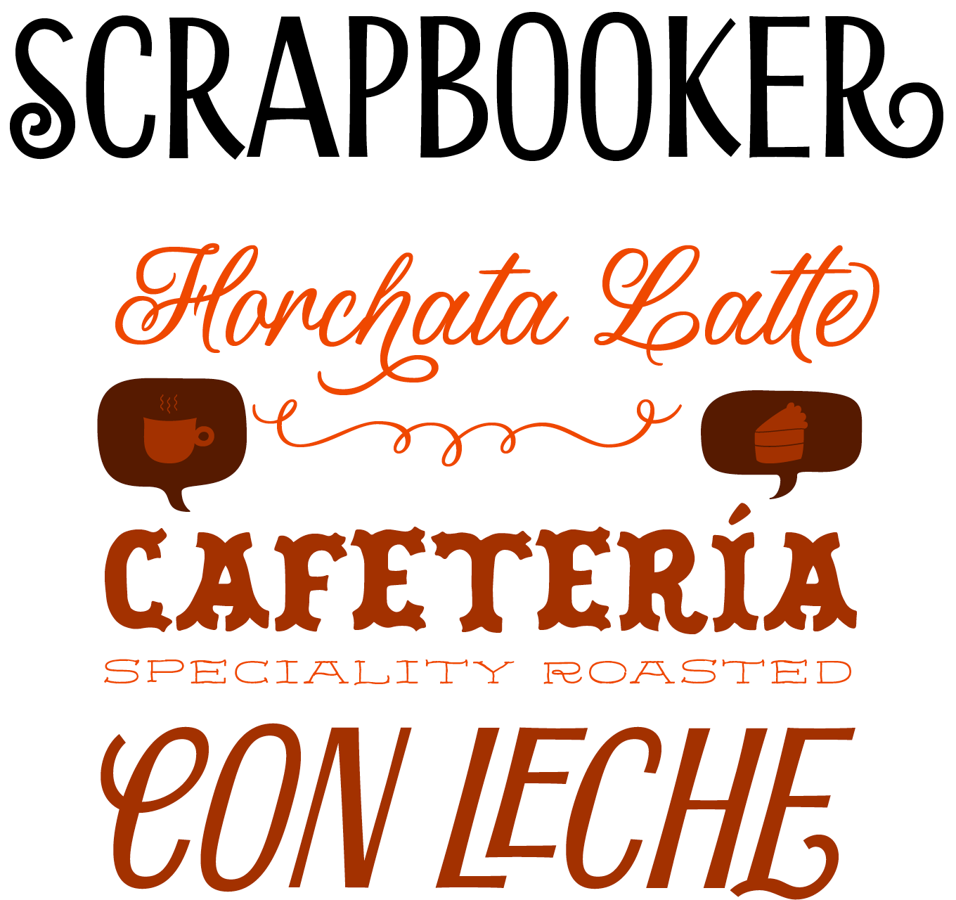
There is no need to introduce Sudtipos, the popular Argentinean foundry run by script master Alejandro Paul. For Scrapbooker he got together once again with Carolina Marando, with whom he also co-designed Blog Script and the bestselling Distillery suite. Just like in their two previous collaborations a joyous sense of unencumbered freedom pervades this eclectic collection of fonts. The set takes its cue from the world of scrapbooking, where people turn memories and diaries into amazing works of art, creating mixed-media collages that tell personal stories. The Scrapbooker family consists of six styles with a clear hand-drawn flavour, each with its own distinct personality: a condensed all-caps sans serif in upright and italic styles; a relaxed interpretation of a copperplate script; a whimsical decorated Tuscan; a wavy, very wide thin slab serif; and a fun set of icons to spruce up your designs. Scrapbooker Sans and Script come with numerous ligatures, alternates, swash variants, and other options to personalize your designs. The Scrapbooker set is at half price until February 26, 2016.
|
|
|
|
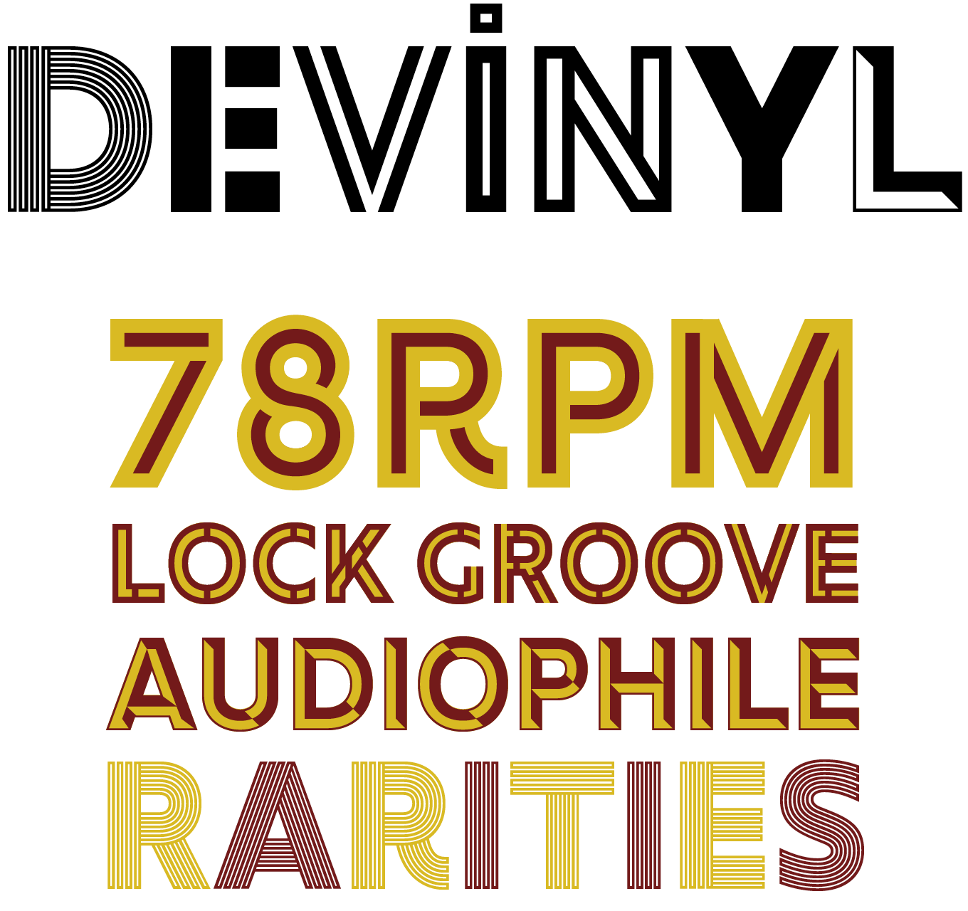
When we envision Swiss type, Devinyl is probably not the first thing that would come to mind. Far removed from the austere aesthetic of the International Style, the latest release by Nootype is a warm, fun all-caps typeface inspired by the sans serifs from the late 19th century. The family consists of a base font and seven surprising variants that can be layered to create striking multi-colour effects. These variants run the gamut from stencil via multiple inline versions to a beveled font mimicking extruded letters — think disco album sleeves, shop signs from the sixties, vintage posters, and so on. Nico Inosanto designed alternate letter forms, located in the lowercase slots, that cause the appearance of the typeface to shift from grotesque to humanist sans. Devinyl feels perfectly at ease in editorial layouts, posters, packaging… any display application that takes advantage of its inventive style. Devinyl is on special offer until February 24, 2016.
|
|
|
Text Fonts of the month
Typesetting for books, magazines or annual reports requires font families with special qualities: excellent readability, a generous range of weights with italics and small caps, multiple figure sets (lining, oldstyle, table) and ample language coverage. Here is a selection of recent, high-quality text typefaces.
|
|
|
|
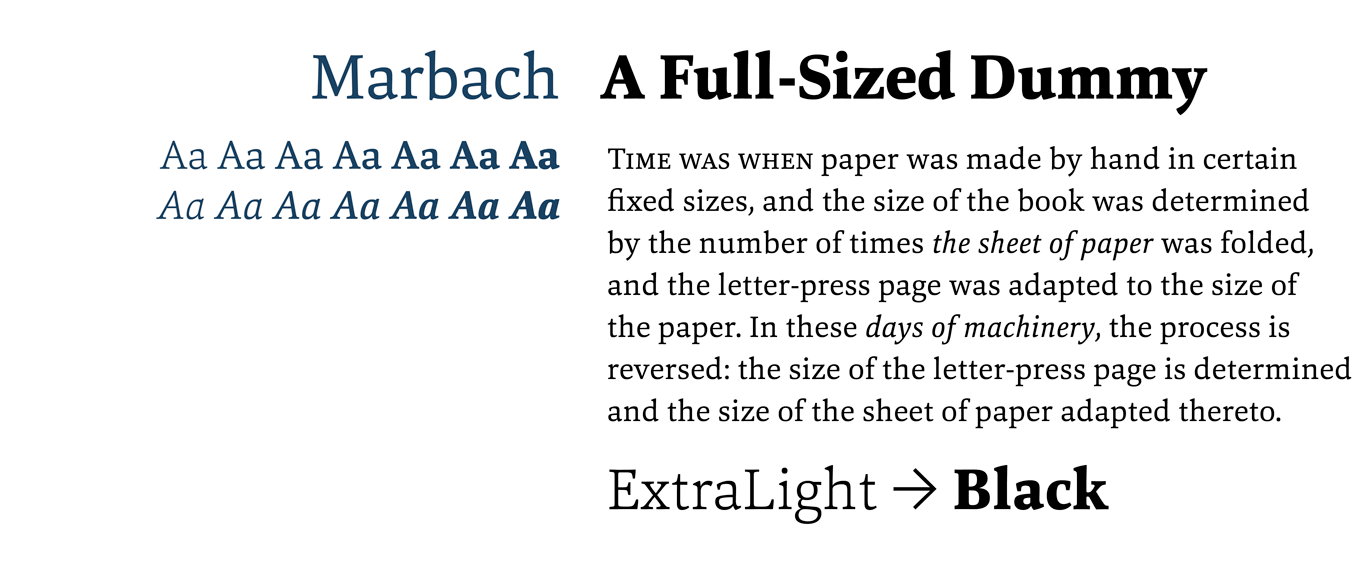
Combining a solid, slightly squarish structure with a soft finish, Marbach from Hoftype succeeds in looking simultaneously confident and friendly. Dieter Hofrichter’s design is firmly rooted in the tradition of classic book faces yet is peppered with contemporary details. Open letter forms and a low contrast give it a calm and balanced appearance in smaller sizes. Available in seven weights with matching italics, all the fonts feature small caps, a broad selection of ligatures, all the necessary sets of numerals, plus arrows and some alternate characters. The Marbach family is half price until February 27, 2016.
|
|
|
|
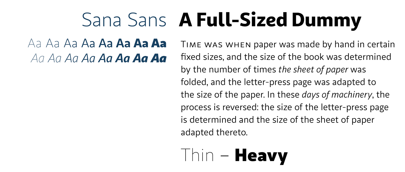
Sana Sans was designed by Chilean Felipe Sanzana, under the supervision of the Latinotype team. This humanist sans serif with a modern feel was developed with editorial use and publishing in mind. Sana Sans looks neat and perfectly legible in long texts, and clear and simple in display use. The versatile family works well both on screen and in print. Sana Sans comes in eight weights from Thin to Heavy with matching italics, in two flavours — a functional regular version and a more relaxed Alt version — adding up to 32 fonts. All fonts include small caps and several figure sets. The Sana Sans special offer ends on March 5, 2016.
|
|
|
|
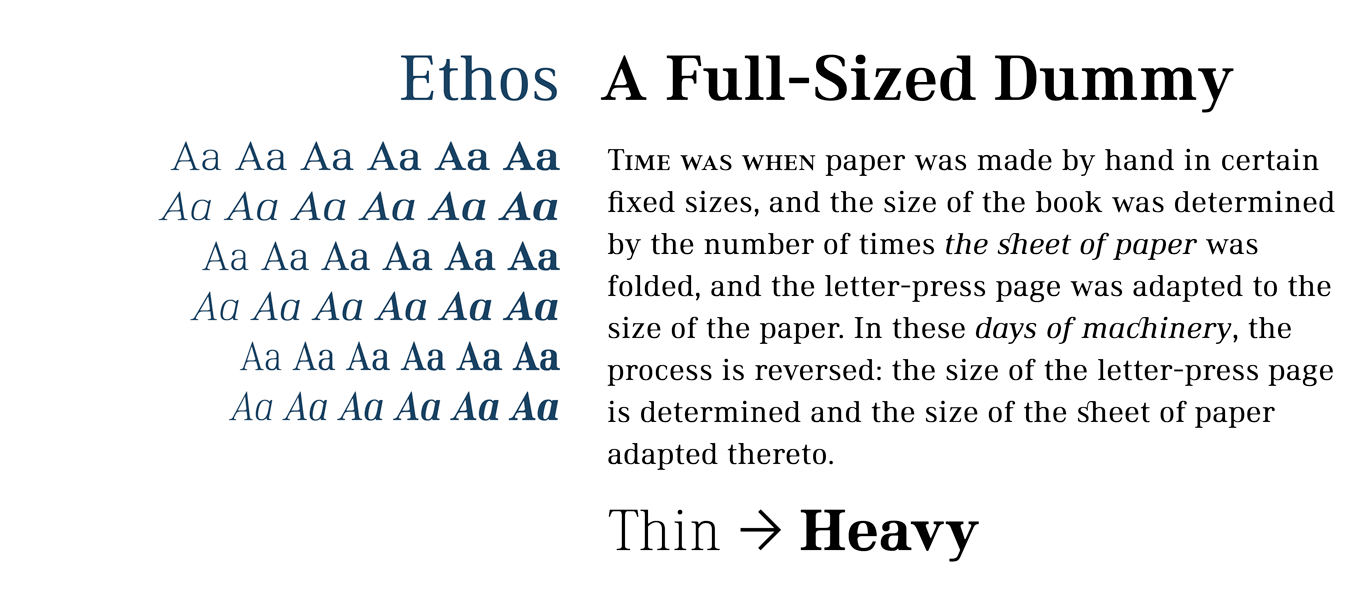
Ethos, the first text family from the Fonts With Love foundry, is sure to delight in the detail. When examined up close, this contemporary serif type family divulges alternating angular and curved corners and lovingly rounded serifs. With its generous x-height and vertical stress Ethos remains legible even in small type sizes. The geometric character and unusual design details make the typeface stand out when used big. The lighter weights have a low contrast, improving their legibility on screen. Ethos is available in 6 weights and three widths, all with matching italics for a total of 36 styles. The small caps that are exactly as high as the lowercase give the option to set unicase text. The fonts include extra ligatures, all the necessary figure sets, and arrows. The special introductory price for Ethos ends on February 21, 2016. You can try Ethos Regular and Italic for free.
|
|
|
News Round-Up
In this section we pick out interesting news snippets from MyFonts’ own kitchen and from the greater world of fonts, lettering and typography.
|
|
Monotype Library Subscription available on MyFonts
The Monotype Library Subscription is a new way to work with fonts Brand new to MyFonts, the Monotype Library Subscription gives you unlimited access to over 2,200 font families, all licensed for desktop use and ready to install immediately.
You’ll get unlimited access to classics from the Monotype library like bestselling Helvetica®, PMN Caecilia®, Frutiger® and Avenir Next®; modern updates like Neue Haas Unica™ and Gill Sans Nova®; and contemporary designs like Burlingame™, Harmonia Sans™ and Kairos™. This isn’t just a new way to buy, it’s a whole new way to work with fonts.
The subscription includes fonts from Monotype, Linotype, Ascender, Bitstream and ITC. New typefaces will be added as they are released, about once every three months.
This amazing subscription is available for just $14.99/month or $119.99/year.
|
|
International Type & Design Gatherings in February
February brings two type events and a design conference on both sides of the Atlantic, on three different continents. On Wednesday February 17 typographer, typeface designer and design historian Christopher Burke delves into the calligraphy and modernist typography of Paul Renner and Jan Tschichold at the Art Workers’ Guild in London.
On February 25–26 the 2016 International Conference on Design Principles and Practices in Rio de Janerio, Brazil, explores the nature, meaning, and purpose of design. Leaders in the field, emerging scholars and interested designers travel from all corners of the globe to this annual event to represent a broad range of disciplines and perspectives.
Finally it’s off to the San Francisco Public Library on the West Coast on Wednesday March 9 for a [email protected] presentation. With Bodoni, the Face behind the Face, Valerie Lester sets Giambattista Bodoni in the context of the places and the era in which he lived, and will present some rarely-seen images of his work.
|
|
Popular Designer of the Month
Each month, we add a new designer to the sidebar of popular designers on our homepage, based on their popularity with customers. This month, our new addition is Veneta Rangelova of DearType.
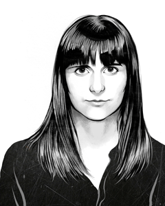 Last month, this slot featured a young emerging designer from Sofia, Bulgaria. And it is with great pleasure that we get to do exactly the same again this month! Veneta Rangelova’s foundry DearType began life as blog about typography, but it quickly evolved into a fully-fledged type business with the release of her first font Brunette — a whimsical, handmade script font. Veneta’s latest success is her recent Lifehack. She follows it up with the brand new Guess, a casual connecting script with a very attractive introductory offer — it’s climbing quickly up our Hot New Fonts list as we speak.
|
|
|
MyFonts on Facebook, Tumblr, Twitter & Pinterest
Your opinions matter to us! Join the MyFonts community on Facebook, Tumblr, Twitter and Pinterest — feel free to share your thoughts and read other people’s comments. Plus, get tips, news, interesting links, personal favorites and more from MyFonts’ staff.
|
|
|
|
|
|
|
Comments?
We’d love to hear from you! Please send any questions or comments about this newsletter to [email protected]
|
|
|
|
|
|
MyFonts Inc. 600 Unicorn Park Drive, Woburn, MA 01801, USA
MyFonts and MyFonts.com are registered service marks of MyFonts Inc. PMN Caecilia is a trademark of Monotype Imaging Inc. registered in the U.S. Patent and Trademark Office and may be registered in certain other jurisdictions. Helvetica, Avenir and Frutiger are trademarks of Monotype GmbH registered in the U.S. Patent and Trademark Office and may be registered in certain other jurisdictions. Burlingame, Kairos, Harmonia Sans, Haas and Unica are trademarks of Monotype Imaging Inc. and may be registered in certain jurisdictions. Gill Sans is a trademark of The Monotype Corporation registered in the United States Patent and Trademark Office and may be registered in certain jurisdictions. Other technologies, font names, and brand names are used for information only and remain trademarks or registered trademarks of their respective holders.
© 2016 MyFonts Inc
|
|
|
|