|
We just double-checked our archive, and what we feared is true: January editions of Rising Stars usually begin with an apology. Because each year, we sincerely hope not to irk you with so many major newsletters in quick succession. But we are committed to providing thorough, fontastic information and so we bravely step where others merely tread. Last week it was the past (the Most Popular Fonts of 2015 in case you missed it), and this week it’s back to the future: four great new display fonts, four promising new text fonts, and a designer who hopes to conquer the world of typography. Enjoy!
|
|
|
This Month’s Rising Stars
|
|
|
|
|
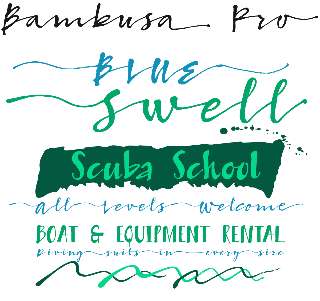
Dutch designer Hanneke Classen has a growing fanbase among the MyFonts population for her personal variations on popular genres — from all-purpose sans-serifs to playful scripts. Her latest offering Bambusa Pro, is something of a milestone for her Fontforecast foundry: it’s made the #1 position on our Hot New Fonts list. Bambusa owes its name to the bamboo pen with which its characters and swashes were originally drawn. The typical ink strokes of this traditional tool give the face an energetic appearance that is clearly different from dip pen calligraphy fonts like Classen’s Salt & Spices Pro. Like its predecessor, Bambusa offers a wide variety of long swashes connecting to the first and last letter of a sentence or name. Within words, all letters connect — both upper and lower case, and vice versa. Thanks to five different connecting spaces, the user can create phrases that look as if the pen was never lifted from the paper. Besides the connected Regular and Bold styles, Bambusa also offers the unconnected Basic, hand-lettered in the same atmosphere but more straightforward. On top of that Bambusa Pro Ornaments offers 100+ glyphs for additional design possibilities. The Bambusa package deal ends soon: on January 20, 2016.
|
|
|
|
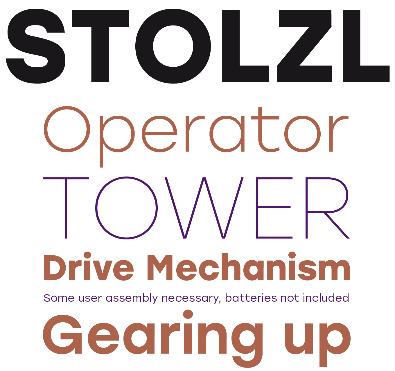
In mid-2015, British foundry The Northern Block presented Stolzl Display, a geometric font that stands out through its pert combination of square and circular shapes. Six months later, designer Mariya V. Pigoulevskaya completed Stolzl , the family’s more introvert text version. While showing the same fondness for modernist elements, the new sub-family has shed the avant-gardism and stylization of the display version. Designed to perform in a wide range of sizes, the new Stolzl was designed for maximum readability in print and on screen. Its designer (whom we interviewed two years ago) is originally from Belarus, and so it come as no surprise that Stolzl also offers a Cyrillic character set. Stolzl is on special offer until January 22, 2016.
|
|
|
|
|
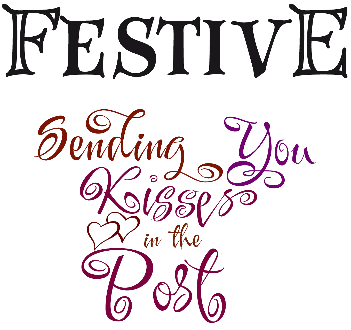
The latest script by Missouri-based master Rob Leuschke is Festive! But don’t let its name and holiday-themed posters limit your imagination… Festive will ooze joy and fun the whole year round. Referencing 1950s scripts as found in the period’s advertising and record sleeves, Festive offers a huge range of alternates and ornamented lettershapes, allowing you to lovingly imitate the custom look of those hand-lettering styles. The basic font, simply called Festive, works well for larger bodies of text, while the alternate fonts can be used to swap out individual characters. The Pro version contains all those alternates — over 1100 glyphs in all — plus OpenType programming to easily access alternates. But to those unaccustomed to OpenType technology, the Festive package offers ten fonts of alternates, each packaged with Festive Regular. It’s an exciting toolkit, completed with a font of capitals (Festive Roman) and a lovely set of icons and illustrations, called Ornaments. Festive’s introductory discount ends on January 23, 2016.
|
|
|
|
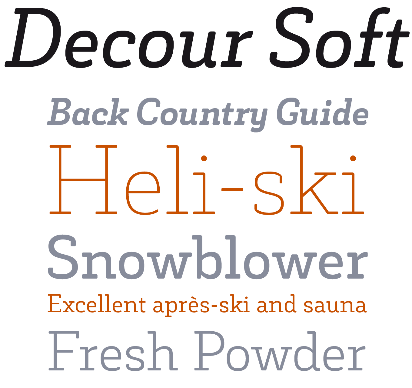
Decour Soft is a multi-purpose face of its time. Its appearance: personable. Its silhouette: rather wide, with an open and generous italic. Its serifs: sturdy slabs. Decour Soft is the rounded-edged version of the earlier Decour, even more friendly on the eye, and smoother on the screen. Its designer, Latinotype collaborator Jorge Cisterna, has retained the original Decour’s elegant features, such as a strong difference in height between upper and lower case, inspired by Art Deco designs. Decour Soft is suitable for branding and packaging, but will work equally well in book and magazine titles. Its soft detailing is likely to make it a good web font across platforms — test it directly by using MyFont’s 30-day webfont trial.
|
|
|
Text Fonts of the month
Typesetting for books, magazines or annual reports requires font families with special qualities: excellent readability, a generous range of weights with italics and small caps, multiple figure sets (lining, oldstyle, table) and ample language coverage. Here is a selection of recent, high-quality text typefaces.
|
|
|
|
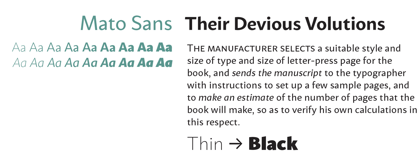
Mato Sans from Warsaw-based Maciej Włoczewski is a superbly equipped text family for demanding typography. Its basic design is a contemporary variant of the humanist sans, developed for legibility under heavy circumstances. From small sizes in footnotes to long texts in Vietnamese, from tables full of numerals to linguistically sensitive Cyrillic texts in Bulgarian, Macedonian and Serbian — Mato Sans has built-in solutions for all this and more. It comes in nine weights plus matching italics. Rich in high-end typographic features, the family offers over 2000 glyphs per font. The Mato Sans special offer ends on January 20, 2016.
|
|
|
|
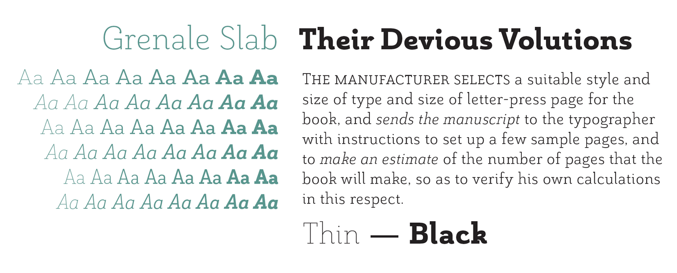
Grenale Slab is the latest addition to Jeremy Dooley’s Grenale superfamily. It is a glamorous slab with a look all its own, drawing much inspiration from Grenale’s Didone sans and its haute couture influence. The sub-family is huge — three widths, eight weights, plus matching italics: 48 styles in all. It’s a collection that offers a wide range of atmospheres — Grenale Slab’s elegant thin weights naturally lend themselves to designer journals and high-end branding; its powerful fatter weights provide your headlines with a firm and stately look. All of Grenale Slab’s weights provide a well-matched companion to its original counterparts, Grenale #2 and the original Grenale.
|
|
|
|
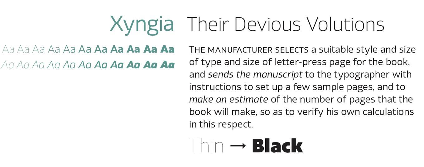
Readers of this newsletter section may sometimes feel a little pang of indecision at the sheer number of promising sans-serif text fonts being released. MyFonts can’t help it — hundreds of type designers feel there’s still room for their new take on the genre. Some take braver steps than others. Xyngia by Polish designer Roch Modrzejewski is full of ultra-modern yet subtle details, without sacrificing readability. Xyngia works well in long and short text blocks, headlines and user interfaces. It’s practical, yet has personality — making it an interesting option for logo design and brand recognition. With 11 weights and their corresponding italics, small caps, extended language support, a good range of numerals and more, Xyngia adds an interesting new color to the typographic palette.
|
|
|
|
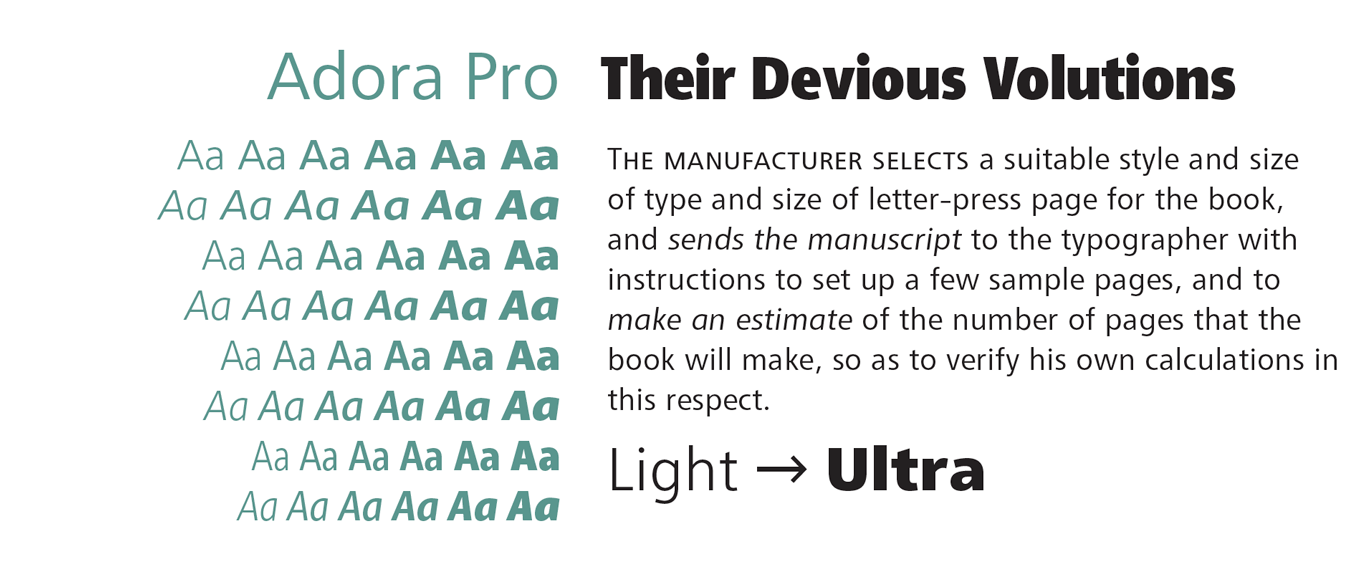
German type designer Ingo Preuss created his Adora “clan” of four sans-serif sub-families between 2010 and 2015. It’s an impressive suite: with four widths, from Normal to Compressed, and six weights plus italics for all, the total is 48 fonts, each sporting a character set of over 1100 glyphs. Not only do the fonts offer extensive language support and small caps, they also contain ligatures, superior characters, letters in round and square boxes, multiple numeral styles with matching currency symbols, and arrows. The Adora Pro clan is suitable for a wide range of uses — from editorial design and publishing to branding, way-finding and beyond. Introductory offer expires January 20, 2016.
|
|
|
Popular Designer of the Month
Each month, we add a new designer to the sidebar of popular designers on our homepage, based on their popularity with customers. This month, our new addition is Radomir Tinkov of Fontfabric.
 Radomir Tinkov is a web, graphic and type designer based in Sofia, Bulgaria. His first typefaces appeared on MyFonts back in 2009 under his own eponymously named foundry creating a wide range of styles including the contemporary sans Quanelas and the playful Maya Script.
His star is in the ascendant thanks to his contributions to several of Fontfabric’s recent successes, where he was on the teams working on the massive Intro Rust and Nexa Rust projects (those were families of 214 and 83 fonts respectively), as well as working together with Fontfabric’s founder Svet Simov on their recent Sensa family of hand drawn script fonts.
|
|
|
MyFonts on Facebook, Tumblr, Twitter & Pinterest
Your opinions matter to us! Join the MyFonts community on Facebook, Tumblr, Twitter and Pinterest — feel free to share your thoughts and read other people’s comments. Plus, get tips, news, interesting links, personal favorites and more from MyFonts’ staff.
|
|
|
|
|
|
Subscription info
It is never our intention to send unwanted e-mail.
Want to get future MyFonts newsletters sent to your inbox? Subscribe at:
MyFonts News Mailing List
|
|
|
Comments?
We’d love to hear from you! Please send any questions or comments about this newsletter to [email protected]
|
|
|
|
|
|
MyFonts Inc. 600 Unicorn Park Drive, Woburn, MA 01801, USA
MyFonts and MyFonts.com are registered service marks of MyFonts Inc. Other technologies, font names, and brand names are used for information only and remain trademarks or registered trademarks of their respective holders.
© 2016 MyFonts Inc
|
|
|
|