|
It’s been quite a year for MyFonts. We’ve introduced the new, responsive, visual homepage. We’ve rewritten the “More Fonts Like This” feature using artificial intelligence techniques; we’ve built in new ways of favoriting fonts and designers. We released FontScout for iPad. We’ve improved our quality control, carefully selecting and coaching new type foundries.
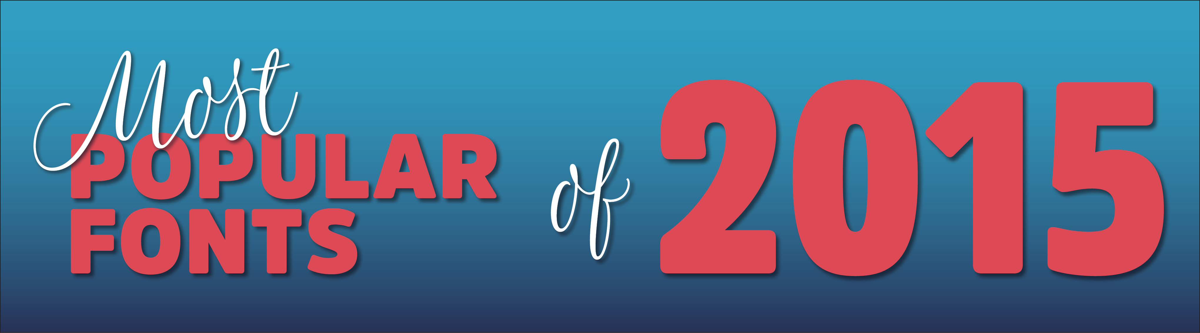
The year has also been quite remarkable for new fonts. Here is our yearly overview of most popular releases. As usual we have waited until the very last moment to put the finishing touches to this list, giving the faces released during the last months of the year a fair chance to make the cut. Unlike most other Best-of-the-Year lists, this one is based on sales. Not simply the total sales volume across the year, as that would give the oldest font families an unfair advantage. We’ve looked at average sales over the year and during the successful introduction period; we made sure popular genres are fairly represented; we included no more than one font family from each foundry.
There you go: a type hit parade like no other. Thanks for helping us put it together.
|
|
|
|
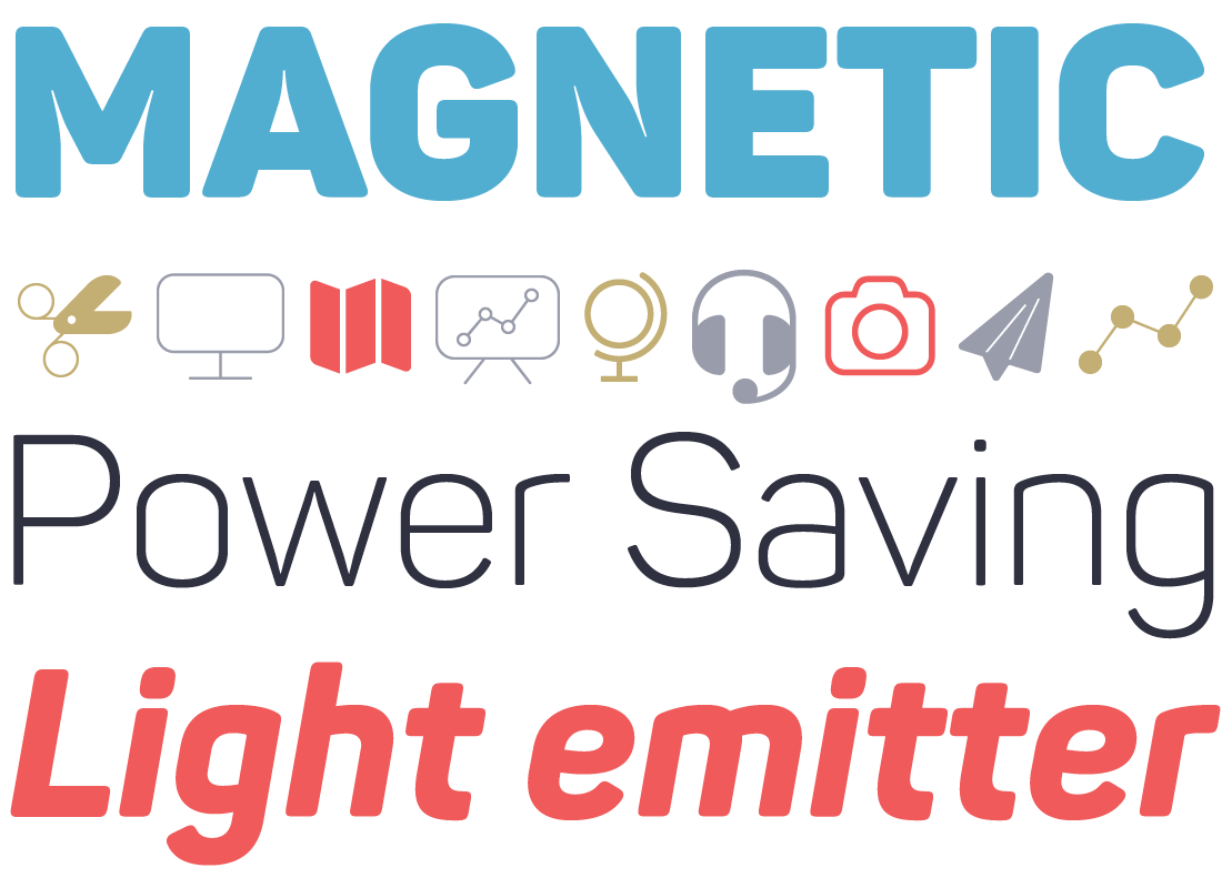
In a short timespan, Bulgaria’s Fontfabric has grown from a one-man effort into a productive group venture. Their popular success has been impressive this past year, with Panton their most successful new design. The burly sans-serif explores no less than FIVE well-known typographic phenomena within one typeface: The squarish sans basic shape with straight sides, plus the lack of spurs where curves meet stems, plus rounded corners, plus exaggerated ink traps in fat uppercase characters (like M and N in MAGNETIC, above) plus a huge collection of icons. An eclectic yet happy exercise, resulting in a large family characterized by broad usability and excellent performance in print and web design.
|
|
|
 |
|
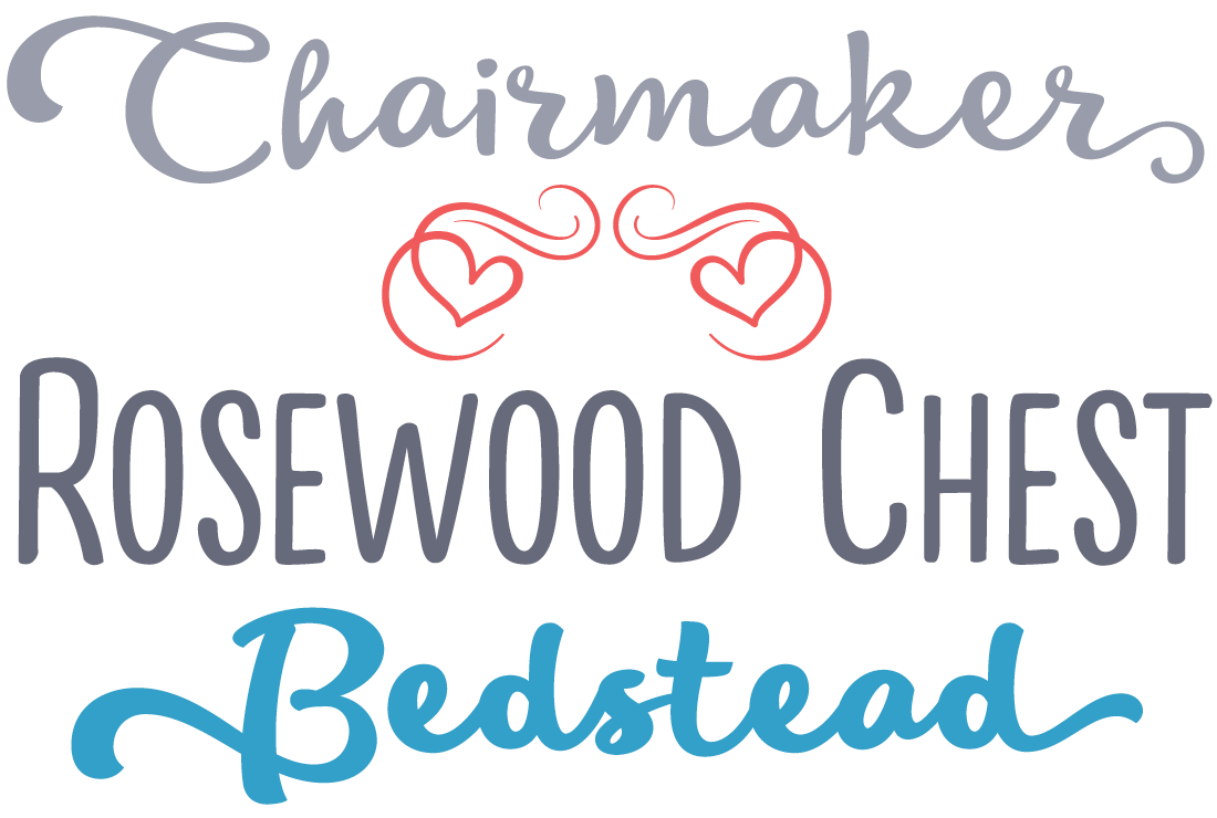
Since he joined MyFonts in 2012, Berlin-based designer René Bieder has made our list of the year’s favorite fonts every single year — this is his fourth time in a row. It’s all the more remarkable because with Mirador he left his comfort zone of sturdy, low-contrast grotesques and slabs to make something more unusual and mature. His novel choice of genre — a highly contrasted serif family — resulted in a classy typeface of lavishly wide proportions. Suited for headlines as well as short body text, this new family was the year’s most successful of its kind. Its “Latin” (i.e. triangular) serifs make for a striking impression, especially in the heavier styles — the wedge shape is repeated in other details like the ear on the ‘g’ and the terminal on the ‘y’ — in this regard, Mirador might pass as an unrestrained descendant of Aldo Novarese’s ITC Fenice™ type family. Ten finely graded weights plus tasty italics with cursive forms encourage a wide range of applications. Get your hands on the free Demo version and test-drive two weights (with a reduced character set).
|
|
|
|
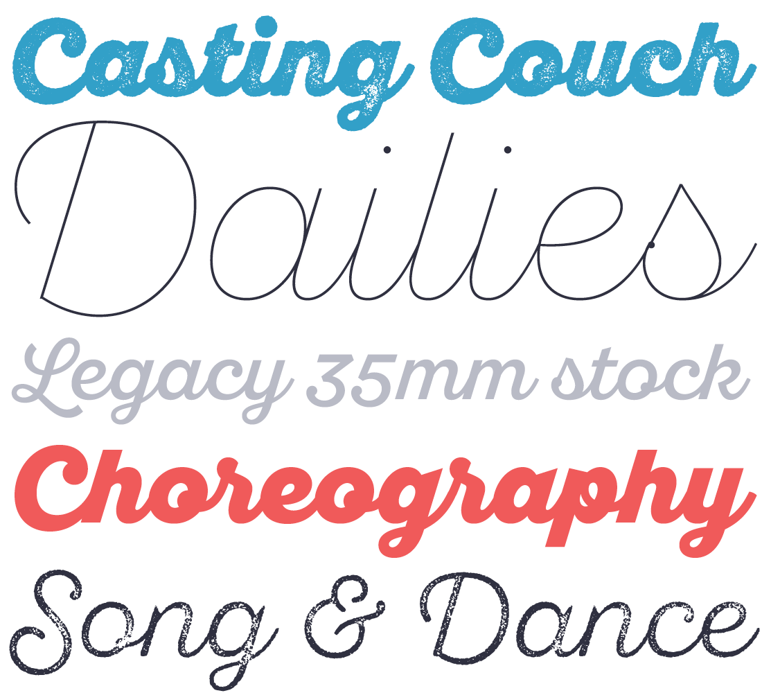
Many foundries today present a “clean” version of a family or type suite, then revisit their design a few months later making a textured version. Designer Ryan Martinson of Yellow Design Studio did it differently this time: he launched his complete Sant’Elia Script family in one big bang, offering a huge family of clean and weathered varieties at a remarkably low price. He produced his robust and modern script in six weights, from Line (hairline) to Black, then gave each weight the “rough” treatment at which he is a master — offering three different distress levels that can be mixed for customization. An alternate version with more contrast and angled strokes was added for some nervous energy. The family has quite a collection of OpenType features, including a set of swash forms and alternates, ligatures, old style numerals, and more. The result is a 44-style family that allows for a high degree of stylistic control. Try Sant’Elia Rough Line, Line Two and Line Three for free!
|
|
|
|
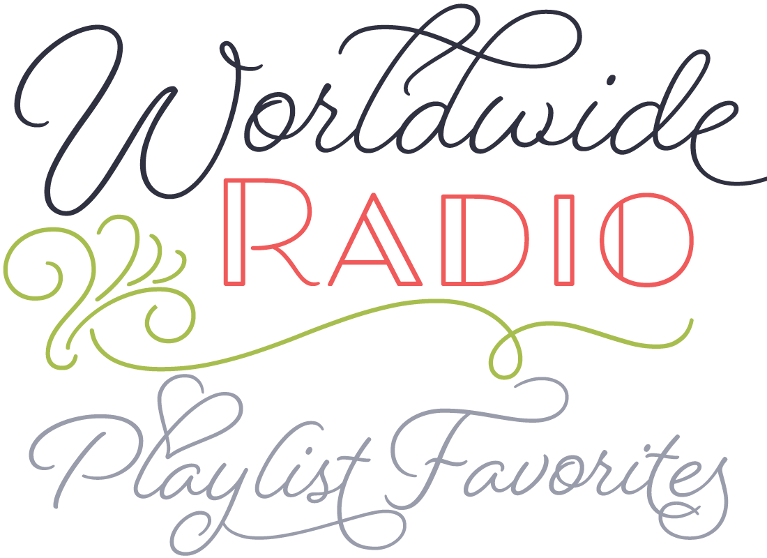
A seasoned lettering artist, Laura Worthington knows that in calligraphy it’s the tool that makes the style. For her Beloved Script she recreated the baroque spirit of Roundhand scripts, known for the modulation of a rotating pointed pen, into the ballpoint’s monolinear stroke. We think that’s like modernizing the rococo plot of a classic English play, by transposing it to romantic comedy in a contemporary urban setting. While many digital script faces impose “on or off” rules about character connections, Beloved Script embodies a more casual and natural state of handwriting — the semi-connected script. Out of the box, the font is lively but casual. But behind the scenes 3000+ glyphs are waiting, ready to help the designer create beautiful and decorative spectacles. The typographic palette is further enhanced by Beloved Sans, a set of caps and small caps and a compatible set of Ornaments. Has it ever been such a pleasure to create powerful headlines and unique word marks?
|
|
|
|
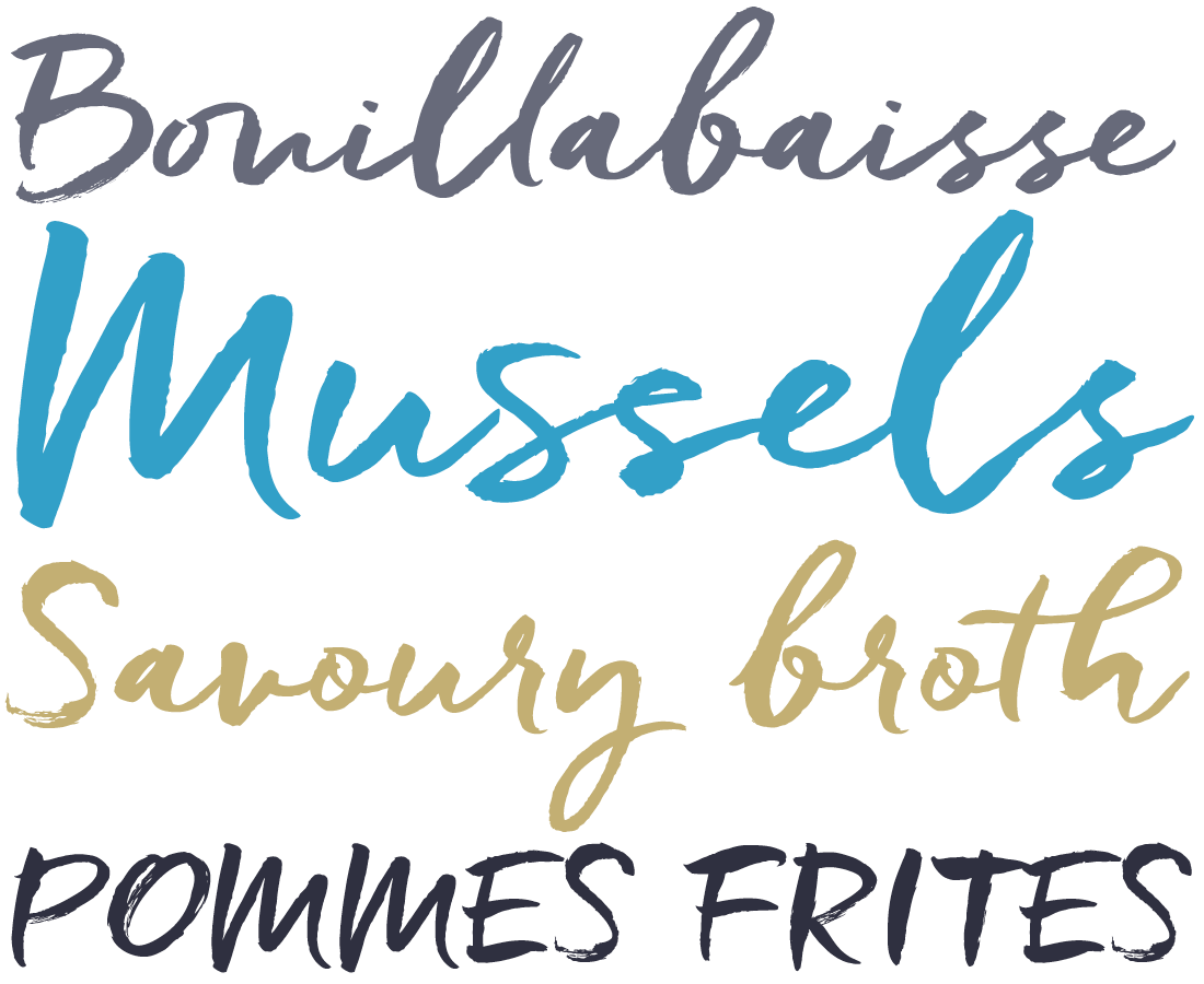
Laura Condouris from Baltimore describes herself as “a calligrapher, illustrator … and occasional comedienne.” The name of her foundry certainly conveys her comedic talent — Trial By Cupcakes is equal parts silly and brilliant. Similarly, her fonts combine whimsy and accuracy, spontaneous energy and typographic savvy. After her delicate Quickpen, featured here exactly a year ago, the new Freeland is proof that Condouris masters quite a broad range of informal scripts, and knows how to make them into flexible fonts. A casual brush typeface with a rich, inky texture, Freeland is modern, bold, and lively. It has, says the designer, “just a bit of a masculine, edgy vibe.” Its realistic hand-lettered look found a broad group of admirers and users this past year.
|
|
|
|
Stawix is an ambitious young foundry based in Bangkok, Thailand. Its founder Stawix Ruecha likes giving a personal twist to traditional genres, and Amsi Pro has been their biggest success so far. There has been no lack of historically inspired sans serif families this past year, but Amsi Pro was a sans with a difference. Its dense shapes were inspired by the simple yet expressive Plakatstil display faces of early 20th-century German posters. The Amsi family is an ambitious interpretation of the historical model, extrapolating a dark, condensed display style into a huge family. With three widths and eight weights, from Thin to Heavy, and with Obliques, it totals 48 styles. The Narrow and Condensed styles are good choices for compact headlines; the middle weights of both the normal and Narrow versions will work well in longer texts.
|
|
|
|
Sabrina Mariela Lopez of Buenos Aires takes her time for each release: she publishes about one lavish script or display family each year. Her 2015 offering, Blend, was a huge success — and deservedly so. The name refers to the technique in coffee-making to combine different beans to get an optimally balanced taste. Blend is a suite that does just that, although in this case each typographic flavor can also be enjoyed separately. Among the 21 styles are a bouncing informal script, programmed with plenty of OpenType wizardry; a nicely drawn set of condensed romans, and two subfamilies of condensed caps, both with stackable Inlines. The family is completed with playful Dingbats and Ornaments. The collection takes its cues from the visual universe of bakeries and coffeeshops, but can be used for projects as varied as branding, children’s books, wedding invitations, labels, and more.
|
|
|
|
One of the most eagerly anticipated releases of 2015 was the Neue Haas Unica™ type family: the typeface had been unavailable for decades. Designed in the late 1970s for Haas Type Foundry in Switzerland, the original Haas Unica® was a masterpiece of Swiss precision. Three designers known as Team ’77 combined the best of the Helvetica® and Univers® type families, both owned by Haas at the time, in an attempt to create the ultimate sans-serif. Released in 1980, the family was only available as a proprietary typeface for photo-typesetting — and vanished into obscurity after the advent of PostScript. When Monotype’s Dan Rhatigan discovered the original film masters for Unica in late 2012 (read the full story on Wired) staff designer Toshi Omagari set to work to develop Neue Haas Unica. He gave it a fresh, digital facelift with more weights, more languages and more letters to meet the needs of today’s designers. And for the first time in its life, Haas Unica became a bestseller.
|
|
|
|
Chile’s Latinotype is releasing one huge group project after another. Revista (Spanish for “magazine”) was their most successful type system of the past year. Its three designers have put together a family, or suite, that covers a range of functions and atmospheres designed to grace fashionable editorial and branding projects. The package consists of a Didone uppercase and small caps family of four weights plus italics, a stencil version of the same set, and an Inline Black weight. Revista also contains a Script subfamily that comes in five weights, from a monolinear Thin to whimsical contrast in Black, with many ligatures and alternates. For more instructions on how to use the script, see the font page. Finally, the suite includes two sets of dingbats, varying from zodiac signs symbols to fashion and technology symbols, and a font of Ornaments in three weights.
|
|
|
|
DearType is a brand new microfoundry run by an energetic young designer from Bulgaria named Veneta Rangelova. After a modest start with three informal display fonts, she released the more ambitious Lifehack, a family in the popular genre we’ve called “shabby chic suite”. Its casual script has a strong and amiable personality; it comes in three weights plus a more dynamic “Italic” (read: oblique) variety. The scripts combine perfectly with the narrow hand-drawn Sans; there is also a simpler (and cheaper) Basic version — unconnected and with a less ambitious glyph set. The Goodies set offers several dozen frames and ornaments. The Lifehack suite comes with plenty of OpenType features, such as swashes, stylistic alternates and initial/terminal forms allowing users to give a custom flair to their designs.
|
|
|
|
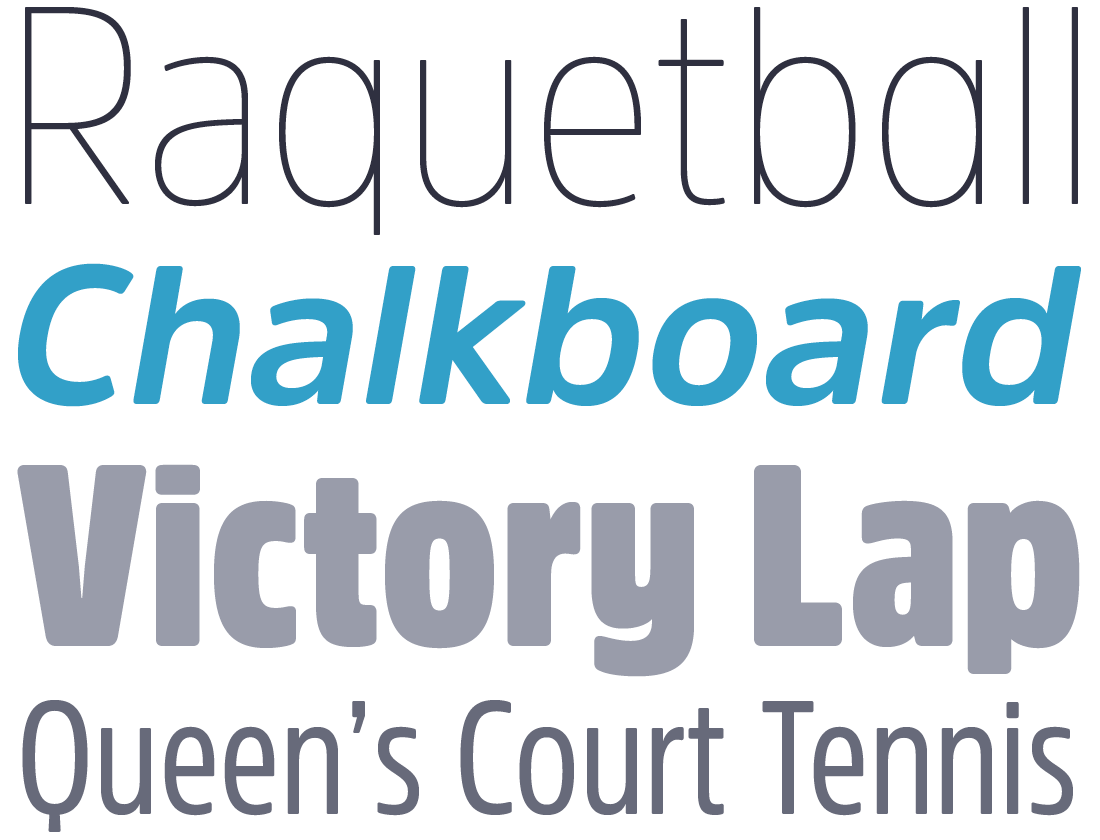
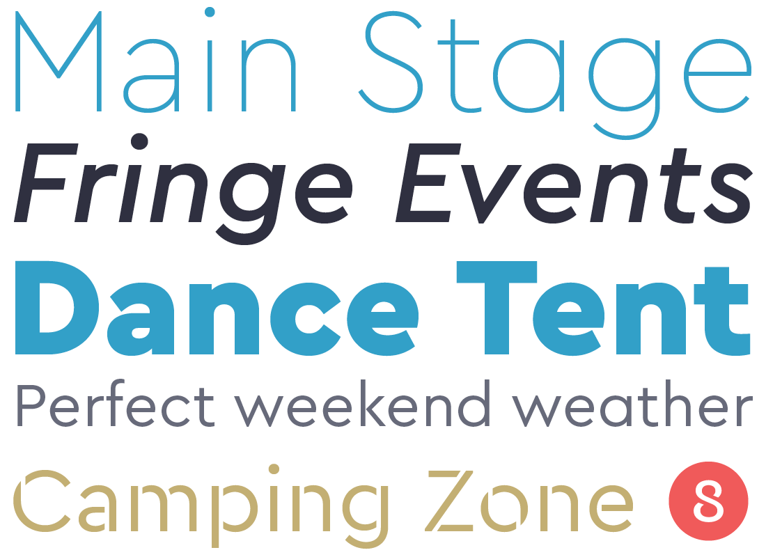
Jakob Runge is one of several talented new voices from Germany, his delightful oldstyle FF Franziska winning him three major awards and becoming a deserved bestseller. Cera is a very different bunch of curves. Indebted to geometric classics such as the Futura® type family, it takes the modernist model into the postmodern age with technical savvy and a healthy dose of human warmth. This pan-European family has impressive language support: the designer has paid attention to differences in how characters and accents are used in different countries, adding localized diacritics and letter shapes. Cera was released in early 2015 under Runge’s own one-man label, but got a new start after he launched the new TypeMates foundry with kindred spirit Nils Thomsen towards the end of the year. There’s also a nicely made stencil version, sold as a separate typeface: Cera Stencil, a useful addition for striking headlines.
|
|
|
|
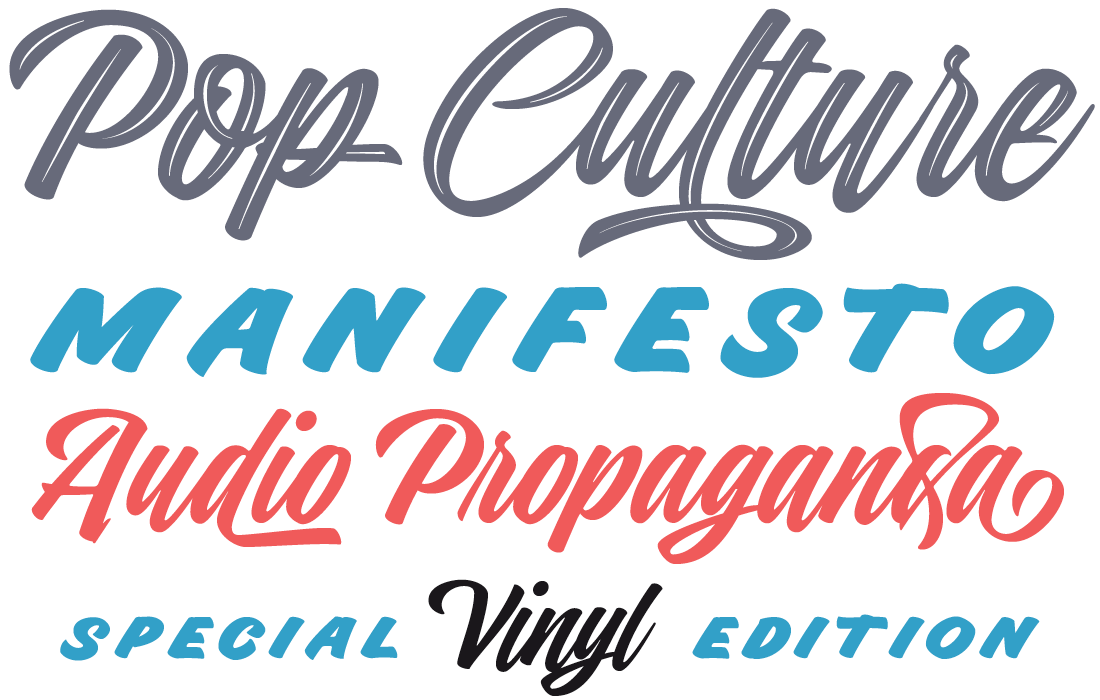
Indie from Lián Types was one of 2015’s most original script families. Based on a well-known pointed-brush style, it offers some features that few scripts have. To designer Maximiliano Sproviero — a long-time fan of sign painting and hand lettering — brush scripts have become the epitome of urban hipster culture, representing the cult of the Now. He created Indie from his own hand-lettering. Besides its basic style, Indie offers a couple more versions to create sophisticated headlines and logos: Indie Shade and Indie Inline are stand-alone variations, while Indie Shade Solo offers the possibility to create shadow effects in a second color. All share the exact same glyph sets and metrics for carefree layering. For a more casual look, activate the contextual and the decorative ligatures. A very fine toolkit indeed.
|
|
|
|
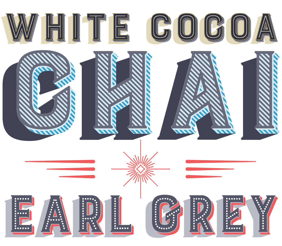
Californian designer Kimmy Kirkwood is good at picking up trends and adding her own personal touch. Her successful Burford typeface is a case in point. Based on sketches made while traveling through Europe, Burford is a layerable family whose individual fonts can be stacked to create multi-colored headlines and logos. The complete Burford Pro package comes with 18 layering fonts, including base layers, top and bottom layers for shadows, decoration and 3D effects, and two sets of graphic elements. For users unable to obtain the layering effect by stacking frames in specialized design applications, there’s the Burford Basic package. The Burford Extras sets offer banners, borders, corners, arrows, line breaks, catchwords, anchors and more — around 100 elements per set. Users craving a worn-out look are invited to check out the weathered environment of the Burford Rustic family.
|
|
|
 |
|
Quotes was one of the the year’s most successful releases from Argentina’s Sudtipos. Calligraphed by Yani Arabena, the face’s inspiration is the thrill of handling the pointed brush, the fascination for spontaneous messages and gestures. The typeface’s name refers to the kind of texts it was designed to express — inspirational phrases and quotes. Expertly digitized and produced by Guille Vizzari and Alejandro Paul, Quotes comes in two complementing handwriting styles: Script and Caps, investing the visualization of the spoken word with variations in rhythm and energy. Script, the more carefree and spontaneous family member, offers a great variety of alternates in both its lowercase and uppercase letters, adding ligatures and alternates to shape the beginnings and endings of words and phrases. Caps is an uppercase set offering a huge amount of alternate glyphs, ligatures and connectors to enrich different types of messages. Quotes, made to express feelings — or sell beer if you’re so inclined.
|
|
|
|
Recently, the Indian Type Foundry has broadened its scope by taking up collaborations with designers outside India. Weissenhof Grotesk was the most successful result to date of these new ambitions. Designed by Stefanie Schwarz and Dirk Wachowiak from Stuttgart, Germany, the typeface is inspired by that city’s housing project of the same name, a 1927 modernist classic. Architectural features such as curves connecting to straight segments inspired the typeface’s letterforms. Weissenhof Grotesk features monolinear strokes and a well-balanced range of stroke thicknesses — four weights with matching italics. Among the huge array of modernist sans-serif families published the past year, Weissenhof is one of the most striking designs, and one of the most likely to build up a fan base.
|
|
|
|
|
|
Comments?
We’d love to hear from you! Please send any questions or comments about this newsletter to [email protected]
|
|
|
|
|
|
MyFonts Inc. 600 Unicorn Park Drive, Woburn, MA 01801, USA
MyFonts and MyFonts.com are registered service marks of MyFonts Inc. ITC Fenice is a trademark of Monotype ITC Inc. and may be registered in certain jurisdictions. Helvetica and Univers are trademarks of Monotype GmbH registered in the U.S. Patent and Trademark Office and may be registered in certain other jurisdictions. Haas and Unica are trademarks of Monotype Imaging Inc. and may be registered in certain jurisdictions. Futura is a registered Trademark of Bauer Types. Other technologies, font names, and brand names are used for information only and remain trademarks or registered trademarks of their respective holders.
© 2016 MyFonts Inc
|
|
|
|