
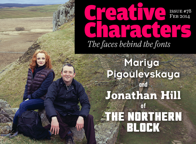
Photo by Gareth Jones
They’re based in Newcastle-upon-Tyne, a city that, like Liverpool and Manchester, was a one-time center of the industrial revolution. Jonathan Hill is from Sheffield, where he worked as a graphic designer for the thriving local music industry. After several years in a London studio he moved back to North East England to set up his own logo and type design studio. Mariya Pigoulevskaya came to the region from Belarus in 2006 to study Art and Design and joined Jonathan’s studio after graduation. Their company’s type library is a fast-growing and increasingly popular collection of type families — many of them clean, modern sans serifs with an industrial or tech touch. Getting better all the time: here is The Northern Block.
|
Your foundry name is a wordplay on “the Eastern Bloc” — the old name for the Soviet-allied countries behind the iron curtain. I gather that for The Northern Block to be located in the North of England and not in London, for instance, is important to you. Yes, you’re right about our name: it was derived from what was known as “the Eastern Bloc”. I was strongly influenced by how The Designers Republic, who are from my hometown of Sheffield, used wit and irony in their marketing to separate their ideas from the London design scene. One of their best known phrases was “North Of Nowhere” which heavily influenced my decision making process. I guess I was trying to create a name that best represented who I was, what I did and where I did it, but in a less satirical way that was easy for people to remember. Did you go to an art school or design college? Did they teach you anything about type design there? I originally trained as a painter and decorator because my grades in maths and English were below the entry requirements for most design colleges. My original passion was to be a footballer, and this took me away from my school studies and exam work although my close friends would say that I draw a better picture than kick a football. Shortly after becoming a qualified decorator I realized my skills would be better placed elsewhere, and with college entry requirements becoming more flexible I decided to take a place at Batley School of Art in West Yorkshire. This was a vibrant place in the heart of industrial Yorkshire with its heritage of wool and textile mills. The general art and design course had a strong bias towards surface pattern, but I was drawn towards graphics and the interior skills I’d developed as a painter and decorator. After a year in general art and design, my tutors directed me towards a more specific path and I was accepted on a course to study interior design, were I perfected my draftsmanship and perspective drawing to a professional level. This led me to Newcastle College of Art & Design, where my relationship with the tutors was very different as they had initially declined my application to the course, and they viewed my work as rather orthodox. This added tension provided that magic spark that would push me to a much higher level. The program was very theoretical, and often bordered on conceptual art rather than interior design. This left-field approach made for an exciting journey and gave me a very open minded view to the industry. What I gained from Newcastle College, although nothing specifically related to type design, probably helped steer me in the path towards The Northern Block. Were you focused on type design right from the start, or did you work as a graphic designer as well? What kind of clients did you have? Helvetica, Futura and Akzidenz Grotesk were fonts that interested me, but that was as far as it went. I only recognized them as a product to enhance my interior or graphic design work. I initially pursued a career in interiors as this was my main specialism, but during the recession in the mid ’90s there was a shortage of positions for interior designers, so I turned my attentions towards graphics and advertising. Working from my bedroom in my father’s house on a Mac 8100 (beige) and a copy of Adobe design collection for company, I managed to find freelance design contracts with Sheffield’s music establishment. This was when I discovered The Designers Republic (TDR) and the work of Ian Anderson. I applied to work for their studio on various occasions, but did not get an invite — which in hindsight was understandable; my levels of experience and skill were not up to their standards. My breakthrough came with a job offer at a company called Mainartery, a London-based studio working mainly for clients in the music industry. They helped to refine my typographic skills which then led to a more professional interest in fonts. Their projects covered a wide range of genres within music packaging from pop to rock, blues to jazz and dance to hip hop. Mainartery had good relationships with boutique type designers like Rian Hughes (Device Fonts), which helped me improve my typographic awareness and produce more cohesive designs. The next source of influence came from a duo called Identikal. Their work was bold and exciting like TDR, but they also created their own fonts. This was the first time I began to realize how I could design individual letters in a logotype to create something unique. I experimented on some CD covers, but due to my inexperience and the fierce schedules imposed by clients like Universal Music and EMI Records, they never saw the light of day.
|
Acrom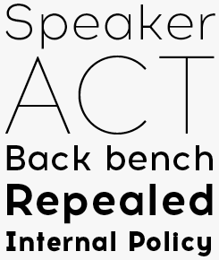
The Northern Block’s most recent release (currently respectably positioned in our Hot New Fonts list) is Pigoulevskaya’s Acrom, a geometric, modernist typeface that is more naturalist than mechanical. There’s a subtle variance to the stroke width that lends the letters a humanist flavor which makes the typeface feel very contemporary. Unobtrusive stylistic detailing contributes towards the face’s individuality, while not compromising its overall legibility and functional purpose. Corbert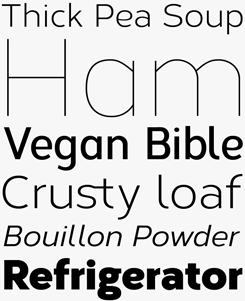
Corbert — one of last year’s Most Popular Fonts — presents a softer, more open take on the geometrically-constructed alphabet. It owes its friendly character in part to several alternate letters, such as the cursive ‘e’, but also to its rather wide form and an attractively simple and lucid construction. Corbert Condensed (used for the third line of our sample, above) is the companion family for tighter text or headline settings. |
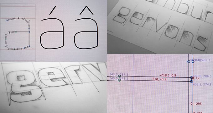
From pencil sketches to digital precision: the design process of a new design based on the Kuro template.
|
After you decided it could be a neat idea to design typefaces for retail, did you shop around to find a foundry for your work? Or did you immediately decide to start your own company? After leaving Mainartery, I headed back to Sheffield. I had no desire to return to London, but I was missing the work I did there so I decided to set up a graphic design studio. This was a humbling experience. I faced some harsh criticism and home truths about myself, my business idea and my future. It was clear that a conventional graphic design business modeled on my own experiences was not the answer, especially in the light of The Designers Republic closing their studio. Following feedback from various people in the industry, I decided to look outside of design at other areas of the industry including video gaming, software and computer programming. I took on a business mentor who became pivotal in my future decision-making and helped me realize that I have some great skills and ideas which could be developed into a profit-making business. The skills of creating logotypes were married together with business expertise and from this point forward, The Northern Block was founded. At that point, how did you go about creating your font collection? Had you collected a hard disk full of ideas for typefaces? Prior to starting The Northern Block, I was working as a freelance designer on various projects in the Sheffield region. One job was to create a promotional campaign for a local graphic design studio, and I pitched a display typeface as part of the campaign. Again, the typeface was omitted due to budget and time constraints, but this time I learnt from my earlier experiences and factored this into my plan so that the typeface could become part of my own self promotional work. This typeface later became known as StealWerks, The Northern Block’s first font. BlockOut was the next font to be developed and was initially used to create The Northern Block identity. At this stage, I was designing fonts for the purpose of brand creation and so I could communicate my products to my business mentor. The process of distributing and selling fonts on the internet would be a new experience to my advisors here in the UK, so it was key that they could understand my business model. As Identikal was one of my original influences, I decided to approach them first about selling and distributing my early font designs. They were very positive and full of expert advice on how to design and sell fonts. Although they didn’t offer me a distribution agreement, their feedback helped me to establish the basic ground rules for my early font collections. Many of the early fonts you submitted to MyFonts were rather minimalist: sans-serif display fonts that were often constructed from straight lines only. In the course of several years you evolved to a more sophisticated idiom of smoother and more flowing forms. Had you planned it that way — or, in other words, have you surprised yourself? Those early designs were my sketchbook ideas and concepts, published without much experience or training. The fonts were raw, mechanical and almost machine-like — or as the experts would say, without an understanding of the rules. I have accepted this criticism as part of my apprenticeship as a type designer, as I develop and perfect my craft in the view of others rather than behind the scenes. Coming from a background of team sports this approach better suited my more social personality. It also gave me the confidence to question, probe and take criticism from some of the leading experts in type design. This learning program was an organic process which has evolved along with my development as a type designer. I have surprised myself in terms of how much more sophisticated the fonts are, but also how in-tune they are with current market trends and technologies. I would say that this is a result of asking the right questions to the right people, in the right industries. |
Nauman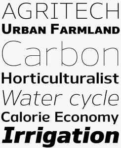
Designed with screen typography in mind, Nauman is a clean, no-frills geometric sans serif typeface with a personable, open feel. Its high x-height recalls Verdana, and like Verdana, Nauman will also be equally at home in plenty of other design uses. There’s a lot on offer here: ten weights with italics; over 800 glyphs in each font; real small caps; multiple numeral styles; and several OpenType alternative characters. All in all, a powerful and versatile toolkit for text and display. Hapna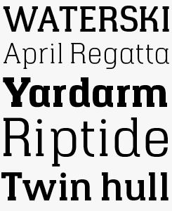
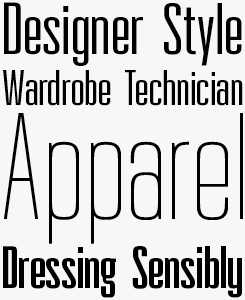
Hapna is an exploratory diversion from The Northern Block’s focus on ultra clean sans serif typefaces. It successfully marries slab serifs to geometrically derived forms, creating a distinctive and eye-catching alternative while retaining the advantages of each genre — the wide, open construction of a modernist face combined with the punchy authority of nineteenth-century advertising display type. The family is composed of six weights and will be well suited to posters, packaging and website mastheads and page titles. |
|
Mariya, you’re originally from Belarus. What prompted you to move to Northern England? My parents encouraged me to learn languages from a very young age, and they ensured that I got into a school with a variety of specialized linguistic subjects. There, I learned English and received an insight into British culture, history and traditions. When the time came to go to university, I had an opportunity to continue language studies and become a teacher, but my passions led me elsewhere. I realized I wanted to be a part of the creative community. In 2005, I was accepted by the Belarus Arts Academy. A year later I got an opportunity to visit the UK. I was inspired by the North East’s industrial heritage and decided to continue my studies in the UK. In eight years living here, I have discovered England for myself and found a place within the community. I also pursued my interests in art and design by completing the BA and MA of Arts at Teesside University. And how did you end up a type designer in the Northern Block? I was introduced to Jonathan by chance. During my final MA degree in Future Design at the university, I met a lot of talented people. One of them, a graphic designer who now works in Singapore, mentioned that his close friend was looking for a designer with knowledge of Cyrillic. I could not miss this golden opportunity. My understanding of type at that time was limited, although I had some experience of producing custom fonts for personal and student illustration projects. After meeting Jonathan in person, he gave me an opportunity to be a part of The Northern Block and share his experience and knowledge as an apprentice within the foundry. For a year, I was tutored in type design resulting in my first font release Baufra. Within the Northern Block type library, several families that you designed (like Acrom, Neusa, and Kizo) stand out because of their references to 20th-century typographic styles. Do you have a special interest in design history? I am interested not just in design history, but in art and cultural history in general, in typography, art, architecture, product design, graphic design, illustration and photography. It is fascinating for me to understand how and why certain cultural movements evolved, and why some of them had such a profound and long-lasting impact on the world as we know it today. When talking about design history and typeface development, I would say my interest lies in modernist and post-modernist culture. I am a big fan of Cubism, Avant-Garde, Minimalism and the Memphis Group. They have a profound influence on my work. As a result, I try to combine two conflicting pursuits in my work: functionalism and individuality. I must honestly admit, however, that my first year as a type designer at The Northern Block was more about acquiring the necessary knowledge and experience for realizing my goals. Playful handwriting faces such as the recent Qiber and and Velik are a new thing for your foundry. Can we expect more in this vein? Qiber and Velik can be characterized as naive expressionist typefaces. They reflect another side of my character, which lives very comfortably alongside my love for rational geometry. Working on such playful fonts in parallel with sans serifs feeds my imagination. It has a very close relationship with craftsmanship, which enriches my understanding of the typographic processes and techniques. Velik and Qiber are my first steps towards an exploration of this genre. |
Neusa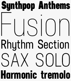
Neusa is a condensed sans serif face with a DIN-like rational simplicity. Pigoulevskaya took as her inspiration the coverage by “Life” magazine of the 1969 Apollo space program, and there is certainly an imaginative, evocative note to the letterforms that enlivens the typeface, and ensures it doesn’t feel too sterile or artificial. Qiber & Velik
Pigoulevskaya’s Qiber & Velik are the first two of what should become a growing collection of playful script faces. Nonchalantly drawn, these fonts combine the fun and whimsical approach of informal handwriting with the thorough font production savvy that characterizes the designer’s geometric sans serif fonts. |
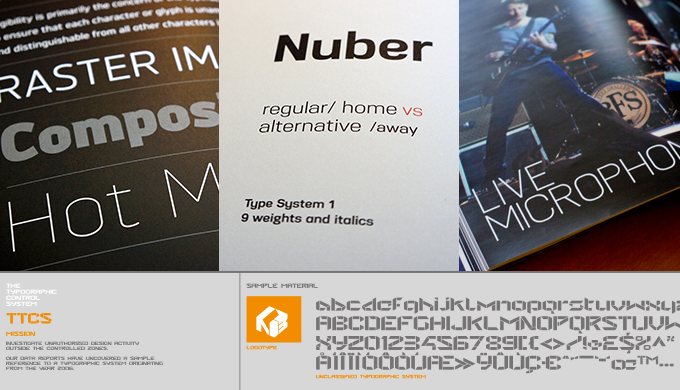
Top row, left to right: Brokman featured in Slanted’s Type Yearbook; a print ad for Nuber; Knul used in AKG branding materials. Bottom row: Promotional material for Hill’s first full typeface, Stealwerks.
|
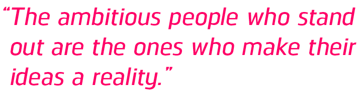
Back to Jonathan: You have developed a particular feel for modernist, industrial-flavored sans-serif typefaces. What is it about clean sans-serifs that is so attractive? Modernism was widely taught on the design courses, especially in interiors and architecture, and exposure to the working practices of Le Corbusier and Mies van der Rohe had a major impact on my design methodology. Geometry is also a key part of my work, which probably goes back to seeing how my father worked precisely with different metals as an engineer. Logically the combination of both ideals have directed me towards the creation of clean, geometric style fonts. You have been incredibly productive in the past few years — more than 80 families in five years. I’ve heard other type designers say they could never work so fast, and that spending more time on a typeface allows one to go deeper. What’s your opinion on that? As a designer, I worked on each font to the very edge of my capabilities. If I met the edge within one week, one month or one year then that was just down to the level of my ability and understanding of type design. In the beginning, working alone with only a basic knowledge of type design, the limit of my ability was not so far away. This simple, almost naive approach meant I worked very productively whilst collating feedback on each font to help deepen my understanding of type design. As my knowledge and skill became stronger, then the program for each font grew longer. What is your most ambitious plan you have not yet realized? A good percentage of people I meet who work in design have big ideas and dreams. The ones that stand out are those who make their ideas a reality. The Northern Block was an idea that somehow has been turned into a reality. It is easy to be praised for the individual effort, but that would not be telling an honest story. It has taken me seven years to get to the craftsmanship level where the products meet the brand’s promise. From here the ambitions are more than just my own — they are Mariya’s, our graphic designer Gareth’s, the type design apprentices Jason and Rebecca, and a host of talented people who collaborate with The Northern Block. The most ambitious plan may not have yet been realized, but if it does comes along, The Northern Block as a collective will better understand how to make it a reality. That sounds like a promising perspective. Thanks to you both! |
Norpeth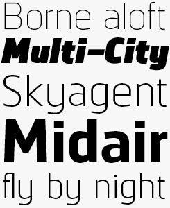
Jonathan Hill’s Norpeth is a no-frills sans-serif with humanist undertones. The characters’ proportions have a strong lateral dynamic that makes the typeface ideal for on-screen use. Optical balance is achieved with consistent, subtle stroke contrasts throughout each weight. The family comes in nine weights plus italics, with over 570 characters per font, manually edited kerning and OpenType features. While the middle weights work well in long-form texts even at small sizes, the lightest and darkest weights are striking display faces to create eye-catching headlines. |
Save for laterSave this article to Instapaper for offline reading, or with better formatting for small screens. Full disclosure: Using the link we provide will allow us a degree of analytic insight when we come to decide whether to develop this feature further. By all means use your own bookmarklets or other preferred methods for saving content. We’re hoping to be able to offer better support for other read later services in the future, but for now Instapaper does the best job at parsing our layout. |

|
Who would you interview?Creative Characters is the MyFonts newsletter dedicated to people behind the fonts. Each month, we interview a notable personality from the type world. And we would like you, the reader, to have your say. Which creative character would you interview if you had the chance? And what would you ask them? Let us know, and your choice may end up in a future edition of this newsletter! Just send an email with your ideas to [email protected]. In the past, we’ve interviewed the likes of Michael Doret, Laura Worthington, Jonathan Barnbrook, Rob Leuschke, David Berlow, Ronna Penner and Jos Buivenga. If you’re curious to know which other type designers we’ve already interviewed as part of past Creative Characters newsletters, have a look at the archive. |
ColophonThis newsletter was edited by Jan Middendorp and designed using Nick Sherman’s original template, with specimens by Anthony Noel. The Creative Characters nameplate is set in Amplitude and Farnham; the intro image features Acrom, Regan Slab, Neusa and Tabia; the pull-quote is set in Norpeth; and the large question mark is in Farnham. |
Comments?We’d love to hear from you! Please send any questions or comments about this newsletter to [email protected] |
Subscription info
Had enough? Unsubscribe immediately via this link: Want to get future MyFonts newsletters sent to your inbox? Subscribe at: |
Newsletter archivesKnow someone who would be interested in this? Want to see past issues? All MyFonts newsletters (including this one) are available to view online here. |