
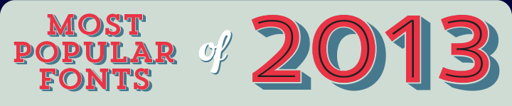
Belated best wishes for 2014 from the MyFonts team! Convinced, as usual, that the year ain’t over till its over, we waited longer than most other list-makers to compile our overview of the Fonts of 2013. This is a list that you, as our customers, have voted for — with your wallet. It is a font hit parade that is based on average sales (revenue, not number of copies sold), with some correction for what we sometimes call the Introduction Sales Peak, and making sure that popular genres are fairly represented. There you go: your annual barometer of trends in type. Thanks for helping us put it together.
Trend
Designer Daniel Hernández of Latinotype is an eager trendwatcher. As stated when we interviewed him for our Creative Characters series, “I really want to know what fonts people are using, … what is successful and what isn’t.” Designed in collaboration with Paula Nazal Selaive, the Trend family is an eloquent response to one microtrend Hernández has picked up — the latest craze of chromatic fonts, using stacked text frames to create dynamic multi-colored headlines with three-dimensional effects. The Trend family may be capitalizing on current fashions, but it does so in an inspired and aesthetically pleasing way. The icing on the cake? A lovely Ornaments font with elegant curlicues, icons and English key words.
Quadon
Based in Berlin, Germany, Rene Bieder is one the most successful one-man type foundries in recent years. His RBNo2.1 was one of our Fonts of 2012, and this year Bieder has struck gold again with Quadon. With nine weights and matching italics, Quadon is a modern, clear and flexible interpretation of the slab-serif model. The open squarish shapes and large x-height keep the font legible in small sizes, while short descenders support the compact powerhouse center. Its wide range of typographic features and alternative glyphs allow for a fair degree of personalization. From the sensitive-but-sharp thinner weights to the punchy heavy weights, Quadon is well-suited for a wide range of tasks.
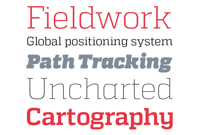
Cantoni
Hurme Geometric Sans 4
New to MyFonts, Finnish designer Toni Hurme came up with an ambitious first type project: his Hurme Geometric Sans suite consists of four complete sans-serif families based on the same skeleton, each with slightly different characteristics. They are all well-equipped for use as text fonts, with simple, open shapes that reference geometric predecessors from Futura to Avant Garde to Museo. Hurme Geometric Sans No.4 was the most fanciful of the quartet — and throughout the year, it was the most the most successful. Like its siblings, it comes in seven weights with true small caps, obliques and swash alternates. Alternate characters and other OpenType features make for a versatile text and display family that can be adjusted for specific needs.
Desire
The success of Desire by lettering artist Charles Borges de Oliveira is proof that in the font trade, hard work and risk-taking pays off. Moving away from his signature style of lively scripts, Borges worked for an estimated 7,000 hours to develop this condensed, classicist display face offering hundreds of alternates, ligatures and other goodies. The result is a versatile toolkit to create elegant lettering for anything from book covers and magazine headlines to packaging and branding. Check out the video showing how to experiment with flourishes and ligatures in Adobe Illustrator CC. Desire is a different font every time you use it.
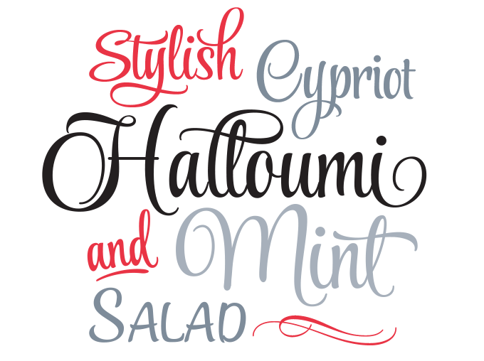
Charcuterie
Not unlike the above-mentioned Desire, Laura Worthington’s Charcuterie represents a new course (or an experimental intermezzo) for its designer. Known for her finely detailed script fonts, Worthington came up with a font project situated almost at the other end of the spectrum, a zone that is home to whimsicality and deliberate imperfection. A suite of 22 very different display fonts that nevertheless combine well together, Charcuterie is vaguely based on historical letterforms you might find in European magazines or shop lettering from the early twentieth century; there’s a distinct Parisian feeling to some of them. Combine freely to create tasty headlines, logos, display, packaging, signage, or advertising.
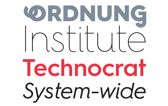
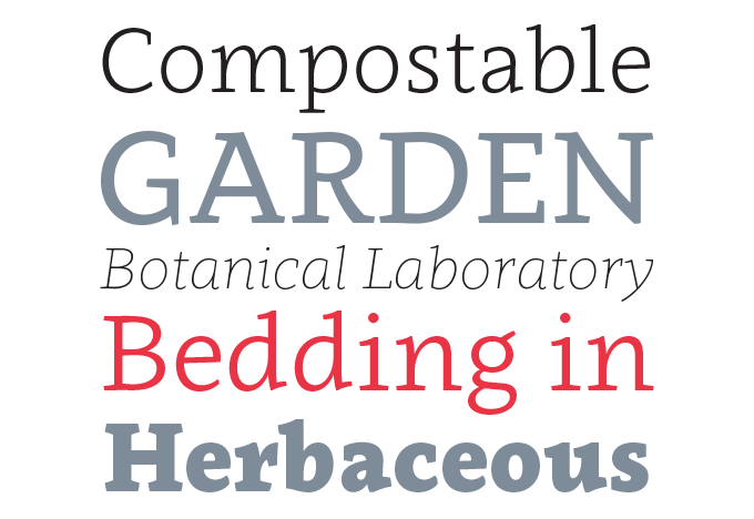
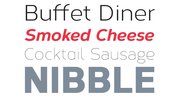
Brandon Text
Brandon Text is a useful companion to Brandon Grotesque, the biggest blockbuster to date from Berlin’s HVD Fonts. The family has remained wildly popular to this day, lending a touch of Art Deco charisma to hundreds of websites, books and magazines the world over. But with its long extenders and small x-height, it’s not ideal for long text and immersive reading. That’s why designer Hannes von Döhren made Brandon Text. With its generous x-height and rational shapes, it is optimized for long settings and small sizes. It is manually hinted and optimized for screens, so it is also an excellent choice for websites.
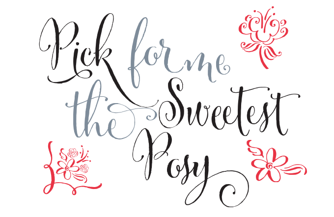
Wishes Script
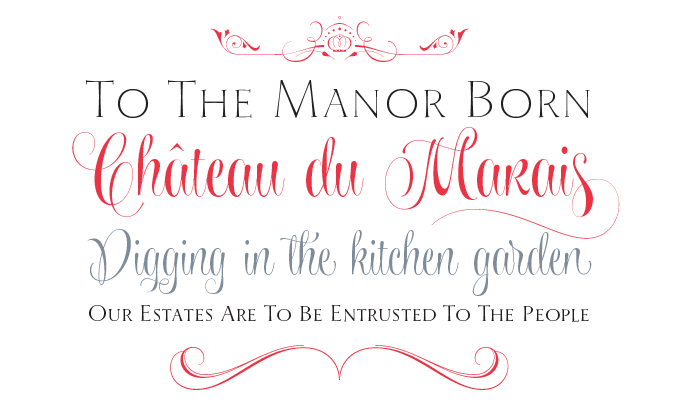
Designer-calligrapher Sabrina Mariela Lopez took her time to create Wishes Script — it was released two years after her previous success, Parfumerie Script Pro. Having trained with some of the best calligraphers in the Americas, Lopez has truly found her own voice with this typeface. It has plenty of swashes, ligatures and alternate shapes — but none of the solemnity that characterizes so many scripts in the Copperplate and Spencerian genres. With its effortless grace and wit, it recalls advertising scripts of the 1950s. When used in OpenType-savvy layout programs, Wishes Script Pro offers the designer an additional decorative toolkit full of frames, ribbons, hearts, flowers and ornaments, plus a collection of caps and small caps. For users of simpler programs or for the web, the scripts, ornaments and caps are available as separate fonts.
Metro Nova
Lettering artist and designer W.A.Dwiggins was a true original — and so was his Metro typeface, drawn in 1929 to compete with Futura and other European sans-serifs from the era. The result was warmer and more human than the European geometric sans-serifs, and became a modern classic. The Metro Nova family by Monotype staff designer Toshi Omagari finally introduces Metro to the 21st century. Seven weights with italics and small caps, a condensed version, and a wonderful set of alternate shapes make the family a serious contender for editorial projects that require a readable sans with personality.
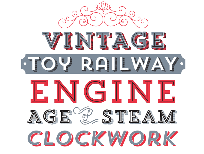
No. Seven
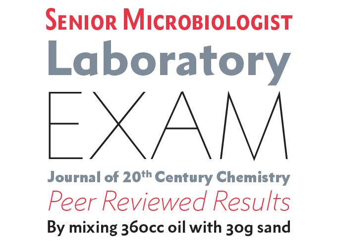
Clavo
Warsaw’s Dada Studio has been doing very well this past year, and with Clavo they have managed to produce the year’s best-selling serif text face. With its distinctive shapes, pronounced serifs and marked transitions, it has an animated energy about it that makes it stand out at display sizes. When used in smaller texts, Clavo is attractive and flexible, with proportions that are easy on the eye and help immersive reading. Clavo comes in no less than ten weights with matching italics, carefully adjusted for optical harmony. With a large set of numerals, small capitals, fractions and other OpenType goodies.
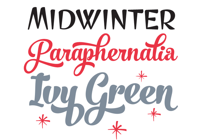
Style Script
Style Script is one of Rob Leuschke’s most ambitious projects so far. It has Leuschke’s signature freshness and natural look — as if it’s been lifted directly from mid-20th-century brush lettering. But technically it goes a step further than many of his typefaces. Programmed with a little help from his friends Maximiliano Sproviero and Mark Simonson, Style Script combines immediate charm and brisk detailing with the power of today’s digital design. Design professionals equipped with OpenType-enabled software will have easy access to all of the font’s features and 1275 glyphs. Those using less sophisticated programs can still create elaborate typography thanks to the Style Script Family package that includes endings, swashes, ornaments, capitals and each of the three main styles as separate fonts.
Core Circus
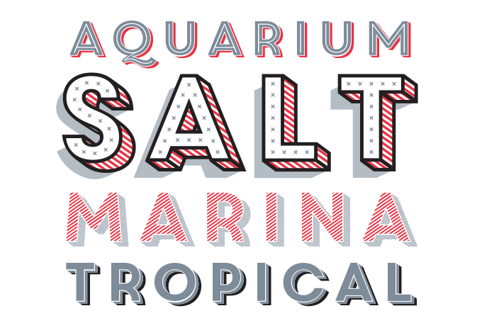
Core Circus from the S Core foundry belongs to the same category as the Trend typeface we opened the newsletter with — display alphabets in a range of styles that can be layered to dazzling multi-colored effect. Core Circus has an impressive arsenal of seven 3D effect layers, eight 2D effect layers and one shadow effect layer. The family is all-caps; but there are marked differences between the Deco-inspired shapes that are found in the lower case set. While the basic shapes are simple, the system offers endless possibilities for layering, coloring and combining.
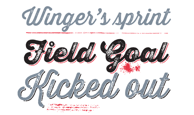
Thirsty Rough
Corbert
Among all the type families featured in this newsletter, Corbert is a special case: it’s the only typeface that made the Fonts-of-the-Year list without being featured in our Newsletter of popular new fonts, Rising Stars. Despite missing that list, it gradually became a steady seller, helped by the fact that the Regular and its Italic are permanently free. Influenced by Bauhaus and the early modernist era, Corbert offers lucid geometry, optically adjusted to create a clear, rather wide and very readable typeface for display and text.
ColophonThe nameplate of this Special Edition newsletter was set in Trend and No. Seven. |
Subscription info<<<<<<< .mine Had enough? Unsubscribe directly via this link: To change your email address or email preferences, log into your MyFonts account and edit your Account Settings. Want to get future MyFonts newsletters sent to your inbox? Subscribe at myfonts.com/MailingList =======Had enough? Unsubscribe immediately via this link: To change your email address or email preferences, log into your MyFonts account and edit your Account Settings. Want to get future MyFonts newsletters sent to your inbox? Subscribe at: |
Comments?We’d love to hear from you! Please send any questions or comments about this newsletter to [email protected] |