|
Aaah, summertime. Whether you prefer listening to the surf on a sun-kissed beach or breathing in the exciting atmosphere of a just-discovered city, work gets to take a back seat. The world quietens down a little… yet the typographic world not so much. Typeface designers keep tirelessly developing and releasing new typefaces at a steady pace, month after month. August is no different. So while you’re sipping a cocktail at the coast or taking in the view from a rooftop terrace, get on your smartphone, tablet or laptop and discover with us which new font families top the Hot New Fonts list.
|
|
|
This Month’s Rising Stars
|
|
|
|
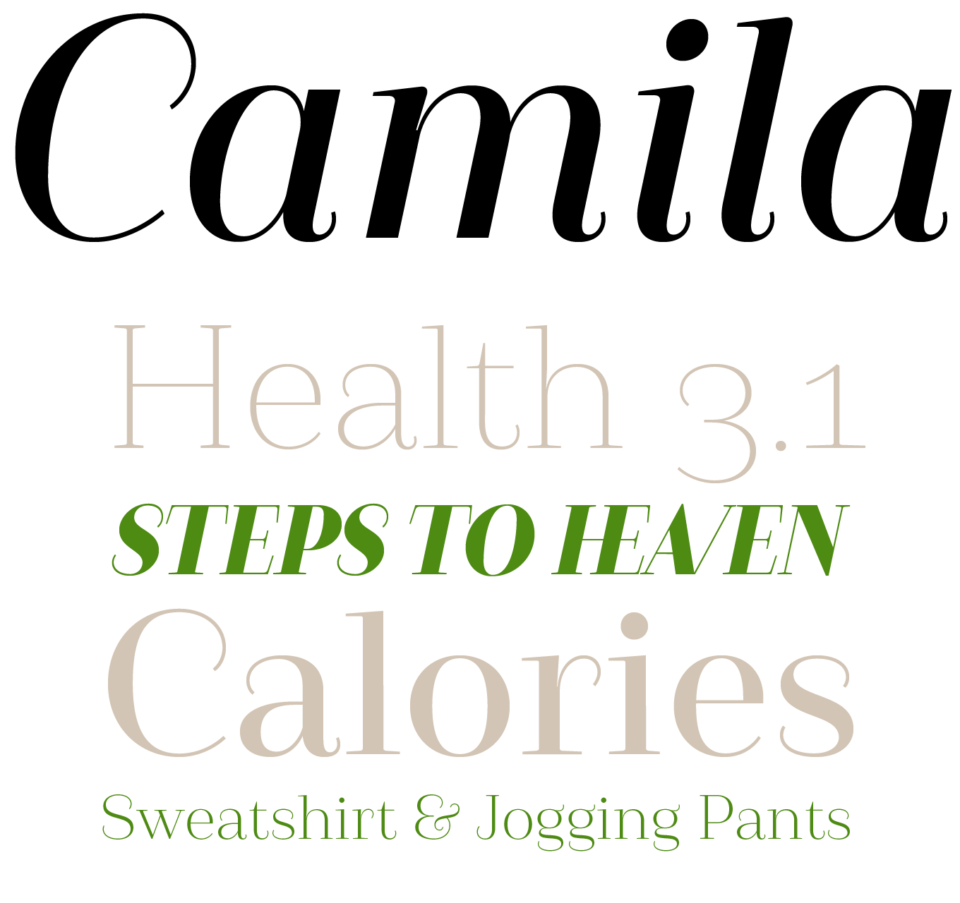
With the abundance of new typefaces being released every month, you might think it’s becoming nigh impossible to come up with a fresh take on a classic typographic model. Not so for Paula Nazal Selaive. Inspired by Coco Chanel’s famous quote “Simplicity is the key to elegance”, the graphic designer born in that other Los Angeles, in Chile, created the delicate Didone Camila. What makes it special is that it lacks one of the style’s most distinctive traits — the typical ball terminals. Instead the stroke endings are hairlines, giving the design an instantly recognizable appearance. While the Black on one end of the weight range is very common in Didones, the almost monoline Thin at the other extreme is very rare. Add to that some capital ligatures and four playful ampersands, and you have a unique neo-Baroque family well-suited for display and short- to mid-length body copy in fashion, editorial and branding projects.
|
|
|
|
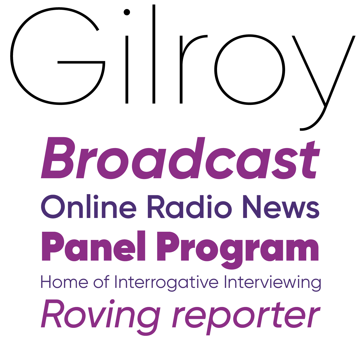
If you have the impression Gilroy looks somewhat familiar, you’d be right. Radomir Tinkov intended his newest release to be a cousin for Qanelas and its rounded sibling Qanelas Soft. This modern geometric sans serif builds on the heritage of its vintage predecessors, yet abandons their strict geometry in favor of a more balanced and less clinical appearance of the letters. While the large x-height is true to the ideals of the ’70s and ’80s, the angled apertures add a contemporary touch. The extensive range of weights from Thin to a very dark Heavy is also typical of a modern type family. Gilroy comes with an extensive character set including a full Cyrillic complement and a selection of arrows, making it a good choice for print projects, web design, and signage systems. You can try the Light and ExtraBold weight for free.
Gilroy’s introductory discount runs until August 25.
|
|
|
|
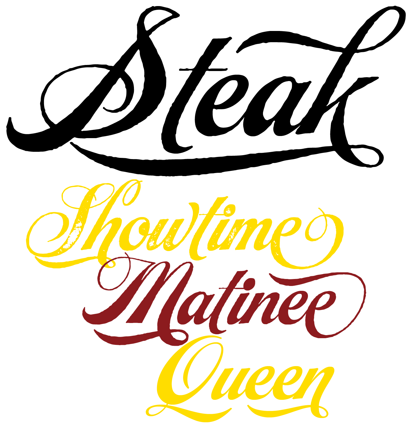
For Alejandro Paul, revisiting Alf Becker’s work is always a breath of fresh air. The inspiration for Steak is a 60-year-old alphabet by Becker, arguably the greatest American sign lettering artist of all time. Ale Paul turned it into the latest of the high-performance feature-rich OpenType scripts that the Argentinian script master is so well known for. While little is left of the original alphabet — incorporating typographic functionality into pure lettering is a major operation — the spirit survived the adventure, and was even accentuated. Steak comes in three flavours — a smooth Barbecue, a slightly rough Braised, and a distressed Smoked. It is a great fit for menus and wall art of high-end steak houses that recreate an urban American 1930s atmosphere, and any other project where a vintage style is desired.
Get Steak at a tasty discount until August 20.
|
|
|
|
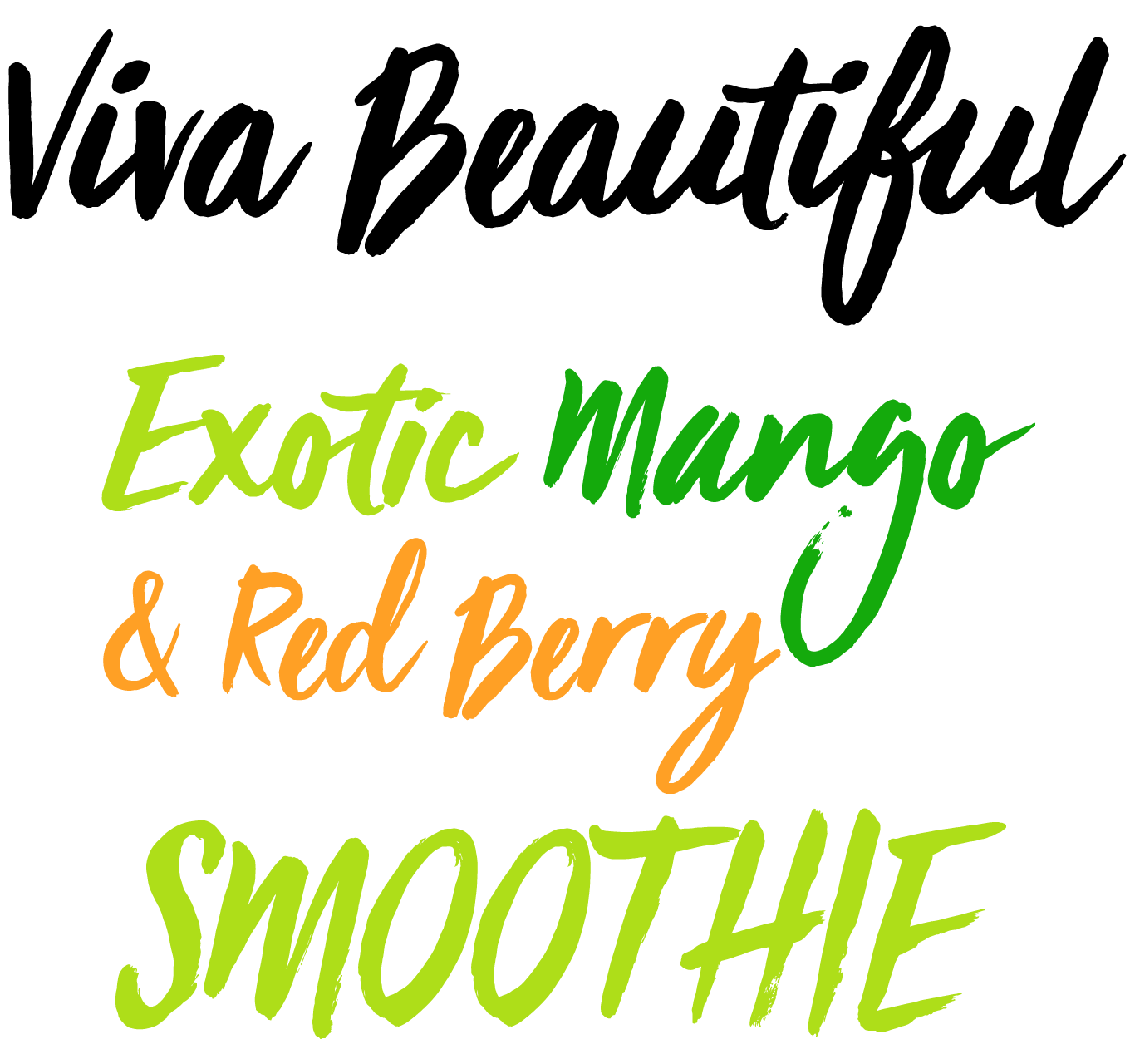
With Viva Beautiful, Cindy Kinash released the perfect summery script through her foundry Cultivated Mind. It is a relaxed hand painted brush script that captures the no-stress, lazy atmosphere of sunbathing on the beach, or gently floating on an inflatable mattress in the swimming pool. Viva Beautiful is available in two subtly different styles — A and B — and Viva Beautiful Caps, an all caps font that nicely complements both. Pro versions of both regular styles include OpenType alternates and ligatures to give the text a realistic hand painted look. The design works well in editorial and marketing uses for fashion, beauty products, food, and apparel.
|
|
|
Text Fonts of the month
Typesetting for books, magazines or annual reports requires font families with special qualities: excellent readability, a generous range of weights with italics and small caps, multiple figure sets (lining, oldstyle, table) and ample language coverage. Here is a selection of recent, high-quality text typefaces.
|
|
|
|
|
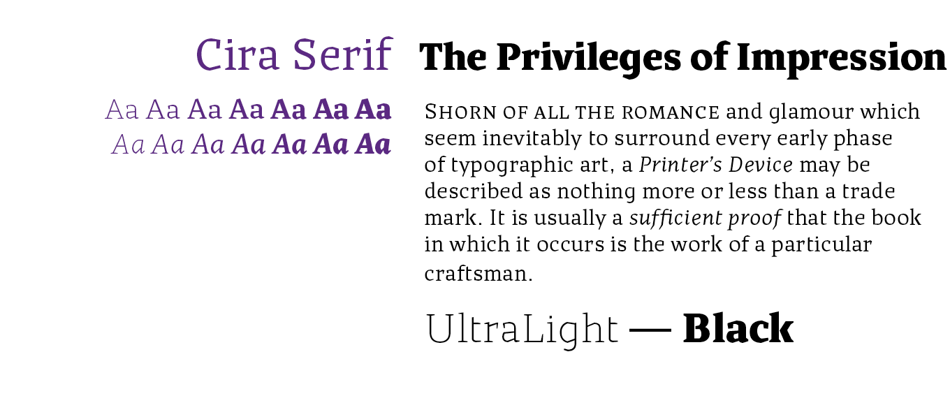
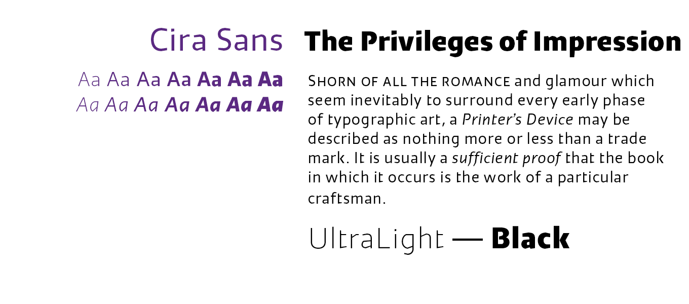
Cira by Huerta Tipográfica is a type system consisting of two families — Cira Serif and Cira Sans. Andrés Torresi originally conceived the typefaces for Katachi Media, as corporate fonts for text and as an experiment for an iPad magazine. The transitional serif face Cira Serif is characterized by straight lines and hard corners in unexpected places, giving it a unique and striking appearance. The letter forms confidently cut through the page, and create a sharp and lively text image, while the reduced contrast guarantees a comfortable reading experience. Its middle weights are suitable for text use, and combine well with the extreme weights in display sizes.
The sans serif sibling Cira Sans shares the same letter structure as Cira Serif. Its humanist shapes mirror many design details from its serif counterpart, like the interrupted connecting stroke of the capital ‘B’, ‘P’, ‘R’, and ‘K’, the single-storey lowercase ‘g’ and the hard corner at the bottom of the lowercase ‘t’. The weights of both subfamilies are perfectly co-ordinated, making the Cira superfamily a versatile and efficient typographic solution for editorial and branding projects.
|
|
|
|
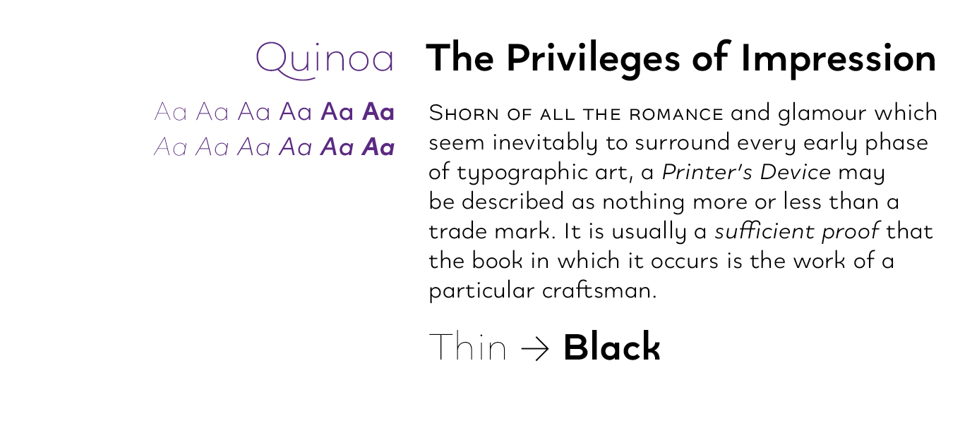
Quinoa by Catharsis Fonts unites the seemingly opposite concepts of clean geometric architecture and organic humanist warmth. With assistance from experts from the TypeDrawers and Typografie.info communities Christian Thalmann developed a typeface with impressive language support, covering multilingual Latin, Greek, Cyrillic, Hebrew, Arabic, and Armenian. Quinoa adopts three different personalities — Quinoa, Quinoa Titling, and Quinoa Round — each of them in six weights with carefully redrawn obliques. The Titling cut offers many alternate capital designs including unicase versions, and the Round variant removes the spurs from round letters for that typical “retro modernist” look. While it was originally conceived as a display and editorial typeface, its accessible forms read well in text sizes too. Quinoa features a wealth of letter variants and other OpenType features for fine-tuning your message to the last detail.
|
|
|
|
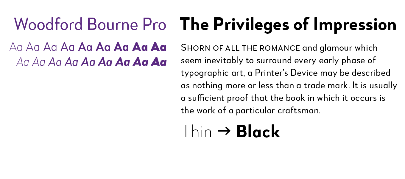
How do you turn architectural lettering into an extensive feature-rich OpenType font family? The iconic stone cast letters on the façades of the 19th century Woodford, Bourne & Co. buildings in Cork City, Ireland inspired Paulo Goode to design the original Woodford Bourne typeface. The vintage geometric sans then went through numerous improvements — the fonts were completely redrawn and respaced, and an additional 500 glyphs were added for a total of over 1,000 glyphs per font. This resulted in the versatile Woodford Bourne Pro family of nine weights with obliques. Their visual style can be switched from contemporary to vintage using one of the nine stylistic sets, and augmented with underlined caps, small caps, petite caps, catchwords, and discretionary ligatures.
|
|
|
Popular Designer of the Month
Each month, we add a new designer to the sidebar of popular designers on our homepage, based on their popularity with customers. This month, our new addition is Kimmy Kirkwood of Kimmy Design.
 Kimmy Kirkwood is one of life’s semi-nomadic typographic adventurers — her typefaces frequently draw on her travels through North America and Europe. In her five-year career selling through MyFonts, she’s produced a wide ranging collection of personality-infused hand-drawn typefaces, often loaded with variations, ornaments and other handy little features.
Her latest is Rainier, a multidimensional family of two unique styles with four weights each, and a complementary set of ornaments and illustrator’s tools.
|
|
|
MyFonts on Facebook, Tumblr, Twitter & Pinterest
Your opinions matter to us! Join the MyFonts community on Facebook, Tumblr, Twitter and Pinterest — feel free to share your thoughts and read other people’s comments. Plus, get tips, news, interesting links, personal favorites and more from MyFonts’ staff.
|
|
|
|
|
|
|
Comments?
We’d love to hear from you! Please send any questions or comments about this newsletter to [email protected]
|
|
|
|
|
|
MyFonts Inc. 600 Unicorn Park Drive, Woburn, MA 01801, USA
MyFonts and MyFonts.com are registered service marks of MyFonts Inc. Other technologies, font names, and brand names are used for information only and remain trademarks or registered trademarks of their respective holders.
© 2016 MyFonts Inc
|
|
|
|