Select this license type when you are developing an app for iOS, Android, or Windows Phone, and you will be embedding the font file in your mobile application's code.
Rainier
by Kimmy Design
Individual Styles from $10.00
Complete family of 9 fonts: $60.00


Rainier Font Family was
designed by
Kimmy Kirkwood and
published by
Kimmy Design. Rainier contains
9
styles and family package options.
More about this family
- Aa Glyphs
-
Best ValueFamily Packages
- Individual Styles
- Tech Specs
- Licensing
Per style:
$6.66
Pack of 9 styles:
$60.00
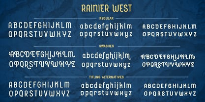
Rainier West Family
4 fontsPer style:
$7.50
Pack of 4 styles:
$30.00
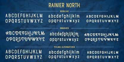
Rainier North Family
4 fontsPer style:
$7.50
Pack of 4 styles:
$30.00
About Rainier Font Family
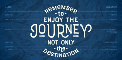
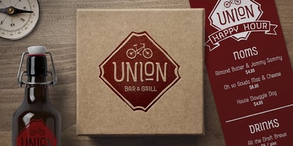
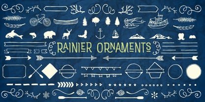
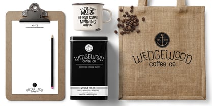
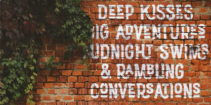
I was inspired to create the Rainier type family during my summer back home in the Pacific Northwest. The concept behind it may be simple - a hand crafted font family - but what it delivers is quite complex! Here is a breakdown of everything you get: FONT FAMILIES: Two sub-families with unique styles - Rainier North and Rainier West WEIGHTS: 4 weights per family, broken down numerically - 100 (light), 300 (regular), 500 (bold), 700 (black) OPENTYPE: In each family, there are tons of OpenType options, offering lots of customizable opportunities (in order to access all these goodies, you must be using Illustrator, Photoshop, Indesign or Publisher). Because Rainier is 100% handmade, contextual alternatives allow each letter has three subtle variations, this way it keeps that authentic hand-drawn look. Additionally, a full alphabet with special descending swashes, as well as start and end swashes for capitals and small caps. Titling alternatives offer a full character set just to help with readability! Meant for captions or smaller text, these letterforms are easy on the eye and a great complement to the regular alphabet. Stylistic Alternatives add a little fun, providing a unified cap height, no matter what case you are using (all caps, small caps or lowercase.) Discretionary Ligatures are created only for capitals, and takes specific letter pairs and creates a unique ligature between them To get a better understanding of everything, please check out the quicker user guide (http://bit.ly/1W0Bfma) and print if you so desire (http://bit.ly/23W9ZV6) that helps you navigate your way around and get the most out of Rainier! Unfortunately those links aren't working right now and soon I will have them fixed. So sorry! ORNAMENTS: In addition to the font, you get a set of awesomely rustic ornaments designed and drawn to go specifically with Rainier! - Rustic Northwest Illustrations - Banners & Flags - Frames - Flourishes - Lines & Line Breaks - Arrows There are a lot of extras packed in this set, so make sure you check out the Ornaments User Guide to get the most out of it! Check it out here: http://bit.ly/1rRVJRx And that’s all folks! Hope you enjoy Rainier!
Designers: Kimmy Kirkwood
Publisher: Kimmy Design
Foundry: Kimmy Design
Design Owner: Kimmy Design
MyFonts debut: May 19, 2016
Rainier
About Kimmy Design
“Kimmy Design is based out of Santa Monica, CA, but it’s as mobile as I am,” Kimmy Kirkwood says. “I love finding new inspiration and I work from Seattle, Palm Springs, Santa Monica, or wherever the next adventure takes me!” Kimmy founded her company in 2010; the same year that she graduated from college. Her first typeface, Madeleine, which is based on a logotype that she had created for a hotel in Positano, Italy, was actually a part of one of her final collegiate projects. She used it as an opportunity to teach herself about the intricacies of type design and develop the programming skills needed to create a true working font. Since then, her most successful designs have included Lunchbox and Lunchbox Slab: quirky hand-drawn typefaces that give an incredible array of customizable options and an authentically hand-crafted look. “My goal with these,” she says, “was to make them unique enough that the end product from any designer would look as if it was all made by hand.” “I love organic typefaces. Creating something that looks naturally handcrafted and letting the customers make it their own. In every hand drawn family I make I include multiple weights, styles and variations.” Kimmy uses contextual alternates in her typefaces and typically creates 3-5 variations of each letter, giving her fonts a truly hand-lettered feel. “I also usually include stylistic alternatives, which range from creating simple variations on specific letters to a unique style alternative for every character. Small Caps are a great way to give more options to designers while keeping the width and size of the font consistent. All of my font families are multilingual, and many include full Cyrillic and Greek alphabets. Whenever possible, I always include some sort of swash - either in fancy capitals, at the beginning and end of characters, or stylistic swashes.” All of these customizable options give the young designer’s families an intimate, personal feel. “Two different people could use my font and create something totally unique from one another. That’s what makes them so fun to use!”
Read more
Read less
- Choosing a selection results in a full page refresh.