
Times are pretty hard for many of us, economically speaking. But as far as MyFonts is concerned, that’s no reason to settle for Times — typographically speaking. Among our 62,530 fonts (give or take a few) from over 600 foundries, there are many useful and original typefaces at prices almost anyone can afford. We selected ten of them for you today: all starting at $10 or less, with further discounts if you order a family, or several fonts from the same foundry. Here’s our special anti-recession end-of-summer font selection, in no particular order.
Anivers
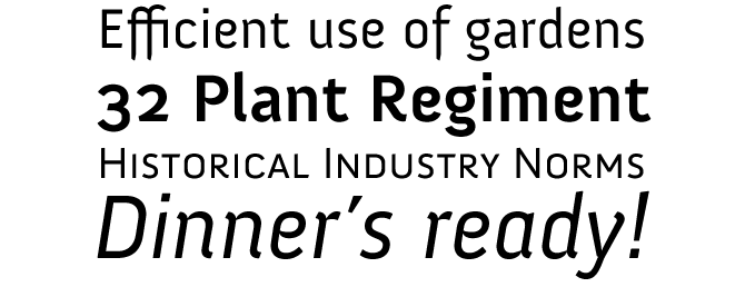
Dutch designer Jos Buivenga describes his Anivers as “robust and rigid, forgiving, flexible and elegant...”. We especially like “forgiving”: as a graphic designer, you can’t ask much more from any typeface. Anivers’ whimsical shapes evolved out of Buivenga's biggest seller, Museo — although, as the designer explained here, it took major tweaking and redrawing for the one font to become the other. A very usable, readable sans-serif with an unmistakable personality, Anivers is suitable for a broad use: from stationery to posters, from pull-quotes and intros in magazines to logos and corporate identity.
Negro
Negro was drawn by Prague designer František Štorm and, like most of Štorm’s typefaces, is a gutsy individualist face with plenty of nerve. It is reminiscent of the poster typefaces of the mid-to-late 19th century; it was in fact inspired by a font called Latin issued by the historical Stephenson Blake type foundry. Negro is bold and spiky and slightly aggressive in character — it can lend a slightly threatening atmosphere to your book cover, poster or magazine page.
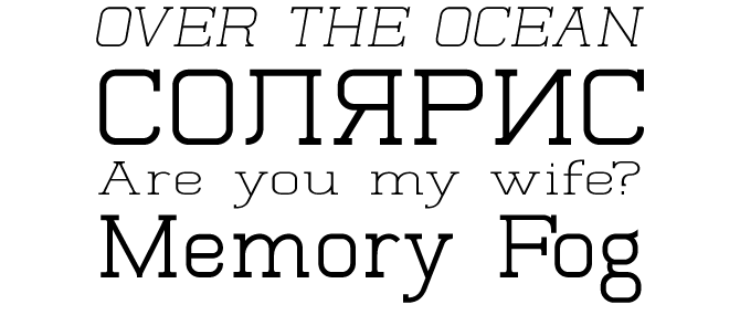
Corzinair
Typodermic is well represented in this list: with their special rates for personal use, their price/quality ratio is hard to beat. While designer Ray Larabie is best known for his prolific output of display fonts, Corzinair is one of his most successful efforts in creating an original text typeface. It is clear, sturdy and contemporary; although its range of weights is limited, it is well-equipped, with small caps and diacritics for many languages. Corzinair is part of several of Typodermic's wickedly affordable value packs. In case you like your oldstyle more weathered and rusty, try Antihistory, a distressed font based on Corzinair.
Glengary
To type archeologists such as Nick Curtis, the type catalogues released by the historical Stephenson Blake foundry are an everlasting source of inspiration. Nick's Glengary was based on the foundry's 1932 font Glenmoy — a typical mid-20th-century retro typeface, with lively capitals, a regular and readable lowercase, and a natural flow. Use it for packaging, book covers, flyers or logos.
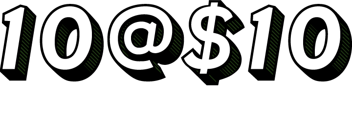
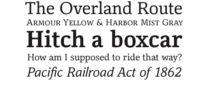
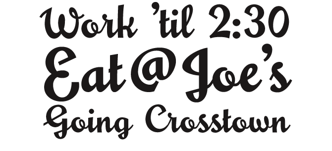
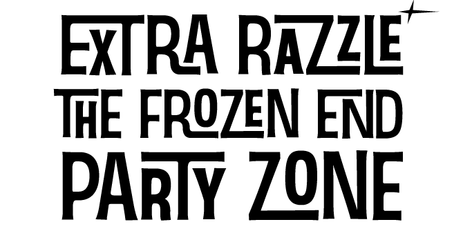
Fenwick
Fenwick is another interesting family from Typodermic’s Ray Larabie. It was vaguely based on that designer’s silent movies font Silentina, but has a less quirky, more straightforward appearance. Although there’s a hint of 1900s nostalgia about it, it ultimately comes across as a contemporary yet historically informed text and display family. Its regular, light and bold versions work well in smaller sizes, with the imaginative oldstyle figures making the set all the more interesting. The striking shapes of the Outline and Olden varieties offer some compatible, tasteful display additions to a Fenwick family.
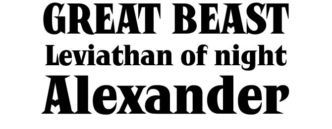
Earmark
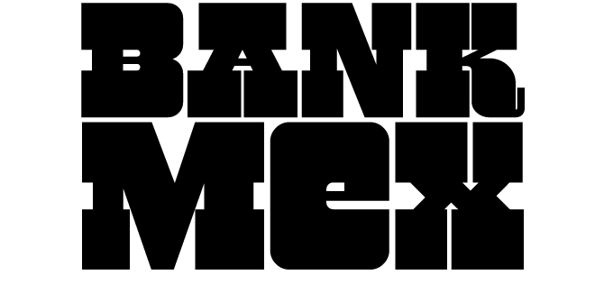
Like some of Nick Curtis' other ’60s-style display fonts, Earmark derives its inspiration from typefaces designed by New York lettering artist Vincent Pacella: Pacella Barrel and Pacella Colossus. Earmark, an extra stout slab serif, is essentially an all-caps font, but there are lowercase variants of a, e, m, n and u at the same height as the capitals — so you can mix things up to create more interesting headlines.
Black Jack Pro
Now here's an original concept for a foundry: CheapProFonts’ founder Roger S. Nelsson has taken dozens of interesting designs from the free font circuit and — with the consent of their respective designers — has expanded them into professional multi-language fonts, optimizing the outlines in the process if needed. The professionalized fonts are offered for $10 a piece, which considering the quality is truly a bargain. Ronna Penner’s lovely Black Jack Pro is one of the latest additions to the collection. Some kerning pairs were added to make the font look even better, and the font was completed with all the glyphs needed to meet the foundry's international criteria. Black Jack Pro was “an absolute joy to rework” says Mr. Nelsson. It will be a joy to use as well.
Antiquettes
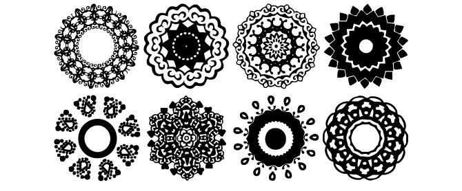
Antiquettes from Fantasy Inspirations is a library of kaleidoscopic ornaments created with web design in mind. By adding color and varying dimension, romantic web graphic can be created within minutes; layering and 3-D effects can be used to create dazzling effect. The Antiquettes family consists of four fonts, each with 26 original shapes (ranged under a to z on the keyboard) with endless possibilities: virtual jewelry, buttons, framing, interfaces, etc.
Quoral
Graham Meade's Quoral is an interesting family to experiment with. It's strictly monolinear and geometric, and kind of stiff; but its mechanic look (and lack of typographic sophistication) may be just what you're looking for to design that streetwise fan-zine or cheeky contemporary art magazine. It makes for striking headlines and works at smaller sizes, too. Quoral is lightweight: its Regular is pretty light, and the Bold is not bold at all, but once you get the hang of it you may start to really like it.
Sinzano
If you like fiddling around with OpenType alternates to create unique, customized headlines, Sinzano is a treat. It has over 400 interlocks which automatically replace the letter combinations you type. The comics-inspired style is certainly not new (Ed Benguiat and others did it decades ago and Larabie himself experimented with the principle in his mid-1990s fonts) but the programming on this one is something really special — and the price is hard to believe.
Colophon
10 Fonts Under $10 was written by Jan Middendorp and designed by Nick Sherman. The title graphic is set in Fenwick, and the background image is made using Antiquettes.
Subscription info
Want to get future MyFonts newsletters sent to your inbox? Subscribe at myfonts.com/MailingList
Comments?
We’d love to hear from you! Please send any questions or comments about this newsletter to [email protected]