|
Welcome to MyFonts’ annual round up of bestselling fonts from the previous year, where we compile our list of new type families that have proven popular with you, the customer. Putting this chart together is a non-partisan project for the editorial team; we look at each family’s daily sales average over the course of its life on sale, rather than an accumulated amount over the year, and we wait until the very last moment so that releases from the back end of December also get a chance to make the cut. As usual, we’ve limited places on the list to one per foundry, and tried to present a compelling selection while still reflecting those styles and genres designers are actually choosing.
Contemporary, modern sans families have had another strong year, while serif and slab styles still seem to be reserved for specialist projects — but both those trends are offset by the continued rise of the multifaceted toolkit family, whether layerable chromatic fonts or sets of diverse yet complementary styles.
It will be fascinating to see how our foundries develop the concept alongside our recently introduced Bundles feature. Perhaps this time next year our Bestsellers list will have a very different character again… watch this space!
|
|
|
|
|
Typeface family of 32 weights
|
| |
|
The Uruguayan foundry TipoType released their extensive Brother 1816 family to commemorate the birth of the very first sans serif two centuries ago. Drawing on the long history of this storied typographic genre, Ignacio Corbo and Fernando Díaz constructed a versatile and multifaceted typeface combining geometric letter forms with humanistic strokes. The multitude of alternate characters turns the family into a true chameleon. The proportions of the typeface are tailored for body copy and screen rendering, while sharp alternates for some capitals and a number of judiciously added swashes turn it into a great display face too.
|
|

|
|
|
Typeface family of 20 weights
|
| |
|
Radomir Tinkov had a good year. The Bulgarian designer had two families in our bestsellers list, with his Ridley Grotesk also highly-placed. Gilroy, a modern geometric sans serif, was his and our bestseller of last year, and is something of a cousin for his earlier Qanelas, building on the heritage of its predecessor, yet abandoning strict geometry in favor of a more balanced and less clinical appearance. While the large x-height is true to the ideals of the ’70s and ’80s, the angled apertures add a contemporary touch. The extensive range of weights from Thin to a very dark Heavy is also typical of a modern type family, making it a good choice for print projects, web design, and signage systems. You can try the Light and ExtraBold weight for free.
|
|
|
|
|
Typeface family of 16 weights
|
| |
|
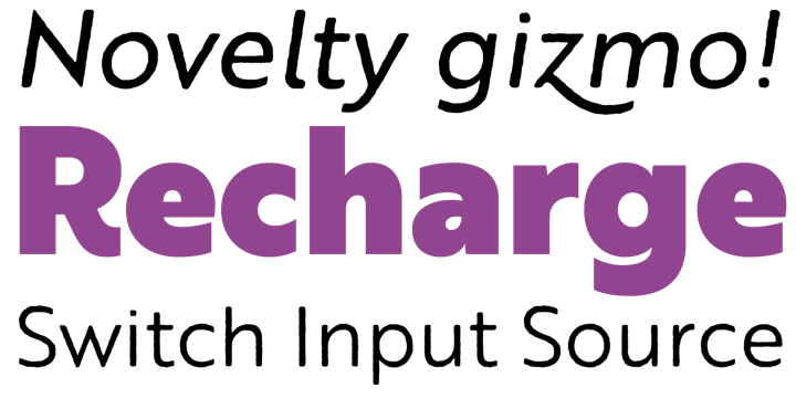
The concept of a type family continued to evolve in 2016, building on the trend for toolkit families — collections of stylistically related designs in a variety of genres. DearType’s Guess was the most successful example of a growing number that marry scripts to sans serifs. The slender connecting script in Regular and Bold strikes the perfect balance between refinement and friendliness, and offers tons of swashes and stylistic alternates to unleash your creativity. Guess Sans is the companion sans serif: nine weights of geometric capitals with gracefully curved details. A set of beautiful borders and swirling ornaments completes the family. This makes Guess the perfect choice for anything from fashion brands and editorial design to greeting cards and invitations — any application that needs to appear classy and chic.
|
|
|
|
|
Typeface family of 20 weights
|
| |
|
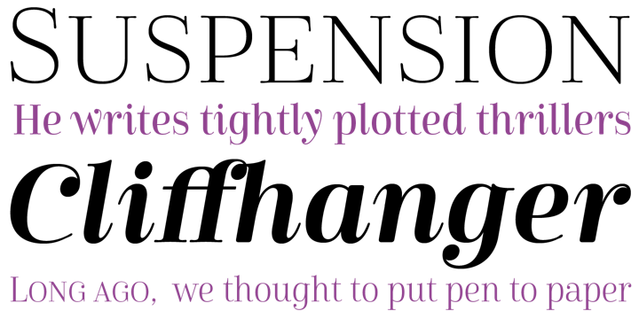
René Bieder has a knack for taking a familiar typographic style and putting a personal spin on it. Sagona, his interpretation of the slab serif, saw him injecting playfulness and warmth in the clarendon/ionic model that dates all the way back to the 19th century. The welcoming atmosphere of the typeface is emphasised by its generous proportions and ball terminals replacing serifs in certain spots. The versatile family works equally well in text and display sizes. A moderate contrast, large x-height, and short descenders and ascenders in combination with sturdy serifs guarantee optimal legibility in print and on the screen making this a great, all-round typographic solution.
|
|
|
|
|
Typeface family of 10 weights
|
| |
|
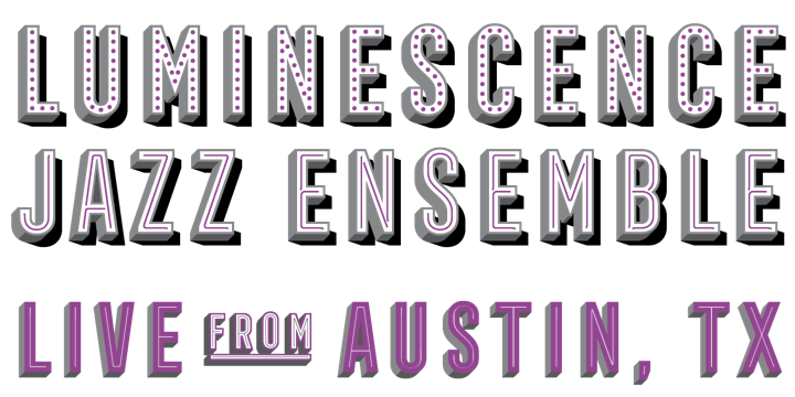
With his Frontage Condensed, Juri Zaech beautifully captured the retro charm of classic narrow gothic capitals with a three-dimensional effect. This layered type system allows you to quickly and easily recreate the eye-catching, colorful style of façade signage. Some of the weights can be used out-of-the-box, but the fun really starts when you start layering. Add the Bulb or Neon ornamental layers to suggest theater signs, or enhance the three-dimensional effect by combining the 3D weight with the Bottom and Shadow layers, while the Line layer provides the finishing touch. The Discretionary Ligatures OpenType feature activates 52 catchwords for the ultimate typographic refinement.
|
|
|
|
|
Typeface family of 33 weights
|
| |
|
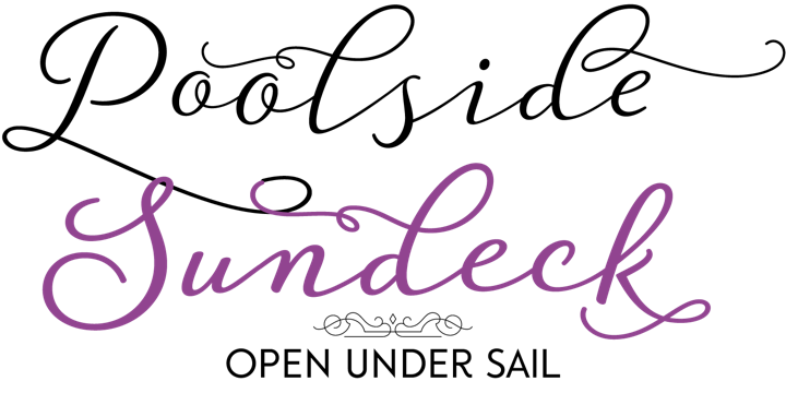
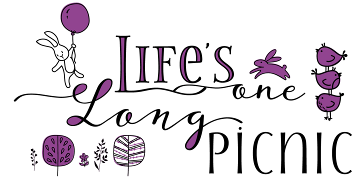
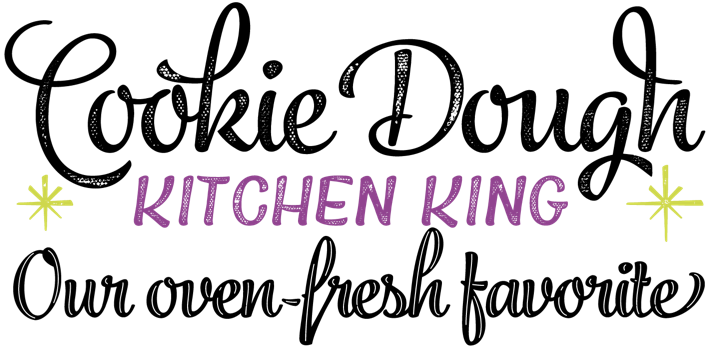
Storyteller is the first big success story from designer Elena Genova and her Edinburgh-based My Creative Land foundry. (Her Sunshine Daisies also did very well last year). Her first co-ordinated suite of fonts, Storyteller consists of scripts in several variations with swashes, ligatures and alternates; an all-caps sans serif in normal, condensed and extra condensed widths; and an all-caps serif face. The fonts look elegant yet casual, and were lovingly handwritten and hand-traced to give your designs that human, personal touch. They come with numerous extras: playful loop fills for the scripts, engraved styles and catchword ligatures for the sans and the serif fonts, an ornament font with frames and borders, and a collection of adorable Spring and Easter-themed illustrations.
|
|

|
|
|
Typeface family of 18 weights
|
| |
|
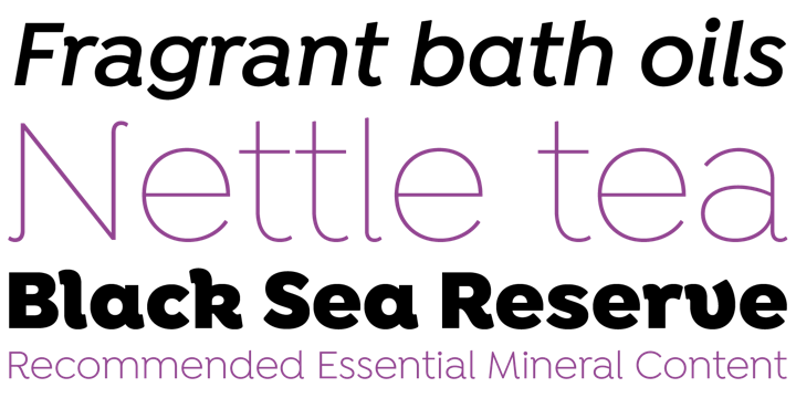
Univia Pro is a clean, versatile text and display family from Mostardesign with a strong and pleasant personality. The confident expression of the superelliptical shapes is softened by smooth curves and round corners. The absence of spurs simplifies the letter forms, further enhancing Univia’s modern look and contributing to an uncomplicated character that makes it ideal for e-books, websites, user interfaces, mobile apps and so on. This professional, feature-rich OpenType font comes in 18 styles (nine weights plus italics), and offers all the necessary features for demanding typography including a selection of surprising @ and # signs for all your social media needs.
|
|
|
|
|
Typeface family of 34 weights
|
| |
|
Kimmy Kirkwood’s Bourton brings the type toolkit concept to the layerable chromatic fonts trend. A companion piece to Kimmy’s earlier chromatic layering kit, Burford (incidentally also a Bestseller in 2015), Bourton is built around a solid grotesque sans, and offers various options for adding depth and extrusion, detail and highlight effects, and a range of borders, ornaments and flourishes, as well as a complementary script in two weights. All this adds up to 34 fonts and a ton of potential for creating endless logo variations, signage mockups or packaging concepts.
|
|
|
|
|
Typeface family of 14 weights
|
| |
|
HVD Fonts continued their uninterrupted run in our yearly bestsellers list with Fabrikat, a geometric design based on German 20th century engineers’ typefaces. This becomes apparent in the plain yet precise letter forms that are mostly constructed with straight lines and circle arcs, as if they were meticulously drawn with straightedge and compass. Don’t let the strict geometry fool you however — the lettershapes are optically corrected with great care, in order to retain their uncut charm. The straight-sided sans serif consists of seven weights from Hairline to Black, all with matching italics. These feature-rich OpenType fonts are equipped for complex, professional typography in both display and text applications.
|
|
|
|
|
Typeface family of 32 weights
|
| |
|
Bulgaria’s Galin Kastelov has focused much of his professional attention on the search for the perfect sans, and his most recent release — November 2016’s Intelo — demonstrates that his quest is coming along quite well. Intelo is a 32-font modern grotesk and humanist sans hybrid, with a subtle softness in its elliptical strokes that makes it warm and approachable. A large x-height makes is eminently legible, and its extensive OpenType features make it a workhorse; it’s even packaged with an alternate cut, which forgoes the soft endings with a cleaner, more traditional look. The two versions complement each other quite well as display (regular) and text (alt) cuts, although they can be mixed & matched in the same line quite effectively as well.
|
|
|
|
|
Typeface family of 39 weights
|
| |
|
The Canvas Acrylic Megafamily is a collection of nine distinct hand-painted font families from Yellow Design Studio — the type design and fine arts studio run by Rena and Ryan Martinson — that range from refreshingly festive to folky and organic. Six of the families include unique layering options for added dimension and impact. With authentic, hi-res texture the fonts maintain their realism even at very large sizes. “Tiny” versions of the Sans, Slab and Brush are included for setting small type. A collection of 340 tasty shapes, icons and seasonal elements, and a series of unique floral icons and patterns designed by Rena Martinson complement the fonts.
|
|
|
|
|
Typeface family of 48 weights
|
| |
|
Don’t be fooled by Between: at first glance, it might seem to be a traditional single-style sans, but look closer and you will see a modern masterwork by Akira Kobayashi, one of the most talented type designers in the world. Between’s flexibility comes from its three states: Between 1, a technical modern square-ish sans; Between 3, a smooth and cheerful informal variety; and Between 2, which straddles the two extremes, marrying the trustworthiness of 1 and the friendliness of 3.
|
|
|
|
|
Typeface family of 16 weights
|
| |
|
Emil Karl Bertell’s unmistakable style — a sort of melding of skateboard/graffiti culture and polished modern calligraphy — is on display in Jazz Script, which may be his most skilfully executed and full-featured script yet. This spicy and modern brush script is relatively narrow and has a fair amount of detail, making it great for very large settings; the even more detailed inline alphabets and two varieties of weathered versions are also suited well for poster work and other large-scale uses. Each of the script families includes over 750 glyphs; they are jam-packed with alternates, swash characters and more. There are also separate fonts with titling caps and a pile of swashes and banners.
|
|
|
|
|
Typeface family of 42 weights
|
| |
|
American designer Jeremy Dooley — principal of the Insigne foundry — has been expanding and improving his Cabrito type system for several years now, and in late October 2016 added Cabrito Didone, his most elegant family yet. Where most Didones keep the cool, elegant feeling of the genre front and center, Cabrito Didone’s character is friendlier and more approachable — no surprise, since it was originally designed “to provide (infants) with clear recognition of letterforms” as part of a children’s book project.
The family comes with upright obliques, alternates, ligatures, multiple sets of numerals, and small caps; over 575 glyphs per font provides support for 72 Latin-alphabet languages. It makes a beautiful titling or poster complement to the other faces in the Cabrito type system, and stands on its own feet as well.
|
|
|
|
|
Typeface family of 28 weights
|
| |
|
If you take one part modern geometric sans and toss with one part Art Nouveau, soften it up a bit, and pass through Latinotype’s unique type kitchen, you might get something like Enrique Hernandez’s newest. Isidora is a flavorful sans family in seven weights and matching italics, doubled by a whole set of alternate fonts for each — a total of 28 fonts — with some of the most idiosyncratic sans forms we’ve seen in a good long while. The designer writes that its mix of “strong and rational structure … (it is) friendly and expressive, thanks to its rounded terminals,” as well as the almost liquid flow between individual characters. We look forward to seeing it in use on a regular basis over the next year and into the future.
|
|
|
|
MyFonts on Facebook, Tumblr, Twitter & Pinterest
Your opinions matter to us! Write to us at [email protected] or join the MyFonts community on Facebook, Tumblr, Twitter and Pinterest — feel free to share your thoughts and read other people’s comments. Plus, get tips, news, interesting links, personal favorites and more from MyFonts’ staff.
|
|
|
|
|
|
|
|
Colophon & Credits
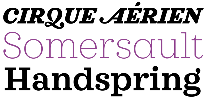
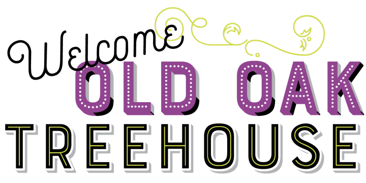
This newsletter was edited by Joshua Lurie-Terrell, Anthony Noel and Tori Grenz, with texts by Yves Peters and the editorial team. The masthead design features Univia Pro, Guess, Storyteller and Frontage Condensed. Body text (for those using supported email clients) is Rooney Sans.
|
|
|
|