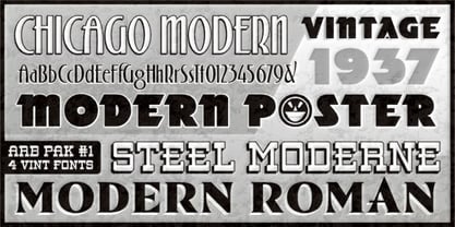
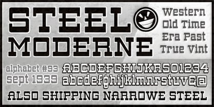
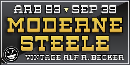
ARB 93 Steel Moderne SEP-39 DTP Normal
ARB 93 Steel Moderne SEP-39 DTP Normal Italic
ARB 93 Steel Moderne SEP-39 DTP Normal Italic
ARB 93 Steel Moderne SEP-39 DTP Bold
ARB 93 Steel Moderne SEP-39 DTP Bold
ARB 93 Steel Moderne SEP-39 DTP Bold Italic
ARB 93 Steel Moderne SEP-39 DTP Bold Italic
ARB 93 Steel Narrowe SEP-39 DTP Normal
ARB 93 Steel Narrowe SEP-39 DTP Normal
ARB 93 Steel Narrowe SEP-39 DTP Normal Italic
ARB 93 Steel Narrowe SEP-39 DTP Normal Italic
ARB 93 Steel Narrowe SEP-39 DTP Bold
ARB 93 Steel Narrowe SEP-39 DTP Bold Italic
ARB 93 Steel Moderne SEP-39 CAS Normal
ARB 93 Steel Moderne SEP-39 CAS Normal
ARB 93 Steel Moderne SEP-39 CAS Normal Italic
ARB 93 Steel Moderne SEP-39 CAS Normal Italic
ARB 93 Steel Moderne SEP-39 CAS Bold
ARB 93 Steel Moderne SEP-39 CAS Bold Italic
ARB 93 Steel Moderne SEP-39 CAS Bold Italic
ARB 93 Steel Narrowe SEP-39 CAS Normal
ARB 93 Steel Narrowe SEP-39 CAS Normal
ARB 93 Steel Narrowe SEP-39 CAS Normal Italic
ARB 93 Steel Narrowe SEP-39 CAS Bold
ARB 93 Steel Narrowe SEP-39 CAS Bold
ARB 93 Steel Narrowe SEP-39 CAS Bold Italic
ARB 93 Steel Narrowe SEP-39 CAS Bold Italic
ARB 93 Steel Ns Blunt SEP-39 DTP Normal
ARB 93 Steel Ns Blunt SEP-39 DTP Normal
ARB 93 Steel Ns Blunt SEP-39 DTP Normal Italic
ARB 93 Steel Ns Blunt SEP-39 DTP Normal Italic
ARB 93 Steel Ns Blunt SEP-39 DTP Bold
ARB 93 Steel Ns Blunt SEP-39 DTP Bold Italic
ARB 93 Steel Ms Blunt SEP-39 DTP Normal
ARB 93 Steel Ms Blunt SEP-39 DTP Normal Italic
ARB 93 Steel Ms Blunt SEP-39 DTP Normal Italic
ARB 93 Steel Ms Blunt SEP-39 DTP Bold
ARB 93 Steel Ms Blunt SEP-39 DTP Bold Italic
ARB 93 Steel Ns Blunt SEP-39 CAS Normal
ARB 93 Steel Ns Blunt SEP-39 CAS Normal Italic
ARB 93 Steel Ns Blunt SEP-39 CAS Bold
ARB 93 Steel Ns Blunt SEP-39 CAS Bold
ARB 93 Steel Ns Blunt SEP-39 CAS Bold Italic
ARB 93 Steel Ns Blunt SEP-39 CAS Bold Italic
ARB 93 Steel Ms Blunt SEP-39 CAS Normal
ARB 93 Steel Ms Blunt SEP-39 CAS Normal
ARB 93 Steel Ms Blunt SEP-39 CAS Normal Italic
ARB 93 Steel Ms Blunt SEP-39 CAS Bold
ARB 93 Steel Ms Blunt SEP-39 CAS Bold Italic