
Ignorer et passer au contenu
Accéder au contenu principal

Arpeggio

par Paulo Goode
Styles individuels à partir de $32.00 USD
30% Off
Famille complète de 27 polices: $270.00 USD $189.00 USD
La famille de polices Arpeggio a été conçue par Paulo Goode et publiée par Paulo Goode. Arpeggio contient 27 styles et options de package familial. En savoir plus sur cette famille

À propos de la famille


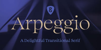
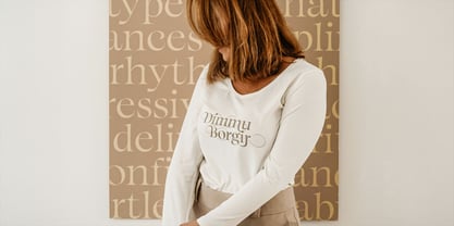
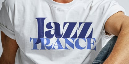
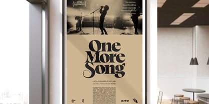
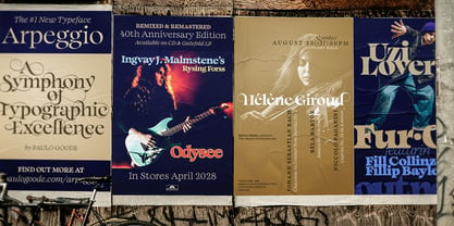
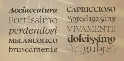
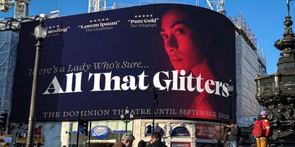
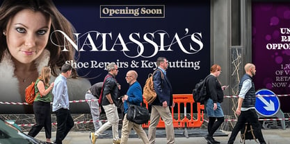
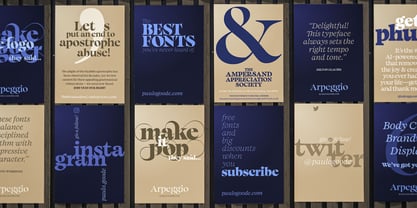
Inspired by the emotional power of music, Arpeggio is an original text typeface that balances disciplined rhythm with expressive character. It delivers clarity, confidence and effortless readability. Arpeggio’s accompanying display collection accentuate the fonts’ characterful nuances with sharpened forms, graceful swashes and exuberant flourishes. Whether your typography calls for quiet sophistication, dramatic expression, or even a virtuoso performance, Arpeggio sets the right tempo and tone.

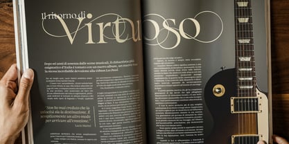
Unlock the potential of Arpeggio Display by utilising the alternates from 3 stylistic sets. These are split into short, medium, and large swashes that add distinctive flourishes to your typographic compositions.

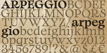
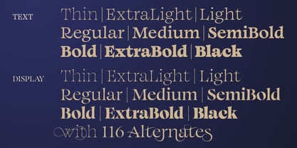
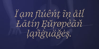
There are 27 fonts in this family across a full gamut of Thin to Black weights. Arpeggio has an extensive character set that covers all Latin European languages.

Full details along with demos, hi-res visuals and a downloadable specimen document are available from my website.

Key features:

• 9 weights

• Text & Display variants

• 116 Alternates in Display weights

• Full European character set (Latin only)

• 500+ glyphs per font.

Concepteurs: Paulo Goode

Fonderie: Paulo Goode

MyFonts débout: Sep 3, 2026

Arpeggio

À propos Paulo Goode

As a child I was fascinated by the multitude of letterforms that surround us, I would spend hours drawing words (and cars) in my sketchbooks. I don’t know what happened to those sketches, but I certainly never made it as an automobile designer! Maybe there’s a chance my fonts will prove more successful? As I grew up, I developed my artistic skills and became a technical illustrator and moved into graphic design with the advent of the Macintosh computer. At the age of 45 I rekindled my interest in typeface design and am thoroughly enjoying the process of font creation and producing some interesting typefaces of distinction. I'm still fascinated by the multitude of letterforms that surround us — and am very happy to be contributing my own.The Premium foundry page can be viewed Here.

En savoir plus

Lire moins