


Astronef Super Std
par Typofonderie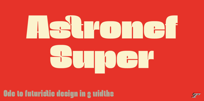
- Aa Glyphs
-
Meilleure offreOffres familiales
- Styles individuels
- Spécifications techniques
- Licences
Par style :
$72.33 USD
Paquet de 3 styles:
$217.00 USD
À propos de la famille
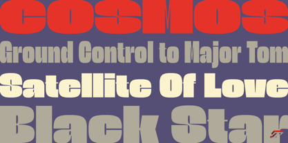
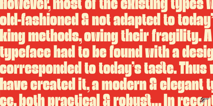
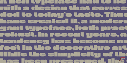
The Astronef Super borrows from the charm of retro-futuristic universes. Without concessions, and even radical, the Astronef Super, declined in three styles, pushes the weight limits as far as possible systematically while preserving a unique design.
Using the Astronef Super in large size is a real pleasure, it is a very identifiable typeface family, recognizable immediately. Undeniably, choosing the Astronef Super in your designs is not insignificant. This typeface used in large sizes will strengthen your graphic identities.
Background
The Astronef Super could be considered as the “Spin-off” of the Astronef currently being designed, that will offer an important variation of styles. Of course the Astronef, is wiser in his drawing, it places himself in the tradition of the Univers more than the Helvetica.
Genesis and the creative process
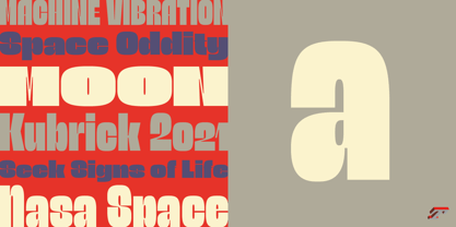
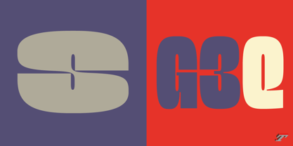
The idea for an Astronef Super comes from an excerpt from a 60s TV show which shows a logo in the background with a very bold S and this super thin in the middle.
The Astronef is already modular in its design. The brief then becomes simple for the Super: accentuate the strongest weights of the Astronef by minimizing the counterform that will remain constant for the three styles. It is the mass effect that maintains the overall cohesion of the Astronef Super family.

À propos Typofonderie
We are an independent French type foundry since 1994, we design, manufacture and distribute exclusive typefaces. Meticulously built years after years, our library includes type families suited for every aspect of typographic usage. We are passionate about our work. Each of our published typefaces is the result of years of teamwork at Typofonderie. Typofonderie is digital type foundry who has become over the years, a real institution in France and abroad. Our customers recognise the timelessness of our typefaces, which help them give meaning and strength to their projects, whether they are companies, brands, publications or institutions. Our typefaces can be found in the métro in Paris, as well as in Osaka, at the Opéra de Paris, La Tour d’Argent, Vuitton, Séphora, Galeries Lafayette, Yves Saint Laurent Beauty and are used by the French Olympic team. You will also encounter them in museums, in the Who’s Who, Wired, at Dell, at the Boston Consulting Group, on the jerseys of the French Olympic team and in the Alps thanks to SwissSki.Hillary Clinton and Emmanuel Macron used our typefaces during their presidential campaigns. The palais de l’Élysée uses three of our typefaces families for the identity and communication of the French president.
En savoir plus
Lire moins
- Le choix d'une sélection entraîne l'actualisation de la page entière.