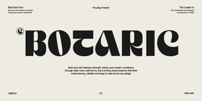
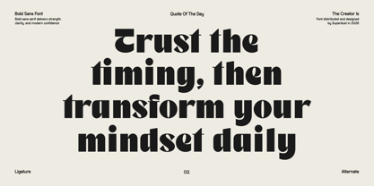
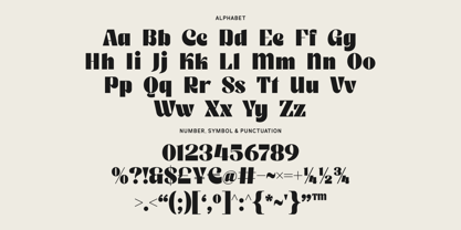
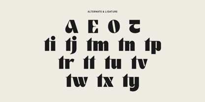
Botaric is a bold sans-serif typeface that combines confident geometry with a distinctive personality, creating a visual identity that feels both modern and unforgettable. Designed for creators who want their typography to make an immediate impact, Botaric delivers strong letterforms with carefully crafted details that balance boldness, clarity, and originality. Every character has been thoughtfully designed to create a powerful presence while maintaining exceptional readability across a wide range of applications.
The name Botaric was inspired by the idea of strength growing through creativity. It evokes a sense of structure, resilience, and innovation, making it a fitting identity for a typeface that stands out with confidence. Rather than following conventional sans serif proportions, Botaric introduces subtle yet unique characteristics that give each letter its own personality. Smooth curves blend seamlessly with sturdy vertical strokes, while carefully refined terminals and balanced spacing create a harmonious rhythm throughout the entire typeface.
Botaric is more than just a bold font—it is a statement of confidence. Its strong silhouette captures attention instantly, making every word feel energetic, expressive, and memorable. Despite its bold appearance, the typeface remains clean and versatile, allowing it to adapt effortlessly to both contemporary and timeless design styles. Whether used in large headlines or supporting branding elements, Botaric consistently delivers clarity without sacrificing character.
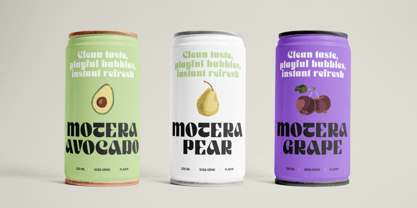
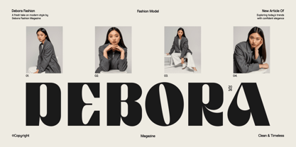
Its modern construction makes it an excellent choice for branding projects that demand a bold identity. From logos and packaging to editorial layouts, posters, advertising campaigns, apparel, product labels, social media graphics, and digital content, Botaric provides a professional yet approachable appearance. The font also performs beautifully in website headers, presentation titles, merchandise, signage, and promotional materials where strong typography plays a central role.
One of Botaric's defining qualities is its ability to communicate confidence without feeling overly aggressive. The balanced proportions and carefully shaped forms create a friendly, contemporary aesthetic that appeals to a wide variety of audiences. This versatility allows designers to pair Botaric with minimalist layouts, vibrant color palettes, or sophisticated visual systems while maintaining a consistent and polished result.
Every curve, corner, and proportion has been refined to ensure visual harmony and smooth reading performance. The generous weight gives the font remarkable visibility, while the thoughtfully engineered spacing allows words to breathe naturally. This careful balance makes Botaric suitable for both print and digital environments, ensuring consistent performance across different sizes and media.
Whether you are building a memorable brand, designing eye-catching marketing materials, or crafting bold editorial compositions, Botaric offers the perfect combination of strength, uniqueness, and modern elegance. It is a typeface created for designers who believe typography should do more than communicate—it should leave a lasting impression. With its distinctive character, confident structure, and timeless versatility, Botaric becomes a reliable creative companion for projects that demand bold visual impact and exceptional design quality.