


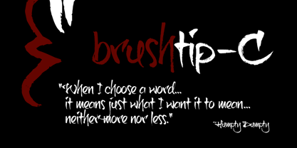
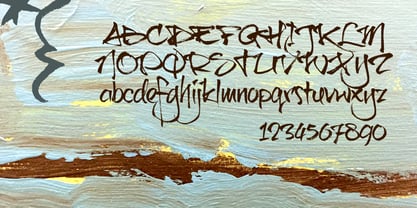
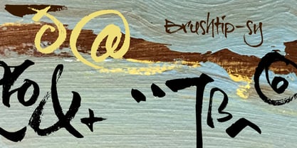
Brushtip C
par JOEBOB graphics
À propos de la famille
Slightly erratic straight up brush tip handwriting script that was written with an ‘intoxicated’ hand, with a lot of very unique characters as a result. The overall font looks wild yet very readable. It includes all eastern European, Baltic, Scandinavian and Turkish characters.

À propos JOEBOB graphics
At JOEBOB graphics we like to write. And we like to keep it real.We create our handwritten fonts in such a way that they end up looking like handwriting, not like polished scripts. We do so because we think it’s a good idea to establish a natural feel to our fonts and aim for character and intention over perfection. Little flaws we make while writing are welcomed and left in on purpose because we think it contributes to the idea of being human in an increasingly digital world.Foundry of Jeroen “Joebob” van der Ham.
En savoir plus
Lire moins
- Le choix d'une sélection entraîne l'actualisation de la page entière.