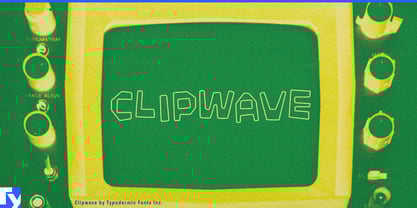
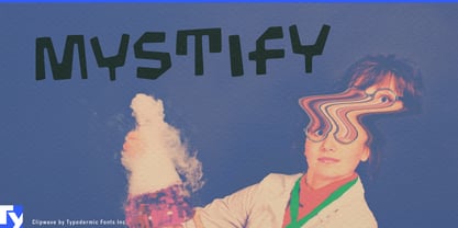
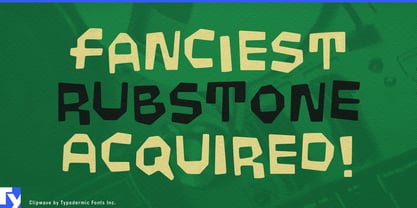
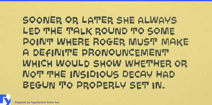
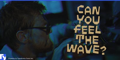
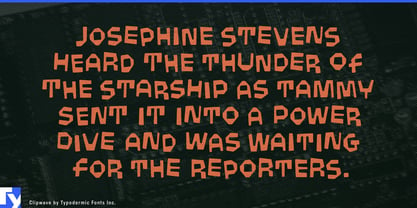
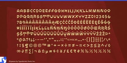
Children’s products need lettering that feels spontaneous, but spontaneity is hard to turn into a system. Hand-drawn display type can become messy, nostalgic, or inconsistent once it has to cover dozens of products, flavors, kits, expansions, signs, and advertisements. Clipwave offers controlled craziness: zany cartoon-lettering energy rebuilt through crisp digital geometry, with automatic character variation that keeps repeated letters from looking mechanically identical.
That makes Clipwave especially useful for construction and creative toys. Building-block systems, magnetic tiles, marble runs, gear kits, snap-together vehicles, robot-building sets, beginner electronics, coding toys, science kits, and mechanical construction sets all benefit from lettering that suggests invention before the box is opened. Clipwave can carry product names, kit titles, expansion packs, instruction-book covers, retail displays, and animated launch graphics while maintaining a recognizable visual language across a large range.
Its slightly robotic quality works particularly well for toys that combine physical construction with technology. Programmable creatures, motorized building systems, screen-free coding toys, modular electronics, and beginner robotics can look technical without becoming clinical. Clipwave feels systematic underneath, but playful on the surface.
Kids’ snacks and candy bring out the same energy in a different way. Sour gummies, chewy candy, fruit snacks, popping sweets, snack puffs, colorful cereal, ice pops, yogurt drinks, and lunchbox treats can use Clipwave for product names, flavor names, limited editions, and promotional bursts. The shifting letterforms add activity before mascots, color, or illustration enter the package, making the typeface especially comfortable around exaggerated flavors, strange shapes, and crowded supermarket graphics.
Clipwave also fits science centers, discovery museums, interactive engineering exhibits, children’s maker spaces, invention labs, and hands-on technology attractions. Zone names, activity stations, challenge prompts, exhibit titles, and campaign graphics can all share the same eccentric system without every sign needing to become a separate piece of hand lettering.
Underneath Clipwave’s wobble is a repeatable geometric structure; on the surface, the letters misbehave just enough to stay lively. That makes it particularly useful for products aimed at curious kids: things built around assembling, mixing, experimenting, inventing, and making a little constructive mess.