Ignorer et passer au contenu
Accéder au contenu principal

Dialup

par Typodermic
Styles individuels à partir de $69.95 USD
La famille de polices Dialup a été conçue par Ray Larabie et publiée par Typodermic. Dialup contient 1 styles. En savoir plus sur cette famille

À propos de la famille


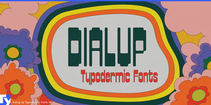
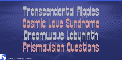
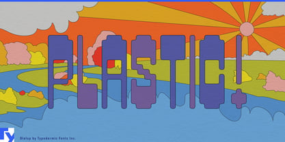
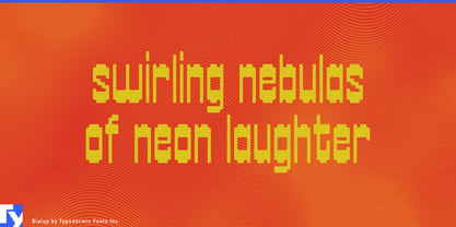
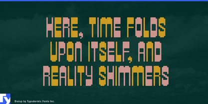
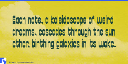
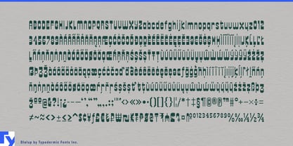
Digital lettering often becomes sharper as it becomes more technological. Dialup goes the other way. Its softened pseudo-pixel construction combines swollen horizontal strokes with pinched vertical connections, giving the letters an unusual mixture of electronic structure and confectionery mass. The grid is still visible, but it seems to have started melting.

That makes signal-processing equipment a natural fit. Fuzz pedals, phasers, delays, filters and other effects devices can use Dialup for pedal names, series identities and box graphics; the digital skeleton supplies the electronics while the rounded distortion reflects the transformation of the signal itself. Audio plug-ins and video synthesizers can use the same idea for product names and major display graphics, leaving detailed controls to a quieter companion face.

The same construction has a surprisingly convincing life around food. Bakery-cafés, pastry counters and candy shops can use Dialup for storefront names, takeaway cups, bakery boxes and large menu headings. Gummies, chewy sweets, filled chocolates and brightly packaged confections share its rounded, compressed sense of volume, while the pseudo-grid keeps the result from becoming ordinary bubble lettering.

Colorful coffee shops built around pastries, sweet drinks and seasonal specials offer another natural setting. Dialup works best when something orderly is being made softer, sweeter or stranger: a clean signal turned into fuzz, a pixel grid turned into swollen lettering, or a café identity pushed toward candy-shop exuberance.

Concepteurs: Ray Larabie

Fonderie: Typodermic

MyFonts débout: Apr 8, 2024

Dialup

À propos Typodermic

Welcome to Typodermic Fonts, a spirited type foundry rooted in Nagoya, Japan, started by the Canadian typeface designer, Raymond Larabie in 2001. Our library brims with 500+ diverse typefaces to fuel creativity in graphic design, advertising, web, and app development. As digital type pioneers, we adopted web fonts and app licensing early, consistently pushing the design envelope. With Canadian heart and Japanese precision, we're your global partners in extraordinary typography. Explore Typodermic Fonts—where creativity meets character.

En savoir plus

Lire moins
