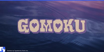
Gomoku looks like lettering cut from thick coloured paper and stacked on the table. Its chunky slab serifs, soft corners, irregular contours, and slightly clumsy joins give each letter the solidity of a small object rather than the smooth finish of conventional display type. A separate background layer can sit behind the main letterforms, turning that cut-paper construction into a two-colour graphic system.
That makes Gomoku particularly comfortable around food made to look fun. Candy bags, gummy sweets, cereal boxes, ice-cream tubs, popsicle wrappers, frosted cookies, doughnut boxes, popcorn, flavoured milk, and birthday-cake kits can use its heavy shapes almost as part of the illustration. Foreground and background colours can change with flavour or variety, letting the lettering participate in the same bright visual language as the food itself.
Family-oriented restaurants and snack shops offer the same setting. Ice-cream counters, doughnut shops, pancake restaurants, pizza places, dessert cafés, and kids’ menus can use Gomoku for names, flavours, specials, and signs that need to be noticed quickly. It belongs more naturally with sprinkles, toppings, paper cups, and party tables than with carefully distressed artisan packaging.
The cut-paper quality also gives it a strong life away from food. Children’s craft kits, sticker packs, classroom art supplies, birthday invitations, party banners, summer-camp activities, museum workshops, and school-fair graphics can treat the letters like pieces of collage. Contrasting layers can resemble stacked cardstock or stickers, while a one-colour setting keeps the same chunky silhouette when the surrounding artwork is already busy.
Gomoku can also lean into its sweeter side for Valentine candy, chocolate treats, bakery specials, and party favours. The affectionate details are already built into the letterforms, so the mood does not have to be added afterward.
This all-caps display face is built for concentrated jobs: product names, flavour names, package headings, signs, invitations, and short slogans. Gomoku works best where words are allowed to have thickness, colour, and a little awkwardness of their own; somewhere between a candy wrapper and the construction-paper table.
Keywords: birthday cake kit, birthday invitation, candy packaging, children's craft kit, classroom art supplies, construction paper style, dessert cafe signage, doughnut box lettering, family restaurant menu, flavoured milk packaging, gummy candy bag, ice cream packaging, kids menu lettering, paper collage lettering, party banner lettering, popsicle wrapper, school fair graphics, sticker pack lettering, two colour lettering, valentine candy