Hello, and welcome to the REN FONT foundry!
REN FONT has steadily built its reputation by repeatedly earning accolades in the Typeface category of the “Yearbook,” an exhibition organized by the Japan Typography Association (NPO). Founded in 2001 with the aim of bringing a fresh breeze to the font industry, REN FONT continues to create distinctive typefaces that stand out.
The hand-drawn-style fonts crafted by REN FONT’s type designer, Kazuo Kanai, have received high praise from professional designers and typographers for their exceptional quality.
A Message from Kazuo Kanai
With the exception of our comprehensive typeface Waon, our company has been particularly dedicated to producing kana fonts in the traditional Mincho and Gothic styles. Most of these fonts have been developed as multi-weight families — and there’s a good reason for that.
In Japanese text, kana characters account for roughly 70% of the total. Even so, kana fonts have little significance on their own; it is only when combined with kanji that they take on “meaning” and come to life.
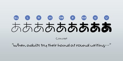
Most vendors offer font weights in seven to nine variations, from “Light” to “Ultra,” but there are no universal standards for these weight categories — each vendor defines them differently. As a result, a “Light” weight from one vendor may differ subtly in thickness from another. For kana fonts to pair harmoniously with such variations and truly come alive, a finer gradation of weights is essential.
This is why our kana fonts feature such detailed weight variations.
Simply changing the kana can greatly enrich the expression of a typeface.
We hope you will make the most of our kana fonts, blending them freely with other typefaces to create combinations that perfectly suit your taste.
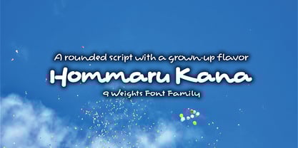
A Grown-up Taste of Rounded Characters
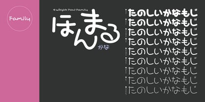
Hommaru Kana 9-Weight Font Family
Subtle traces of brushwork, a rounded style with character
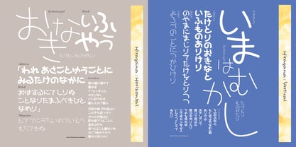
With its slightly upper-left leaning weight, this typeface carries a unique form and an intriguing rhythm born from that delicate imbalance. Traditionally, rounded Gothic fonts (maru-gothic) have a soft, POP-like impression, making them well-suited for pairing with display typefaces. ほんまるかな (Hommaru Kana) blends seamlessly even alongside existing maru-gothic fonts from other foundries, adding a warm, inviting atmosphere.
Kana in display typefaces often tend toward extreme shapes, which can make balanced text setting difficult with standard spacing. Hommaru Kana is no exception. To solve this, every character—both in vertical and horizontal typesetting—has been carefully pair-kerned. As a result, simply applying metric processing yields a well-balanced composition with minimal effort.