Many premium products are designed to disappear gracefully into the home, yet their typography still announces “technology.” Soundbars, charging docks and slim media devices sit among wood, stone, textiles and furniture, but their branding often falls back on the same clinical geometric sans used throughout consumer electronics. There is also a physical problem: long, low products provide generous horizontal space and very little height, while normal-width lettering can leave that surface underused. Honfleur turns those proportions into part of the identity.
Its exceptionally wide forms can run naturally along a soundbar chassis, desktop speaker, media hub or home-theater control unit without exaggerated tracking or artificial stretching. The design retains the sleekness expected from premium electronics, but its 1930s-derived construction brings a more cultivated character than the usual technical vocabulary. For products meant to coexist quietly with interiors, that difference can help the technology feel more like part of the room.
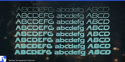
The expanded Honfleur family carries that idea beyond a single wordmark. Thin and Extra-Light can provide discreet model names on anodized metal, glass or molded housings; Regular and Semi-Bold can establish product families and launch graphics; Heavy can expand the same unmistakably wide proportions across retail displays, showroom walls and campaign photography.
Architectural lighting presents a similar dimensional advantage. Linear pendant lights, wall washers, modular track systems, illuminated mirror bars and acoustic-lighting products are themselves long horizontal objects. Honfleur can echo those proportions in collection names, packaging, specification covers, showroom graphics and exhibition stands, allowing the typography to feel integrated with the industrial design.
Beauty and personal care offer an equally literal fit when the package is chosen carefully. Refillable lipstick cases, lip-treatment sticks, solid perfume, travel fragrance cartridges and premium facial-SPF sticks provide elongated surfaces where a wide brand or product name can run along the object. Honfleur’s origins in 1930s perfume advertising make the connection natural while these refillable, portable formats move the design into contemporary product culture.
Slim beauty devices extend the same logic into technology. Microcurrent tools, treatment wands, scalp devices and long charging cases need to feel sophisticated enough for the beauty counter without resembling laboratory equipment. Honfleur can bridge those worlds, using its lighter weights directly on the device and its heavier styles for retail displays and launch campaigns.
Honfleur does not merely tolerate extreme width; it uses width as a design resource. The family can carry a horizontal identity from a discreet mark on a soundbar, lipstick case or lighting fixture to a full-scale showroom installation.