Ignorer et passer au contenu
Accéder au contenu principal

Karst

par Type Forward
Styles individuels à partir de $36.00 USD
Famille complète de 19 polices: $300.00 USD
La famille de polices Karst a été conçue par Mirela Belova, Stan Partalev et publiée par Type Forward. Karst contient 19 styles et options de package familial.

En savoir plus sur cette famille

À propos de la famille


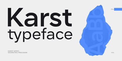
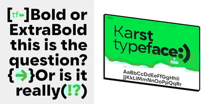
Karst is a geometric sans-serif typeface with a contemporary, edgy character.

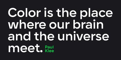
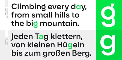
Karst combines geometric shapes with distinctive angles, ensuring clarity and readability. Its high x-height, minimal stroke contrast, and open letterforms make it suitable for both headlines and body text.

Inspiration:

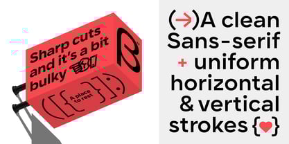
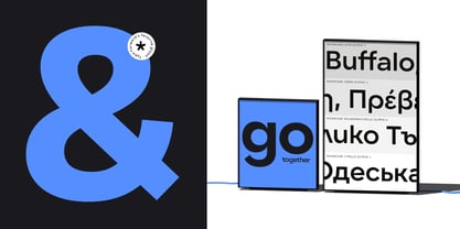
Karst is inspired by natural rock formations called Karst landscapes, known for their flowing curves and sharp edges. These contrasts influenced its precise geometric shapes and distinctive angles, making it visually appealing across web, print, branding, and editorial contexts.

Key Features:

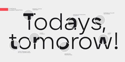
Karst features minimal horizontal and vertical stroke contrast. It has intentionally blunt and sharply cut endings and connections, particularly visible in diagonal letters such as “A,” “Y,” “K,” “M,” and “V.” Horizontal bars in letters such as “e” and “a” have sharp diagonal cuts with a lot of personality. The typeface conveys the feeling of modernity and strength.

Font Family:

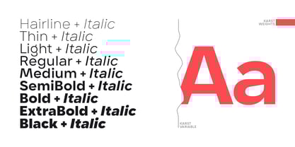
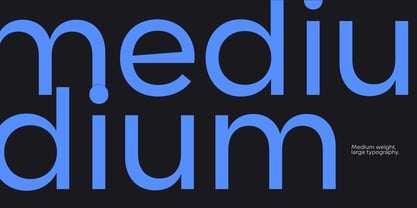
Karst has 9 weights (Thin to Black) with matching italics for a total of 18 styles, also available in variable font format. The variable font includes two axes—weight and italic—allowing dynamic customization.

Technical Details:

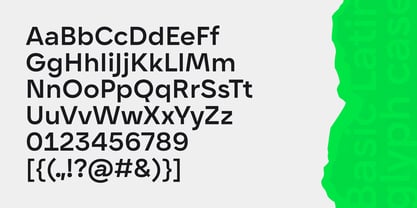
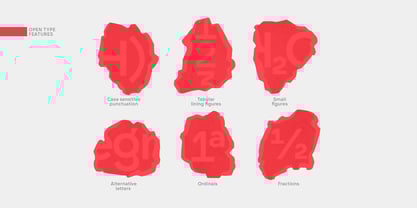
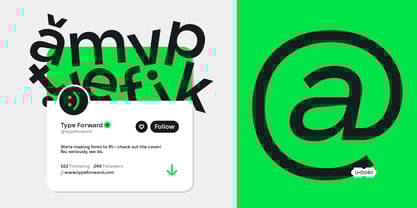
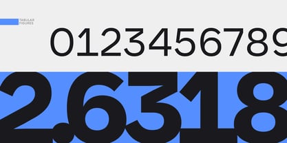
Karst supports over 220 languages, including Extended Latin, Cyrillic, and Greek. It includes advanced OpenType features, such as standard and discretionary ligatures, a stylistic set offering contemporary alternates for letters "a" and "g," tabular numbers, small figures, ordinals, case-sensitive punctuation, and localized language forms.

Recommended Use:

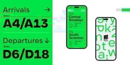
Karst works well across diverse projects. Extreme weights excel in headlines and branding, while medium weights remain legible in shorter, small-body texts, which would benefit from a modern, contemporary feel. It is optimized to perform equally well on screens and in print.

Overview:

Karst combines the clarity of geometric sans-serifs with unique contemporary details, making it distinctive and versatile for various design applications.

Classification: Geometric Sans Serif

Ideal Applications:

  • Body Text

  • Headlines & Titles

  • Digital & Web

  • Print Media

  • Logos & Identity

  • Branding & Editorial

Languages Supported:

  • Latin

  • Extended Latin

  • Cyrillic

  • Greek

Concepteurs: Mirela Belova, Stan Partalev

Éditeur: Type Forward

Fonderie: Type Forward

Maître d'ouvrage: Type Forward

MyFonts débout: Mar 24, 2025

Karst

À propos Type Forward

Type Forward is a type design studio nestled in the heart of Sofia, Bulgaria. We, Stan Partalev and Mirela Belova, founded Type Forward in 2020, building upon our extensive collaborative experience in typeface design. Our studio’s journey began long before its inception, rooted in a shared passion for creating functional typefaces.At Type Forward, we specialize in crafting high-quality retail and custom fonts. Our approach is always forward-thinking, staying abreast of new technologies to ensure our fonts stand out in the ever-evolving design landscape. Our background in graphic design has honed our skills and instilled in us a profound appreciation for functional, thoughtfully designed typefaces.Every font we create is a labor of love, meticulously designed with attention to every curve and stroke. We believe in the power of detail, dedicating time to refine each aspect of our typefaces before they reach the market. We aim to blend visual appeal with functionality, creating versatile and typefaces suitable for various applications.Our studio’s strength lies in the synergy between Stan’s artistic design and craftsmanship and Mirela’s technical acumen. This combination enables us to produce aesthetically pleasing and practical fonts across various contexts. Our portfolio showcases retail and custom fonts uniquely tailored to meet diverse needs.A pivotal aspect of our work is aiding brands in crafting their unique visual identity. We understand typography’s critical role in brand representation and engage closely with our clients. Our collaborative approach helps them choose or develop custom fonts that resonate deeply with their brand’s personality and ethos. We see typography as a cornerstone in effectively articulating a brand’s story and enhancing its visual language.As we continue in the type design industry, our commitment remains steadfast: to assist brands in expressing their distinct character through typography. Our graphic design roots underline the importance of marrying aesthetic quality with practicality, a philosophy guiding every project at Type Forward.

En savoir plus

Lire moins