


Le Monde® Sans Std
par Typofonderie

- Aa Glyphs
-
Meilleure offreOffres familiales
- Styles individuels
- Spécifications techniques
- Licences
Par style :
$53.62 USD
Paquet de 8 styles:
$429.00 USD
À propos de la famille
Humanist sans in 8 styles
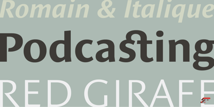
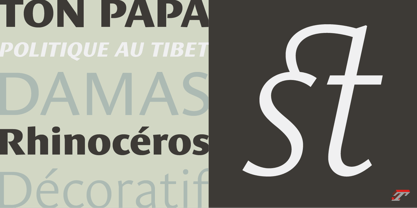
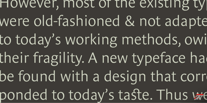
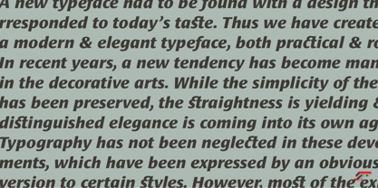
Designed by Jean François Porchez, Le Monde Sans is a sanserif based on Le Monde Journal — a practice that become commonplace from early nineties. Designed originally in 1994 for the Le Monde newspapers, it was expended over the years to the large family we know today. Le Monde Sans features a “traditional g” in addition to the usual 1994’s g. Le Monde Sans is offered in numerous weights — in roman, italic to meet all kinds of situations. It will help designers to select the best weights depending their needs, from glossy paper printing to high resolution screen.
Superfamily
The design of Le Monde Sans continues the basic common structure found in the members of the Le Monde family: its proportions, a relatively narrow width, a fairly oblique axis, etc. The typographer can, at all times, switch between Sans & Journal or Courrier without any disruption in the composition. The verticals metrics and proportions of Le Monde Sans are calibrated to match perfectly others Typofonderie families.
This family was designed in 1994 as bespoke typeface family for the French newspaper Le Monde. The family is not used any more by this newspaper from November 2005.
Type Directors Club .44 1998
European Design Awards 1998

À propos Typofonderie
We are an independent French type foundry since 1994, we design, manufacture and distribute exclusive typefaces. Meticulously built years after years, our library includes type families suited for every aspect of typographic usage. We are passionate about our work. Each of our published typefaces is the result of years of teamwork at Typofonderie. Typofonderie is digital type foundry who has become over the years, a real institution in France and abroad. Our customers recognise the timelessness of our typefaces, which help them give meaning and strength to their projects, whether they are companies, brands, publications or institutions. Our typefaces can be found in the métro in Paris, as well as in Osaka, at the Opéra de Paris, La Tour d’Argent, Vuitton, Séphora, Galeries Lafayette, Yves Saint Laurent Beauty and are used by the French Olympic team. You will also encounter them in museums, in the Who’s Who, Wired, at Dell, at the Boston Consulting Group, on the jerseys of the French Olympic team and in the Alps thanks to SwissSki. Hillary Clinton and Emmanuel Macron used our typefaces during their presidential campaigns. The palais de l’Élysée uses three of our typefaces families for the identity and communication of the French president.
En savoir plus
Lire moins
- Le choix d'une sélection entraîne l'actualisation de la page entière.