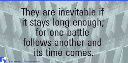
Some technical organizations need to look official before they look futuristic. A conventional neo-grotesk provides credibility but can feel too familiar; a conspicuous sci-fi face establishes the setting at the cost of plausibility. Order occupies the space between them.
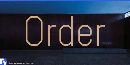
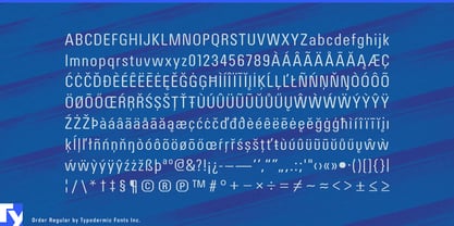
The design was deliberately built around Univers-like proportions, then pushed into a smooth octagonal construction. That familiar modernist skeleton gives Order an institutional, standardized quality, while the altered curves and corners make it feel slightly removed from ordinary corporate typography.
Order is especially useful for believable near-future institutions. Orbital freight authorities, lunar construction consortia, fusion-energy institutes, autonomous-transit operators and spaceport administrations need typography for departments, sectors, facilities and programs that feels routine inside the fictional world. Order can carry organization names, division headings, station sectors, vehicle classes and location graphics without turning every label into a declaration of science fiction.
Games and screen entertainment built around systems rather than spectacle can use the same logic. Infrastructure-management games, near-future thrillers, orbital-industry simulations and research-facility narratives need names for districts, contractors, agencies, cargo classes and controlled environments. Order works especially well on the institutional layer: the organizations and systems that make the world function.
Real infrastructure projects present a related problem. High-speed rail expansions, tunnel programs, offshore wind developments, district-energy systems, data-center campuses and major urban redevelopments all need public-facing identities in addition to engineering documentation. Order can handle project names, construction-hoarding headlines, stakeholder presentations, exhibition panels and milestone graphics with a technical tone that feels planned rather than decorative.
Engineering documentaries and megaproject media can use Order for titles, episode cards, location graphics and diagram headings covering automated ports, rail systems, satellite infrastructure, offshore energy and advanced manufacturing. Industrial-design exhibitions and research institutes can use the same language for exhibition titles, chronology bands, program names and showcase graphics.
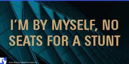
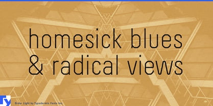
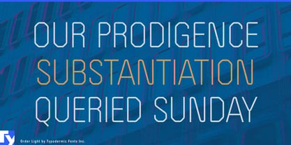
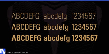
Light, Regular and Bold weights with matching italics provide enough variation to build a compact display hierarchy. Order is for institutions, projects and fictional organizations that need to feel standardized and credible first, with the future arriving only in the details.