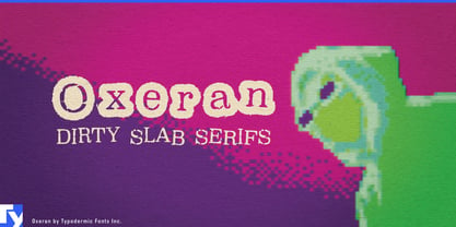
Distressed type often solves the headline and creates a new problem everywhere else. Once a layout needs a second line, a model name, an event date, or short supporting copy, heavy damage can start competing with the message. Oxeran keeps the abrasion while giving it a sturdier structure to work with.
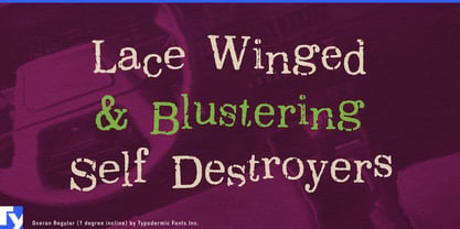
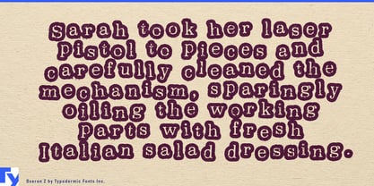
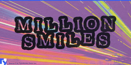
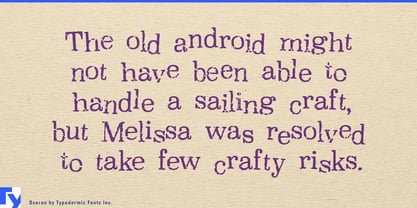
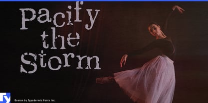
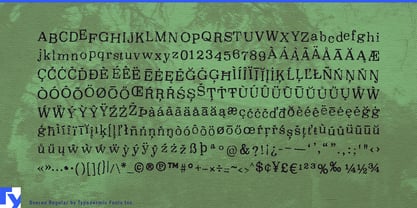
Built on Clarendon proportions and familiar slab-serif forms, Oxeran remains recognizable beneath its rough edges, scuffs, and irregular surface. The regular style keeps the texture relatively open, making it useful for substantial headlines, product names, event information, and short promotional copy. Oxeran Z pushes the treatment much harder, producing a darker, rougher display style for compact titles and focal words. Used together, the two styles can create a complete distressed hierarchy instead of forcing one extreme treatment across the entire design. Ligature alternates introduce variation in common letter combinations, helping repeated shapes avoid an obvious mechanical pattern.
That combination works especially well for products designed to age visibly. Raw denim, welted boots, waxed-canvas outerwear, utility bags, work gloves, forged tools, motorcycle parts, and workshop equipment can use Oxeran for collection names, hangtags, boot-box graphics, dealer displays, and campaign headlines. The wear feels appropriate around materials expected to acquire scratches, creases, repairs, and patina.
Oxeran also suits sports where the equipment comes back dirty. Enduro, motocross, rally raid, downhill mountain biking, boxing, MMA, and strongman events can use Oxeran Z for race names, fighter surnames, and major matchup graphics while Oxeran handles course names, sponsor headings, merchandise, pit banners, and supporting display text.
For entertainment work, Oxeran is a natural fit for weird-West games, frontier horror, abandoned mining settlements, alternate histories, and machinery-heavy survival worlds. Its Clarendon ancestry provides a connection to old commercial printing, while the damaged surface shifts that language toward something weathered, reused, or left behind. Titles, chapter cards, settlement names, faction headings, wanted notices, and in-world printed artifacts can all draw from the same visual system.
Against immaculate fashion or footwear photography, Oxeran can work for a different reason. Oversized collection names, editorial headlines, lookbook dividers, and campaign phrases gain tension from the contrast between polished imagery and battered typography.
Oxeran starts with letters tough enough to survive the treatment. That underlying structure is what lets the family move beyond a single scarred headline and into a broader visual system.