
Ignorer et passer au contenu
Accéder au contenu principal

Panfleta Stencil

par deFharo
Styles individuels à partir de $15.00 USD
Famille complète de 5 polices: $60.00 USD
La famille de polices Panfleta Stencil a été conçue par Fernando Haro et publiée par deFharo. Panfleta Stencil contient 5 styles et options de package familial. En savoir plus sur cette famille

À propos de la famille


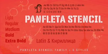
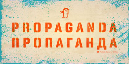
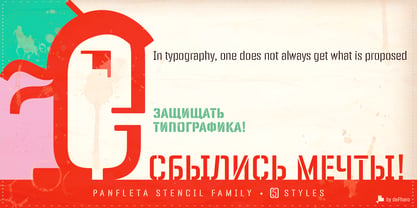
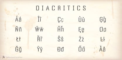
Panfleta Stencil is a rounded typography sans serif, template style with geo-grotesque modulation, semi condensed, with short descending and ascending above the height of capitals and a high height of the x to compose very legible texts in small sizes. The round finish of the corners bring personality and warmth to the pure geometric development of this typeface. The careful study of the metrics and the meticulous configuration of the Kerning make a set of reliable fonts for use in both editorial design and advertising.

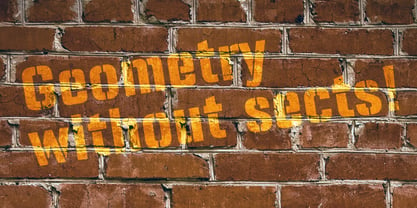
The inspiration for this family of fonts comes from the old pamphlets and political propaganda posters of the early and mid 20th century, in this case the stenciled design adds industrial, military or commercial connotations being perfect for the design of posters, packaging or advertising.

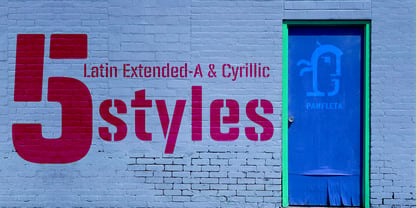
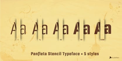
The typography is composed of 5 styles, from the finest (Light) to the thickest (Extra Bold), all of them specially designed for advertising and editorial composition, behaving seriously in paragraph texts as well as in big headlines.

Concepteurs: Fernando Haro

Fonderie: deFharo

MyFonts débout: Dec 3, 2024

Panfleta Stencil

À propos deFharo

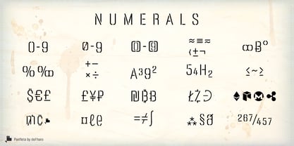
deFharo is the independent type foundry of Spanish graphic and type designer Fernando Haro. With more than 30 years of experience in graphic and advertising design and over a decade devoted to typeface design, Fernando Haro has developed an eclectic body of work that ranges from editorial and corporate typefaces to expressive display, geometric, technological, retro and experimental designs. His approach combines visual character with typographic functionality. Every typeface begins with drawing, proportion and a clear visual idea, and evolves through meticulous work on spacing, metrics, kerning, optical corrections and OpenType features. Rather than following a single recognizable style, deFharo explores different typographic territories according to the personality and purpose of each project. Some families are designed for long-form reading and editorial systems; others are built for branding, headlines, packaging, signage or highly expressive graphic compositions. A strong interest in vector drawing, typographic systems and functional design runs throughout the collection. Alternative characters, small caps, Petite Caps, fractions, numerals, ligatures, symbols and extended language support are frequently developed as integral parts of the typeface rather than as afterthoughts. The result is a growing collection of typefaces designed to be both distinctive and useful — fonts with personality, but also with the technical precision required for professional graphic and editorial work. deFharo typefaces are designed by Fernando Haro and published independently from Spain.

En savoir plus

Lire moins