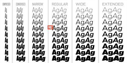
PG Grotesque Compressed Thin
PG Grotesque Compressed ExtraLight
PG Grotesque Compressed Light
PG Grotesque Compressed
PG Grotesque Compressed Medium
PG Grotesque Compressed SemiBold
PG Grotesque Compressed Bold
PG Grotesque Compressed ExtraBold
PG Grotesque Compressed Ultra
PG Grotesque Condensed Thin
PG Grotesque Condensed Thin Italic
PG Grotesque Condensed ExtraLight
PG Grotesque Condensed ExtraLight Italic
PG Grotesque Condensed Light
PG Grotesque Condensed Light Italic
PG Grotesque Condensed
PG Grotesque Condensed Italic
PG Grotesque Condensed Medium
PG Grotesque Condensed Medium Italic
PG Grotesque Condensed SemiBold
PG Grotesque Condensed SemiBold Italic
PG Grotesque Condensed Bold
PG Grotesque Condensed Bold Italic
PG Grotesque Condensed ExtraBold
PG Grotesque Condensed ExtraBold Italic
PG Grotesque Condensed Ultra
PG Grotesque Condensed Ultra Italic
PG Grotesque Narrow Thin
PG Grotesque Narrow Thin Italic
PG Grotesque Narrow ExtraLight
PG Grotesque Narrow ExtraLight Italic
PG Grotesque Narrow Light
PG Grotesque Narrow Light Italic
PG Grotesque Narrow
PG Grotesque Narrow Italic
PG Grotesque Narrow Medium
PG Grotesque Narrow Medium Italic
PG Grotesque Narrow SemiBold
PG Grotesque Narrow SemiBold Italic
PG Grotesque Narrow Bold
PG Grotesque Narrow Bold Italic
PG Grotesque Narrow ExtraBold
PG Grotesque Narrow ExtraBold Italic
PG Grotesque Narrow Ultra
PG Grotesque Narrow Ultra Italic
PG Grotesque Thin
PG Grotesque Thin Italic
PG Grotesque ExtraLight
PG Grotesque ExtraLight Italic
PG Grotesque Light
PG Grotesque Light Italic
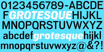
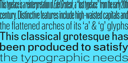
PG Grotesque Regular
PG Grotesque Italic
PG Grotesque Medium
PG Grotesque Medium Italic
PG Grotesque SemiBold
PG Grotesque SemiBold Italic
PG Grotesque Bold
PG Grotesque Bold Italic
PG Grotesque ExtraBold
PG Grotesque ExtraBold Italic
PG Grotesque Ultra
PG Grotesque Ultra Italic
PG Grotesque Wide Thin
PG Grotesque Wide Thin Italic
PG Grotesque Wide ExtraLight
PG Grotesque Wide ExtraLight Italic
PG Grotesque Wide Light
PG Grotesque Wide Light Italic
PG Grotesque Wide
PG Grotesque Wide Italic
PG Grotesque Wide Medium
PG Grotesque Wide Medium Italic
PG Grotesque Wide SemiBold
PG Grotesque Wide SemiBold Italic
PG Grotesque Wide Bold
PG Grotesque Wide Bold Italic
PG Grotesque Wide ExtraBold
PG Grotesque Wide ExtraBold Italic
PG Grotesque Wide Ultra
PG Grotesque Wide Ultra Italic
PG Grotesque Extended Thin
PG Grotesque Extended Thin Italic
PG Grotesque Extended ExtraLight
PG Grotesque Extended ExtraLight Italic
PG Grotesque Extended Light
PG Grotesque Extended Light Italic
PG Grotesque Extended
PG Grotesque Extended Italic
PG Grotesque Extended Medium
PG Grotesque Extended Medium Italic
PG Grotesque Extended SemiBold
PG Grotesque Extended SemiBold Italic
PG Grotesque Extended Bold
PG Grotesque Extended Bold Italic
PG Grotesque Extended ExtraBold
PG Grotesque Extended ExtraBold Italic
PG Grotesque Extended Ultra
PG Grotesque Extended Ultra Italic