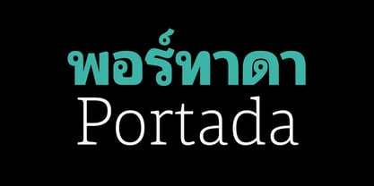
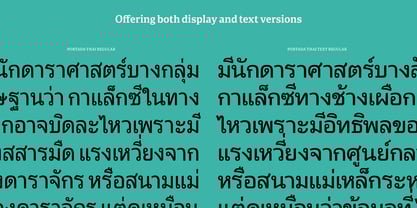
For everyone wishing for a modern looped Thai family that’s clear and readable in restrictive digital environments, meet Portada Thai by Pilar Cano (original Latin by Veronika Burian and José Scaglione). Modern looped styles need to save space and carry a modern tone on small screens to remain viable. They cannot appear fickle and unsteady or suffer from changing pixel grids from one product to another. Portada Thai now provides a looped option for these restrictive digital environments. The screen has met its match. Portada Thai was created from and for the digital world — from e-ink or harsh grids to Retina capability — making it one of the few looped typefaces of its kind. Portada Thai’s text and titling styles were engineered for superlative performance, making great use of loops, wide proportions, ample height, clear interior negative space, and its subservient personality. After all, words should always take priority in text, not the appearance of the typeface being read. It’s not all business, though. Portada Thai has some unexpected energy throughout the family. The terminals aren't too flourished or flashy so they retain their clarity in digital use. When printed these details are downright comforting. For everyone wishing for a modern looped Thai family that’s clear and readable in restrictive digital environments, meet Portada Thai by Pilar Cano (original Latin by Veronika Burian and José Scaglione). Modern looped styles need to save space and carry a modern tone on small screens to remain viable. They cannot appear fickle and unsteady or suffer from changing pixel grids from one product to another. Portada Thai now provides a looped option for these restrictive digital environments. The screen has met its match.
Portada Thai was created from and for the digital world — from e-ink or harsh grids to Retina capability — making it one of the few looped typefaces of its kind. Portada Thai’s text and titling styles were engineered for superlative performance, making great use of loops, wide proportions, ample height, clear interior negative space, and its subservient personality. After all, words should always take priority in text, not the appearance of the typeface being read.
It’s not all business, though. Portada Thai has some unexpected energy throughout the family. The terminals aren't too flourished or flashy so they retain their clarity in digital use. When printed these details are downright comforting.
Portada Thai’s titling styles have increased expressiveness across a few characters rather than maxing out the personality in each individual glyph. They enact slight changes while reducing the individual width of each character and keeping the internal space clear.
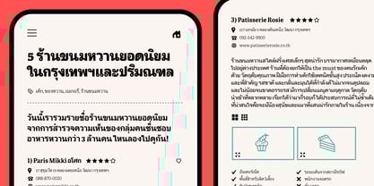
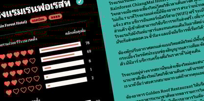
Digital magazines, newspapers, your favourite novel, and all forms of continuous screen reading benefit from Portada Thai’s features, which includes the entire Latin script within the Thai bundle for multiscript use. This family also covers many of the needs developers have: user interface, showing data intensive apps on screen, even one-word directives and dialog boxes. And, as a free download, an exhaustive set of dark and light icons is included to maintain Portada Thai’s consistent presence, whether as a word or an image.
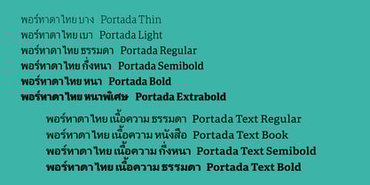
The complete Portada Thai family (four text styles, six titling styles, the two-style icon set, and the entire matching Latin script) is designed for extensive, clear, multiscript use — a rare looped design made specifically for screens.