Prinkle
par Fontasmic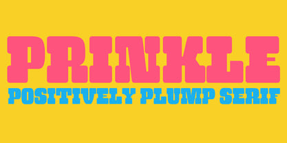


À propos de la famille
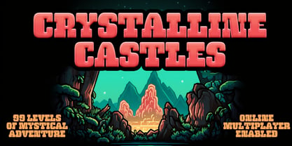
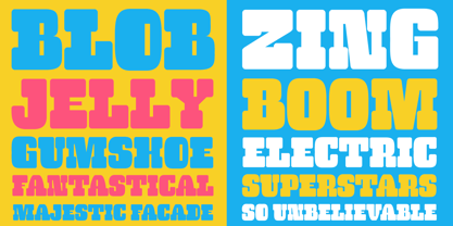
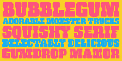
Prinkle comes from my love of old beefy wood type and funky film types mashed together. Fat serif love meets plump and rounded lusciousness. A bubblegum chewy serif with playful weighting and letterforms and squared off counters. Prinkle is like a squeezy stress ball for design play.
Concepteurs: Sawyer Hume
Éditeur: Fontasmic
Fonderie: Fontasmic
Maître d'ouvrage: Fontasmic
MyFonts débout: Mar 25, 2024
À propos Fontasmic
Fontasmic is a type foundry born from a deep affection for the tactile soul of wood type, the spontaneous beauty of ephemeral design, and the charm of typography that refuses to follow the rules. Each Fontasmic creation celebrates the unpredictable—where classic craftsmanship meets a restless curiosity for the offbeat and the obscure. Drawing inspiration from vintage posters, forgotten sign painting traditions, and the imperfect textures of print history, Fontasmic channels the spirit of typographic exploration into every curve and counter. With a collection that thrives on character and quirk, the foundry embraces both the wild and the refined—fonts that carry stories, personalities, and a hint of rebellion. Whether bold and brash or subtle and strange, Fontasmic typefaces are made for designers who seek more than letters on a page—they seek emotion, history, and the spark of the unexpected.
En savoir plus
Lire moins
- Le choix d'une sélection entraîne l'actualisation de la page entière.


