
Ignorer et passer au contenu
Accéder au contenu principal

Prixma Sans

par deFharo
Styles individuels à partir de $10.00 USD
Famille complète de 12 polices: $90.00 USD
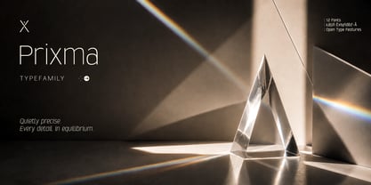
La famille de polices Prixma Sans a été conçue par Fernando Haro et publiée par deFharo. Prixma Sans contient 12 styles et options de package familial. En savoir plus sur cette famille

À propos de la famille


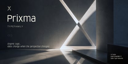
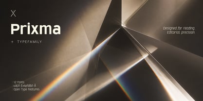
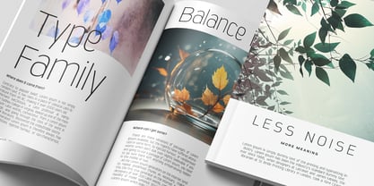
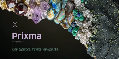
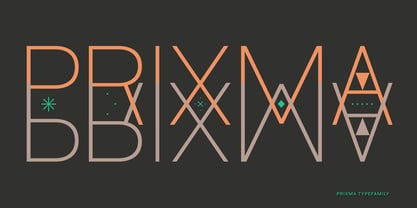
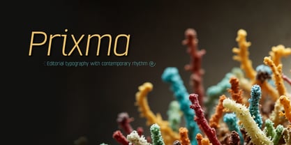
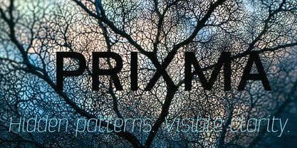
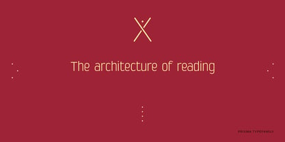
Prixma is a sans-serif typeface family designed for editorial design, visual identity, and communication systems where clarity, consistency, and legibility are essential.

Its construction combines carefully balanced proportions with a serene design and a uniform texture that remains consistent from small sizes to headlines.

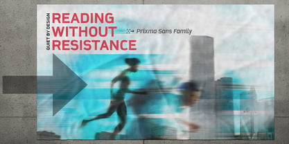
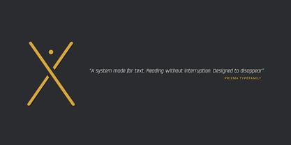
Each character has been refined through a continuous process of optical adjustments, spacing, and professional kerning, with a single objective: to ensure a natural reading experience.

The result is a contemporary, clean, and versatile typeface family, capable of integrating seamlessly into editorial publications as well as branding projects, information design, interfaces, signage, and corporate communications.

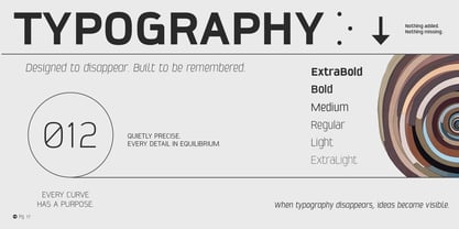
Available in Extra Light, Light, Regular, Medium, Bold and Extra Bold weights, along with their corresponding Italic versions, Prixma maintains a consistent voice throughout the family.

Concepteurs: Fernando Haro

Fonderie: deFharo

MyFonts débout: Aug 31, 2026

Prixma Sans

À propos deFharo

deFharo is the independent type foundry of Spanish graphic and type designer Fernando Haro. With more than 30 years of experience in graphic and advertising design and over a decade devoted to typeface design, Fernando Haro has developed an eclectic body of work that ranges from editorial and corporate typefaces to expressive display, geometric, technological, retro and experimental designs. His approach combines visual character with typographic functionality. Every typeface begins with drawing, proportion and a clear visual idea, and evolves through meticulous work on spacing, metrics, kerning, optical corrections and OpenType features. Rather than following a single recognizable style, deFharo explores different typographic territories according to the personality and purpose of each project. Some families are designed for long-form reading and editorial systems; others are built for branding, headlines, packaging, signage or highly expressive graphic compositions. A strong interest in vector drawing, typographic systems and functional design runs throughout the collection. Alternative characters, small caps, Petite Caps, fractions, numerals, ligatures, symbols and extended language support are frequently developed as integral parts of the typeface rather than as afterthoughts. The result is a growing collection of typefaces designed to be both distinctive and useful — fonts with personality, but also with the technical precision required for professional graphic and editorial work. deFharo typefaces are designed by Fernando Haro and published independently from Spain.

En savoir plus

Lire moins