Ignorer et passer au contenu
Accéder au contenu principal

Quanty

par Slava Antipov
Styles individuels à partir de $35.00 USD $24.50 USD
30% Off
La famille de polices Quanty a été conçue par Slava Antipov et publiée par Slava Antipov. Quanty contient 1 styles. En savoir plus sur cette famille

À propos de la famille


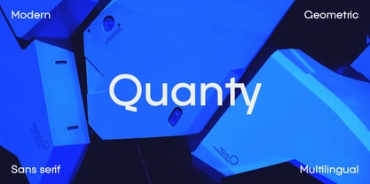
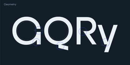
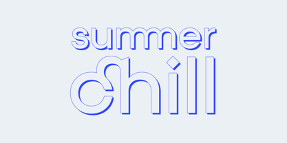
Quanty is a modern geometric sans serif that combines a clean, minimalist construction with distinctive display details. Its restrained geometry gives the typeface a precise and contemporary foundation, while its characteristic forms and carefully designed details give it a more individual visual voice.

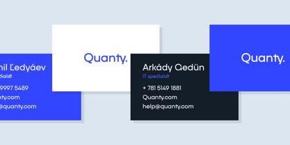
Designed for modern graphic design, Quanty works particularly well for branding, logos, headlines, posters, advertising, packaging, editorial design, websites, presentations, and other applications where clean typography needs a distinctive edge.

The typeface was created as a versatile display-oriented sans serif that can remain controlled and functional without becoming generic. Its geometric structure makes it easy to integrate into identity systems, while its unusual details allow designers to add personality where standard geometric sans serifs might feel too familiar.

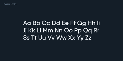
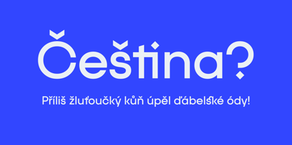
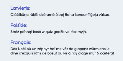
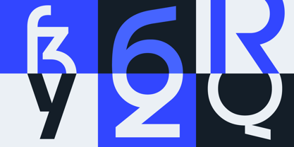
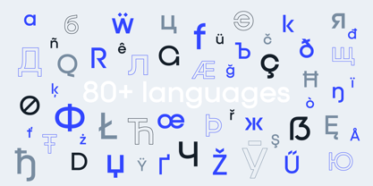
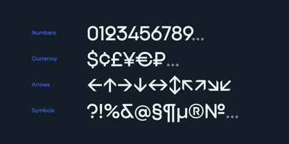
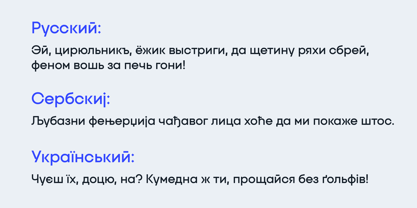
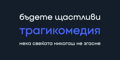
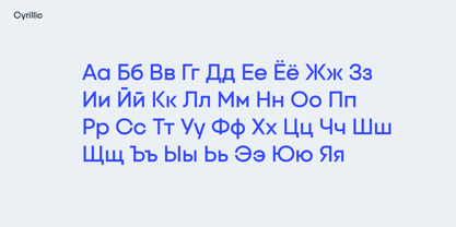
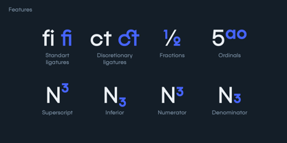
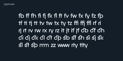
Quanty contains 643 glyphs and supports Latin and Cyrillic scripts with broad multilingual coverage. Its features include standard and discretionary ligatures, Romanian and Bulgarian localized forms, fractions, numerator and denominator figures, superscript and subscript figures, monospaced figures, and case-sensitive forms.

Quanty's combination of minimal geometry, sharp construction, distinctive details, and extensive functionality makes it a strong choice for designers looking for a clean sans serif with a recognizable visual signature.

Concepteurs: Slava Antipov

Fonderie: Slava Antipov

MyFonts débout: Oct 5, 2021

Quanty

À propos Slava Antipov

Slava Antipov is an independent typeface designer focused on contemporary type families, with a particular interest in grotesques and sans serifs. His work explores the balance between functional typography and distinctive visual character, combining geometric construction, expressive details, varied proportions, and flexible typographic systems. Slava creates typefaces for a wide range of contemporary design applications, from branding and visual identities to editorial design, packaging, posters, digital products, and display typography. His families often explore multiple weights, widths, styles, and advanced typographic features, with an emphasis on creating useful and versatile systems rather than isolated typefaces. Multilingual typography is an important part of his work. Latin and Cyrillic have been the foundation of his typefaces from the beginning, while newer projects increasingly expand into Greek and Vietnamese and explore additional writing systems. He is particularly interested in developing high-quality typefaces that make contemporary typography more accessible to designers working across different languages and writing systems. While contemporary grotesques remain the main focus of his work, Slava continues to explore new typographic directions, visual approaches, and writing systems as his type library grows.

En savoir plus

Lire moins