


Ignorer et passer au contenu
Accéder au contenu principal

Reagan

par Typodermic
Styles individuels à partir de $69.95 USD
La famille de polices Reagan a été conçue par Ray Larabie et publiée par Typodermic. Reagan contient 1 styles. En savoir plus sur cette famille

À propos de la famille


The 1980s are often remembered through neon grids, chrome lettering, Memphis patterns, and synthetic futurism. Most people actually spent the decade surrounded by something less glamorous: beige carpet, brass trim, woodgrain, rust-and-umber décor, family restaurants, mall shops, bowling alleys, and decorative lettering inherited from the seventies. Reagan comes from that more ordinary visual world.

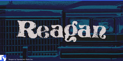
Its underlying forms are based on Pretorian, a decorative serif once common on restaurant signs, framing shops, menus, and other small-business graphics. Reagan pushes that familiar structure toward another period object: the worn local-business T-shirt.

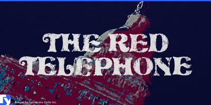
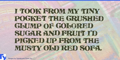
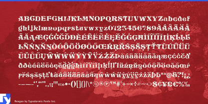
The texture was developed from acrylic paint applied to jersey fabric, then cracked and flexed to produce the irregular breaks of an aging screen print. The result resembles ink that has spent years stretching across cotton rather than generic digital distress. Ligatures vary recurring combinations, helping the wear avoid obvious mechanical repetition.

That makes Reagan especially convincing for family-restaurant shirts, bowling-league tees, campground souvenirs, county-fair merchandise, softball fundraisers, ski-lodge gift-shop graphics, anniversary shirts, and other artifacts of local history. It also works well for period props: a faded pizzeria staff shirt, motel souvenir, framing-shop logo, garden-center tee, or community-event graphic can establish the everyday late-1970s or 1980s setting without leaning on the usual retro clichés.

Reagan is strongest at display sizes where its decorative construction and cracked texture can both register clearly. It recalls the less fashionable side of the era; local businesses, souvenir shirts, community events, and aging screen prints from a decade that was usually much browner than nostalgia remembers.

Concepteurs: Ray Larabie

Fonderie: Typodermic

MyFonts débout: Jan 8, 2008

Reagan

À propos Typodermic

Welcome to Typodermic Fonts, a spirited type foundry rooted in Nagoya, Japan, started by the Canadian typeface designer, Raymond Larabie in 2001. Our library brims with 500+ diverse typefaces to fuel creativity in graphic design, advertising, web, and app development. As digital type pioneers, we adopted web fonts and app licensing early, consistently pushing the design envelope. With Canadian heart and Japanese precision, we're your global partners in extraordinary typography. Explore Typodermic Fonts—where creativity meets character.

En savoir plus

Lire moins
