


Sélectionnez ce type de licence lorsque vous développez une application pour iOS, Android ou Windows Phone et que vous intégrez le fichier de fonte dans le code de votre application mobile.
Seibi Ai
par Nihon Literal
Styles individuels à partir de
$169.00 USD
Famille complète de 2 polices: $338.00 USD

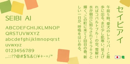
La famille de polices Seibi Ai
a été conçue par
et publiée par
Nihon Literal. Seibi Ai contient
2
styles et options de package familial.
En savoir plus sur cette famille
- Aa Glyphs
-
Meilleure offreOffres familiales
- Styles individuels
- Spécifications techniques
- Licences
Par style :
$169.00 USD
Paquet de 2 styles:
$338.00 USD
À propos de la famille
This typeface combines the rhythmic movement of Mincho and the simplicity of Gothic, with a rounded finish for a touch of elegance and style.
明朝のリズム感とゴシックのシンプルさに加え、ラウンド処理することでエレガントでおしゃれなイメージを求めた書体です。タテ画は太く、ヨコ方向はそれより細く、ハネなどはさらに細く、という三段階処理が施されています。昭和50 年(1975 年)頃、レタリング文字として開発。その後デザイン調整を経てフォント化されました。
Concepteurs:
Éditeur: Nihon Literal
Fonderie: Nihon Literal
Maître d'ouvrage: Nihon Literal
MyFonts débout: Mar 15, 2019
Seibi Ai
À propos Nihon Literal
Since its foundation, Nihon Literal has accumulated trust and a successful track record mainly in the production of characters used for the headings of book advertisements by publishers and newspaper companies. Among them, "Seibi Font" is a unique typeface brand created to satisfy a customer's request for a font that does not exist in print and typesetting and cannot be represented with existing characters. We will continue to combine the technologies and know-how that have been cultivated over the years in the development of "Seibi Font" and bring passion to the making of fonts by paying attention to details while foremost thinking about customers who wish to convey their sentiments. 日本リテラルは創業以来、主に出版社や新聞社の書籍広告における見出し用文字の制作に携わりながら、多くの信頼と実績を積み重ねてまいりました。 その中で、活字や写植にない書体、または既成の文字では表現できない書体がほしい、というお客様のご要望に応えて誕生した独自の書体ブランド、それが「セイビフォント」です。 これからも私たちは、セイビフォント開発において長年培ってきた技術とノウハウを結集し、思いを伝えたい人のことを第一に考えながら、細部にまでこだわった書体づくりに情熱を注ぎ続けてまいります。
En savoir plus
Lire moins
- Le choix d'une sélection entraîne l'actualisation de la page entière.