


Sélectionnez ce type de licence lorsque vous développez une application pour iOS, Android ou Windows Phone et que vous intégrez le fichier de fonte dans le code de votre application mobile.
Seibi Takanawa
par Nihon Literal
Styles individuels à partir de
$169.00 USD
Famille complète de 4 polices: $676.00 USD

La famille de polices Seibi Takanawa
a été conçue par
et publiée par
Nihon Literal. Seibi Takanawa contient
4
styles et options de package familial.
En savoir plus sur cette famille
- Aa Glyphs
-
Meilleure offreOffres familiales
- Styles individuels
- Spécifications techniques
- Licences
Par style :
$169.00 USD
Paquet de 4 styles:
$676.00 USD
À propos de la famille
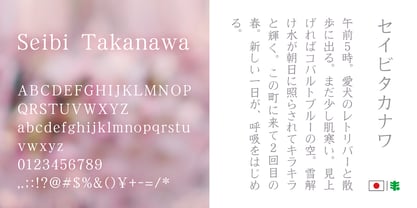
The typeface category is classified as a Kaisho script, but it features a design closer to a textbook style, with slightly softened contrasts typical of Kaisho. The kana characters are designed slightly larger, ensuring proper alignment when typesetting. This Kaisho series offers four weights: L (Light), M (Medium Light), B (Bold), and UB (Ultra Bold), each with distinct characteristics and, strictly speaking, not forming a unified family.
- L and M feature a simplified textbook-style Kaisho design by minimizing brushstroke textures like fading.
- B has moderated stroke contrasts and is tailored for use in headlines.
- UB retains brushstroke textures while maximizing thickness for a powerful, impactful brush-style aesthetic.
As for L, compared to M, it is slightly brighter in tone and features kana characters that are designed slightly smaller.
Seibi Takanawa
À propos Nihon Literal
Since its foundation, Nihon Literal has accumulated trust and a successful track record mainly in the production of characters used for the headings of book advertisements by publishers and newspaper companies. Among them, "Seibi Font" is a unique typeface brand created to satisfy a customer's request for a font that does not exist in print and typesetting and cannot be represented with existing characters. We will continue to combine the technologies and know-how that have been cultivated over the years in the development of "Seibi Font" and bring passion to the making of fonts by paying attention to details while foremost thinking about customers who wish to convey their sentiments. 日本リテラルは創業以来、主に出版社や新聞社の書籍広告における見出し用文字の制作に携わりながら、多くの信頼と実績を積み重ねてまいりました。 その中で、活字や写植にない書体、または既成の文字では表現できない書体がほしい、というお客様のご要望に応えて誕生した独自の書体ブランド、それが「セイビフォント」です。 これからも私たちは、セイビフォント開発において長年培ってきた技術とノウハウを結集し、思いを伝えたい人のことを第一に考えながら、細部にまでこだわった書体づくりに情熱を注ぎ続けてまいります。
En savoir plus
Lire moins
- Le choix d'une sélection entraîne l'actualisation de la page entière.