Ignorer et passer au contenu
Accéder au contenu principal

Sunday Gaul

par Zut Alors
Styles individuels à partir de $35.00 USD
La famille de polices Sunday Gaul a été conçue par Matthew Mcgehee et publiée par Zut Alors. Sunday Gaul contient 1 styles. En savoir plus sur cette famille

À propos de la famille


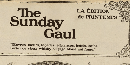
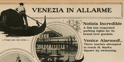
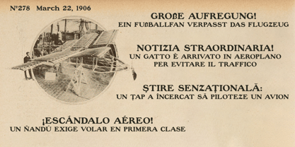
Sunday Gaul is a revival of the display typeface used throughout Le Gaulois du dimanche, the Sunday supplement of the French newspaper Le Gaulois. The typeface first appeared in Le Gaulois as a headline face in June 1906 before becoming a defining element of the Sunday supplement, where it was used for headlines, advertisements, illustration captions, and, following the redesign of December 21, 1907, the publication's distinctive masthead.

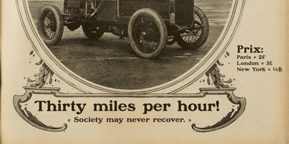
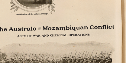
While this revival is based on the version used by Le Gaulois du dimanche, the design originated with the Inland Type Foundry of St. Louis, where it was first issued as Morland before being revised and reissued as Blanchard. It later crossed the Atlantic, becoming a popular display face in France and eventually being issued by La Fonderie Typographique Française under the name Cleveland. By the years surrounding the First World War, it had become a fashionable display face, appearing in newspapers, magazines, advertisements, books, and other printed ephemera throughout France.

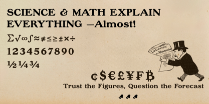
Sunday Gaul preserves the weight and character of the original printed forms while expanding the character set for modern use. Beyond the French of its source material, it supports the languages of the major participants of the First World War and many others, bringing a widely used display typeface of the Belle Époque and First World War era into the twenty-first century.

Concepteurs: Matthew Mcgehee

Fonderie: Zut Alors

MyFonts débout: Jun 18, 2026

Sunday Gaul

À propos Zut Alors

Zut Alors Type Foundry specializes in crafting typefaces that draw inspiration from the printed world of the late nineteenth and early twentieth centuries. Our fonts are meticulously designed based on original newspapers, illustrated journals, books, advertisements, and ephemera, preserving the character, imperfections, and charm of historical printing. Research is central to every project, with many designs originating from careful studies of rare printed sources. We explore the effects of metal type, worn printing plates, and period production methods to create a unique visual identity. Our aim is not merely to reproduce old letterforms but to capture the essence of original printing while adapting it for modern applications. From faithful revivals to historically inspired new designs, Zut Alors Type Foundry is committed to keeping overlooked typographic traditions alive for contemporary designers, publishers, and readers, ensuring that the beauty of the past continues to inspire the future.

En savoir plus

Lire moins