There was a brief period when typewriter-inspired lettering did not read as vintage. In the late 1970s and early 1980s, rounded slab serifs appeared on rock graphics, radio promotions, record-store material, and cheap cotton shirts simply because they looked current. Teeshirt comes from that moment; before the style became nostalgic, and before the 1980s were reduced to neon grids and chrome.
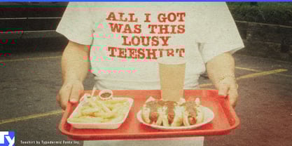
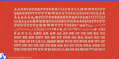
Its starting point was the casual, fashionable presence of American Typewriter, pushed toward the imperfect reality of apparel printing. Letters sit a little unevenly, registration wanders, and the surface carries the broken texture of ink transferred onto fabric. The irregularity is meant to resemble lettering that has been printed on jersey, worn, stretched, and washed; alternate combinations help repeated patterns avoid looking mechanically distressed.
That makes Teeshirt especially convincing for late-1970s and early-1980s music merchandise: fictional tour shirts, record-store tees, radio-station promotions, backstage crew shirts, fan-club graphics, and period wardrobe. It suits the world around power pop, new wave, arena rock, and FM radio without relying on lightning bolts, varsity lettering, or heavy-metal clichés.
The same printed language belonged to ordinary leisure. Summer camps, roller rinks, boardwalk attractions, bowling leagues, amusement parks, softball teams, and local festivals all produced inexpensive shirts tied to a particular place or moment. For film, television, games, and exhibitions set around 1978–1985, Teeshirt can supply the fictional college-radio tee, record-shop uniform, regional concert shirt, or forgotten promotional giveaway that helps make the period believable.
Teeshirt Regular preserves the deliberately loose alignment of a worn, cheaply printed shirt. Teeshirt Pressed keeps the same surface character with a more orderly baseline. The family is most convincing when the goal is not simply “retro,” but the specific look of a shirt from the years when this kind of lettering still felt new.