Ignorer et passer au contenu
Accéder au contenu principal

Waybill

par FontFuel
Styles individuels à partir de $14.00 USD
Famille complète de 5 polices: $36.00 USD
La famille de polices Waybill a été conçue par Roger Ridpath et publiée par FontFuel. Waybill contient 5 styles et options de package familial. En savoir plus sur cette famille

À propos de la famille


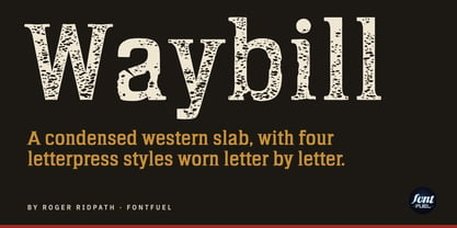
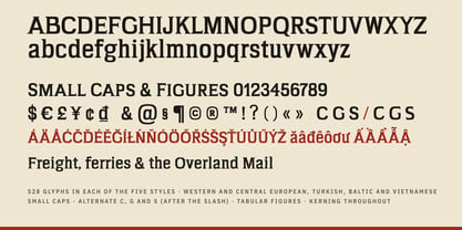
A waybill was the paper that rode along with the freight. Stagecoach and railroad shipments carried one, and the type on it came out of a print shop’s cases. Waybill is my condensed slab serif in that spirit: tall and narrow, with flared serifs, built to say a lot in not much width.

It started back in 2017 as a rougher western face. This year I redrew it from the ground up, gave it a new name and took it to 528 glyphs: Western and Central European, Turkish, Baltic and Vietnamese, small caps, alternate C, G and S, tabular figures and kerning throughout.

Then I made it print.

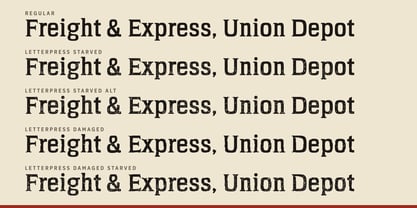
The four Letterpress styles are Waybill as a worn press would print it. Every letter was worn on its own, not covered with a texture, and no two letters came out alike.

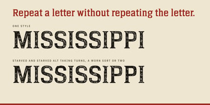
Letterpress Starved is a press that ran short of ink. The edges hold, the middles go dry and sandy, and some letters are hungrier than others.

Letterpress Starved Alt is the same press on a different day. It’s a second set of letters, starved differently, so you can swap one in where a letter repeats and the pattern disappears.

Letterpress Damaged is old wood type that has seen some years: nicks, chipped corners, scratches, a split along the grain. It’s beat up, but it never comes apart. Every letter stays in one piece.

Letterpress Damaged Starved is that worn block on a dry day, both at once. It has the most character at poster size.

Where a scratch lands, where the ink runs out: I didn’t pick any of it. It came from random numbers seeded by a wall of lava lamps. That’s real, and I thought it was too good not to mention.

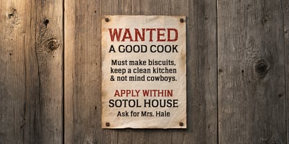
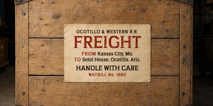
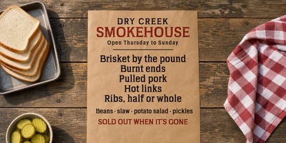
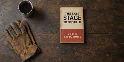
I reach for Waybill on wanted posters, barbecue and brewery labels, rodeo and county fair signs, book covers, menus and anything that should look like it was set by hand in a shop with sawdust on the floor. Regular sets the clean headline; the Letterpress styles bring the history.

Concepteurs: Roger Ridpath

Fonderie: FontFuel

MyFonts débout: Nov 4, 2026

Waybill

À propos FontFuel

My name is Roger Ridpath. I run FontFuel. I am a professional graphic designer with more than three decades of experience. I love typography and enjoy creating my own type designs. Why call it FontFuel? As a designer, I often see how the right type/font can add energy to a design that makes it communicate much more precisely than the wrong choice. In a sense, the type in a design is the fuel that makes it GO! FontFuel was previously known as PhotoshopIsland.

En savoir plus

Lire moins