Ignorer et passer au contenu
Accéder au contenu principal

Wild Title Sans

par Caron twice
Styles individuels à partir de $79.00 USD
Famille complète de 11 polices: $395.00 USD
La famille de polices Wild Title Sans a été conçue par Martin Činčár et publiée par Caron twice. Wild Title Sans contient 11 styles et options de package familial. En savoir plus sur cette famille

À propos de la famille


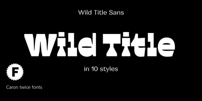
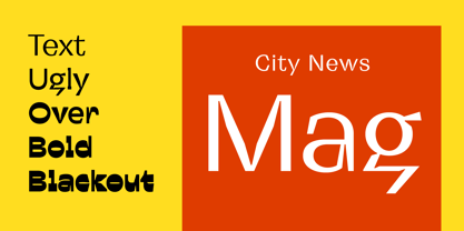
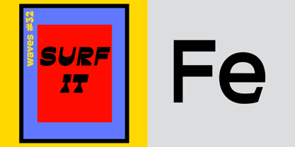
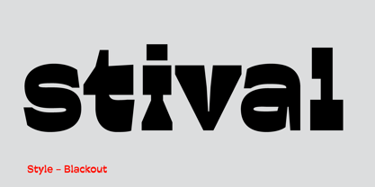
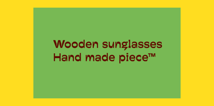
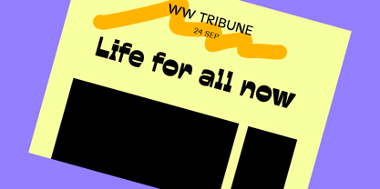
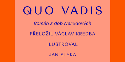
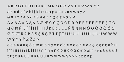
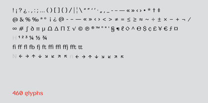
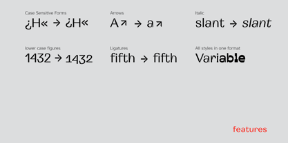
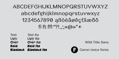
Wild Title Sans is ideal for projects that are intended to be leisurely and relaxed. The font deliberately destroys the principles of restrained fonts, emphasizing unbridled individuality. The distinct notches in the font are enlarged ink traps, which are used for typesetting in small sizes and usually copy the structure of the character. In this case, the ink trap becomes part of the structure of the character, giving the font a strong and original feature. The weight of individual styles is also distinct: the emphasis on the vertical breaks with traditional approaches to posture. This font literally draws attention to itself. Individual styles are suited to a variety of uses, from small-point texts to bold, distinctive headings.


Specimen:

http://carontwice.com/files/specimen_Wild_Title_Sans.pdf

Concepteurs: Martin Činčár

Fonderie: Caron twice

MyFonts débout: Feb 23, 2021

Wild Title Sans

À propos Caron twice

Caron Twice. Twice the care. Hi, I’m Martin Činčár, the founder of Caron Twice Fonts. In typography, this mark ˇ is called a caron. There are two of them in my last name, hence Caron Twice. These diacritics are very typical for Czech, which is where I come from. Yet as a designer I have often found myself mid-project, with a font that looked perfect, only to discover it had no support for my language or fell apart when the letterforms actually mattered. That is what Caron Twice is about. For over eight years I have been making typefaces the slow way. No quick releases chasing trends but functional, timeless typefaces crafted with deep linguistic and typographic expertise. Every glyph, every diacritic, every script designed with an understanding of not just how a letterform looks, but how it behaves across forty-seven Latin languages, Cyrillic, Greek and Hebrew. Every font here reflects that. More at www.carontwice.com

En savoir plus

Lire moins