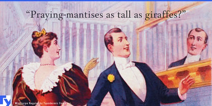
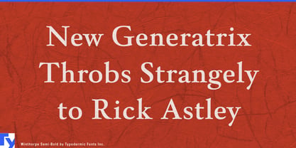
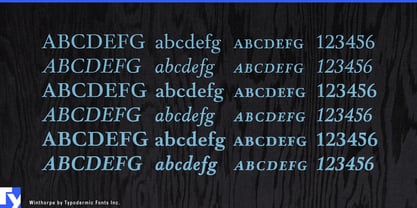
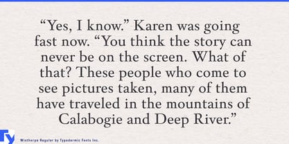
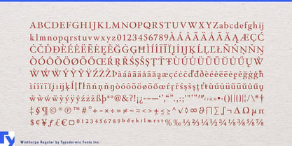
A new institution sometimes needs to look established before it has accumulated much history. Private clubs, auction houses, family offices, foundations, and hospitality groups all depend on typography that can support formal hierarchy without making the identity look conspicuously new. Winthorpe provides that framework with a transitional serif design developed across roman, italic, and dedicated small-cap styles in Regular, Semi Bold, and Bold.
That makes it especially useful for private clubs and membership-based hospitality. A newly opened club may need a name for the building, dining rooms, lounges, seasonal programs, house publications, event invitations, member cards, and environmental graphics while maintaining a consistent institutional tone. Winthorpe’s romans can carry the principal identity; italics can distinguish programs and secondary information; small caps provide a natural hierarchy for room names, departments, dates, and formal headings.
Auction houses and specialist dealers face a similar problem. The objects being presented may already carry strong visual and historical character, so the surrounding typography needs authority without competing for attention. Winthorpe can handle auction titles, collection names, provenance headings, catalog dividers, private-view invitations, lot-section openers, and exhibition-wall graphics. Its small caps are especially useful for names, dates, categories, and other formal distinctions.
Family offices, private investment partnerships, and foundations can use the same restrained structure for report covers, investment letters, donor publications, estate-planning presentations, and institutional headings. A practical companion face can handle tables, figures, and dense text while Winthorpe establishes the formal layer around them.
Hospitality projects with an institutional character provide another natural setting. Restored hotels, members’ lounges, private dining clubs, and long-stay properties may need typography for house names, salons, libraries, dining rooms, event calendars, and printed programs that feels more established than contemporary boutique branding.
The same qualities make Winthorpe useful for fictional institutions in film, television, and games. Private banks, universities, foundations, auction houses, clubs, estates, and family corporations often require stationery, annual reports, donor walls, account statements, certificates, menus, invitations, plaques, and internal publications that all appear to come from the same organization.
Winthorpe works best where typography needs to imply continuity, structure, and an established house style. Its romans provide the main institutional voice; italics add distinction and emphasis; dedicated small-cap styles handle the formal hierarchies that appear naturally in clubs, auction catalogs, financial publications, hospitality programs, and fictional establishments.