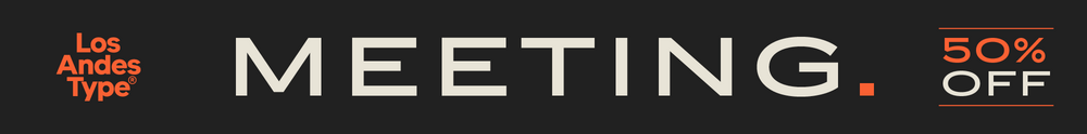
Device Fonts is the font arm of Rian Hughes’ Device studio, based in West London.
An early contributor to FontShop’s FontFont range, Device Fonts was launched in 1997 to carry Hughes’ growing library. It has since released over 250 original typefaces covering more than 1500 individual weights, including custom designs for clients as diverse as Mac User, 2000AD and The Teenage Mutant Ninja Turtles.
Rian studied at the London College of Communication in London before working for an advertising agency, Smash Hits, i-D magazine and a series of record sleeve design companies. Under the studio banner Device, he now provides design, custom type and illustration for advertising campaigns, record sleeves, book jackets, graphic novels and television. He has designed posters for Tokyo fashion company Jun Co.’s Yellow Boots chain, the animated on-board safety film for Virgin Airlines, Eurostar’s poster campaign, a collection of Hawaiian shirts, a range of watches for Swatch, an award-winning brochure for MTV Europe’s Music Awards, and numerous book jacket illustrations and CD covers.
He has designed hundreds of logos for DC, Marvel, Valiant, Image and other comic book companies for such titles as Batman, the X-Men, James Bond, The Avengers and Spider-Man. Long connected with the world of comics, Rian Hughes' first graphic novel was The Science Service for Belgian publisher Magic Strip. This was followed by Dare for IPC’s short-lived Revolver, an “iconoclastic revamp of the ’50s comic hero Dan Dare”, written by Grant Morrison. His strips from the Galaxy’s Greatest have been collected in Yesterday’s Tomorrows (Dare, Really and Truly plus others) and Tales from Beyond Science (written by Mark Millar, John Smith and Alan McKenzie). More recently he wrote and drew a Batman: Black and White tale, contributed to Vertigo: Magenta, designed the map of the DC Multiverse and was reunited with Morrison for several stories in Heavy Metal magazine. He has contributed to numerous international exhibitions, lectured widely both in the UK and internationally, and a one-man show of his work was held in 2003 the Conningsby Gallery, London. A retrospective monograph, Art, Commercial was published in 2002, and Ten Year Itch, a celebration of the first ten years of Device Fonts, was published in 2005. Other books include https://www.amazon.co.uk/Typodiscography-Rian-Hughes/dp/1910870048">Typodiscography , Custom Lettering of the 20s and 30s, and the all-ages wordless graphic novel I Am A Number. Soho Dives, Soho Divas collects his burlesque drawings, and he sets out his memetics manifesto in Cult-Ure: Ideas Can Be Dangerous. A collection of his logo designs, https://www.amazon.co.uk/Logo-gogo-Branding-Pop-Culture/dp/0993337422">Logo a Gogo was released in 2018 by Korero Press.
More recently he has published three novels which incorporate design and typography as an integral part of the narrative: XX, The Black Locomotive and The Absence.
He has an extensive collection of Thunderbirds memorabilia, a fridge full of vodka, and a stack of easy listening albums which he plays very quietly.
The Premium foundry page can be viewed Here.
En savoir plus
Lire moins