

Ignorer et passer au contenu
Accéder au contenu principal

Zalderdash

par Typodermic
Styles individuels à partir de $69.95 USD
La famille de polices Zalderdash a été conçue par Ray Larabie et publiée par Typodermic. Zalderdash contient 1 styles. En savoir plus sur cette famille

À propos de la famille


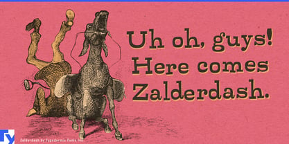
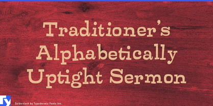
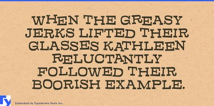
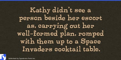
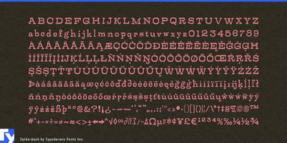
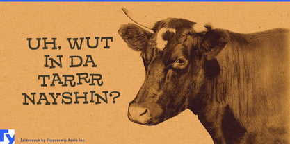
Zalderdash is for systems that need consistency without looking too consistent. Its chunky slab-serif forms bounce, squeeze, and jostle against one another, while automatic substitutions introduce alternate combinations as text changes. The result keeps repeated headlines, names, and announcements from settling into the rigid repetition that can make deliberately unruly digital lettering feel manufactured.

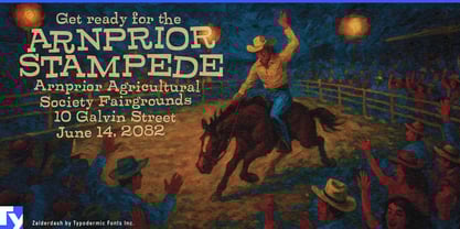
That makes Zalderdash especially useful for family entertainment environments. Amusement parks, water parks, indoor adventure resorts, and large attractions generate enormous quantities of display typography: ride names, attraction zones, queue headings, map labels, food-stall names, seasonal-event titles, souvenir graphics, photo backdrops, and digital promotions. Zalderdash can keep those elements inside one recognizable visual language while allowing individual words and phrases to develop slightly different shapes.

Party and competition games can use the same controlled instability dynamically. Multiplayer cooking games, kart racers, physics games, carnival collections, and slapstick co-op titles need round announcements, challenge names, reward banners, level titles, item names, victory screens, and comic interstitials that feel energetic even when generated from a repeatable interface system.

Large snack and novelty-food ranges present another useful system. Popcorn, tortilla chips, ice-cream novelties, spicy snacks, sauces, and limited-edition flavours can use Zalderdash for product and flavour names across bags, cartons, multipacks, shelf displays, vending graphics, and seasonal campaigns. The irregularity can help individual varieties develop their own shapes while remaining clearly related.

Sports promotions and entertainment competitions offer similar territory. Mascot campaigns, fan zones, exhibition games, halftime promotions, challenge shows, food competitions, and physical-game formats all rely on short phrases that need to feel lively across scoreboards, set graphics, shirts, social clips, and promotional displays.

Zalderdash is most effective in short, prominent bursts where the words are part of the entertainment. It gives attractions, games, snack ranges, sports promotions, and competition formats a repeatable display voice that still looks as though somebody has been rearranging the letters between appearances.

Concepteurs: Ray Larabie

Fonderie: Typodermic

MyFonts débout: Dec 21, 2004

Zalderdash

À propos Typodermic

Welcome to Typodermic Fonts, a spirited type foundry rooted in Nagoya, Japan, started by the Canadian typeface designer, Raymond Larabie in 2001. Our library brims with 500+ diverse typefaces to fuel creativity in graphic design, advertising, web, and app development. As digital type pioneers, we adopted web fonts and app licensing early, consistently pushing the design envelope. With Canadian heart and Japanese precision, we're your global partners in extraordinary typography. Explore Typodermic Fonts—where creativity meets character.

En savoir plus

Lire moins
