Photo © Jan Middendorp
|
|
|
|
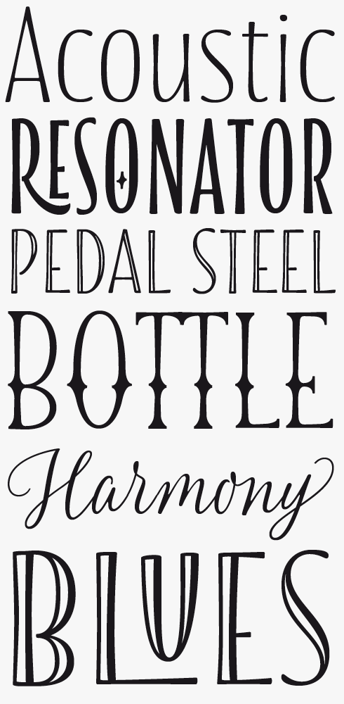
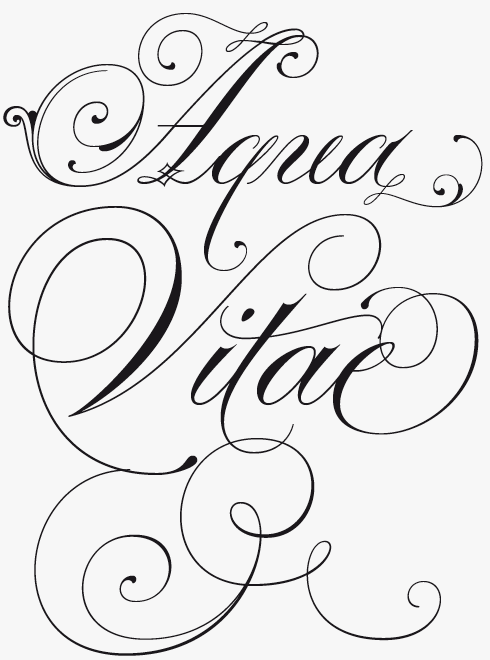
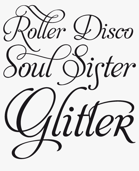
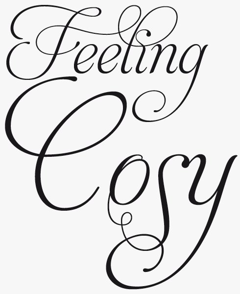
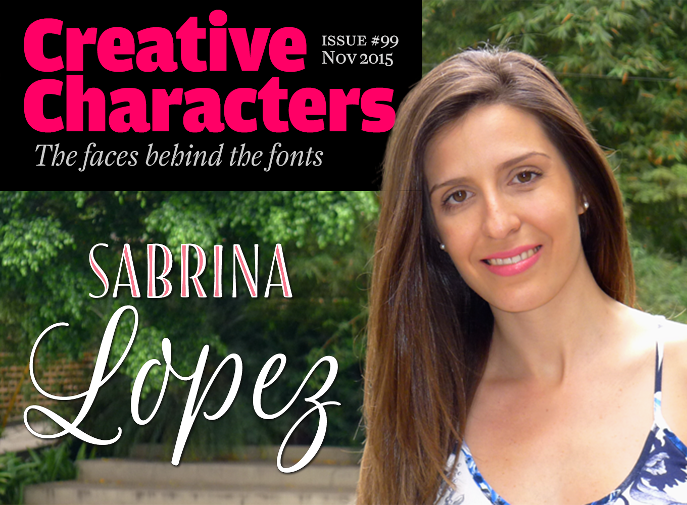
She is part of a new generation of Argentinian lettering artists who move back and forth with ease between manual skills and digital wizardry. One of her secrets is time — it takes her up to a year to design and program a new font family. This has allowed her to move into a different realm of the handwritten letterform with each new typeface; sensitive to trends, but more original and personal than most. She is not a calligrapher who has reluctantly embraced digital type design; as soon as she realized that writing and drawing letterforms by hand was but a first step in making fonts that could be used by others, she knew she’d found her craft. Meet Sabrina Lopez of Typesenses, our woman in Buenos Aires.
|
|
|
Sabrina, you have a background in calligraphy. How did this decision come about — to pursue a manual skill that may seem an anachronism in this digital age?
Whenever people refer to calligraphy as an anachronism in the digital age, I cannot help thinking of the long history of writing, and how far it is from being an obsolete or old-fashioned art. Despite being rarely practiced today, calligraphy has never died, surviving many technological changes to always reinvent itself and coexist with new technologies across the centuries — in fact, ever since the invention of printing, when it stopped being essential to book production, and acquired relevance on an artistic level instead of a purely functional one.
I am interested in exploring that contrast today: the most advanced technology versus the most ancient and human gesture. “The most human gesture”: that’s how Marina Soria, one of Argentina’s most prominent calligraphers, referred to writing when giving a talk at my university. I really love the idea that my work contains a part of myself, my own gestures, which could not be made by anyone else in the world because they are like my fingerprints.
I developed a latent interest in calligraphy from my early childhood. My grandfather Julio Cesar Lopez wrote in a beautiful English cursive. I remember how I enjoyed looking at his writing and tried to improve my own. He was a wonderful mentor. That seed bore fruit when I first encountered calligraphy at the University of Buenos Aires. The Graphic Design program includes two years of Typography, and during the first year, calligraphy — mostly the Foundational hand — is taught as a base, to learn about the structure of letterforms: their proportions, the ductus of strokes, the thick-thin contrast, letter spacing, and more. This is how my calligraphic work began, which I later used in type design.
You are left-handed. In the past, this caused people grief. In some conservative schools children were forced to write with the “right” hand. Did it ever cause you problems, for instance when figuring out how to handle the thick-thin contrast in lettering?
On the one hand, to force “lefties” to write with their right hand seems to go against their nature, making them use the other side of their brains. I have read texts saying that left-hand writers use the right hemisphere of the brain, which is the most sensitive and artistic one.
On the other hand, as a left-hander it is complicated to get used to the western Roman writing system, which was developed for right-handers — as expected, because they are the majority. We write from left to right and this is the first obstacle, especially when writing with ink.
In my particular case, being left-handed has been a limitation in developing certain calligraphic styles, such as Cancelleresca. I have to rotate the sheet 90 degrees, which is very uncomfortable because I am not able to see what I am writing. If I use the sheet without rotation, I need to turn my left hand 45 degrees to the left to achieve the pen angle required for this style, and this is a difficult movement. However, an advantage is that I do not need to change the ductus, as I can follow the order and direction of the strokes. Some movements in brush lettering are hard to achieve too.
In spite of these little troubles, being a lefty is a huge advantage for English calligraphy and that is why this is the style I focused on most. In spite of the extreme delicacy of its lines and curves, it is the style I prefer and with which I feel most comfortable.
Differences between right- and left-handers are evident when using nibs and ink, but with the pencil we are all equal. So if I feel limited with a specific calligraphic style, I try to draw it with a pencil after learning the behavior of the movements with the nib. It is not as nice as doing calligraphy but at least I am able to draw by hand.
To be born a right-hander would no doubt have had its advantages as some of the most basic things in daily life were developed for right-handed operation. Lefties always have to get used to a world that was not designed for us, and I believe that we developed a huge ability to adapt, which is a very useful virtue for life in general. Some things that seem to be a disadvantage at first can become the key to our work and our passions. It gives us possibilities to be innovative.
To quote ‘Insights into Left-handed Calligraphy’ by Betsy Rivers-Kennedy: “Lefties have to think positively and creatively. Where there is a will, there is a way. Lefties can learn to write calligraphically… there is more than one way for left-handers to work. It is the teacher’s job to help the student find the best individual method for that individual.”
|
|
|
|
|
|
|
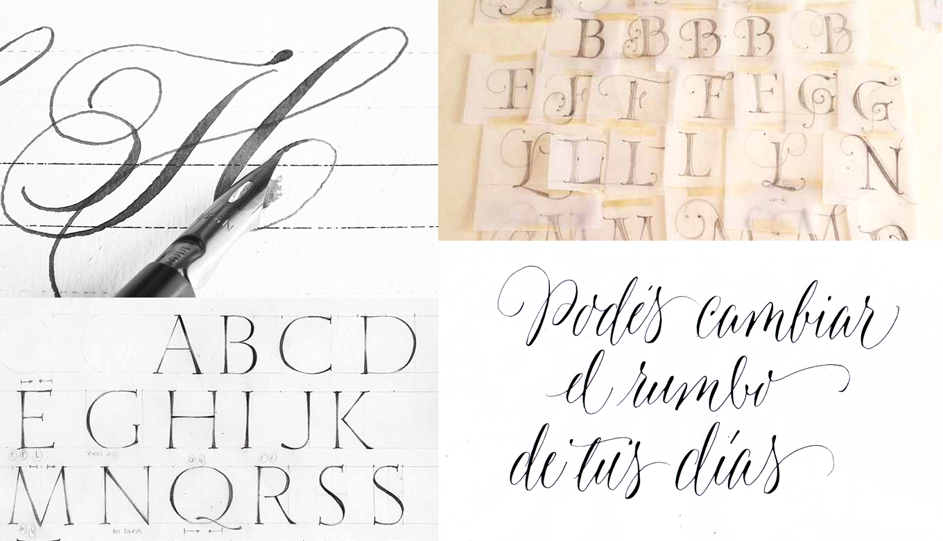
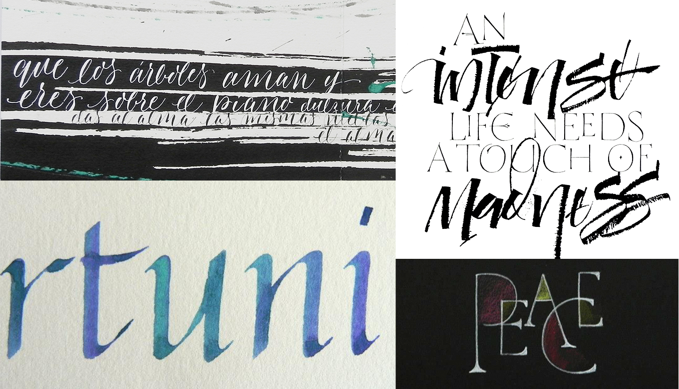
Development sketches for (clockwise from top left) Parfumerie Script, Fantasy, Blend Script and Wishes Capitals
|
|
|
|
After studying in Buenos Aires, you continued your education with several renowned calligraphers in South and North America. Who were the most important figures in that world to you, and what did you learn from them?
I am very grateful to have met such wonderful teachers as Maria Eugenia Roballos and Betina Naab who have been both very kind, generous and patient with me. In their studio in Palermo, Buenos Aires, we have shared lots of hours with letters, stories, tea and home-made food. This comfortable environment is essential for calligraphy. There, I studied styles like Cancelleresca, Roman Capitals, English Roundhand, and the ruling pen. My last workshop was about a calligraphic and experimental book, combining abstract gestures with our own calligraphy style and bookbinding. It was amusing, because it allowed me to use all my knowledge in an informal and free way.
Part of my search for calligraphic knowledge was a trip with my friend Maximiliano Sproviero to the Northern Hemisphere to take a one-week intensive workshop with Julian Waters, Georgia Deaver and Carl Rohrs in Boston. I was fortunate enough to have brilliant classmates like Rob Leuschke, from whom I have been able to learn a lot. I bought books and calligraphic supplies that were very useful to continue my training. It was an incredibly intense week — calligraphy all the time, everywhere, from 6 am to 11 pm, starting with yoga for calligraphers and ending with a gallery of calligraphic art.
One of the things I enjoy most is to share a classroom with people in their eighties. I believe that it is possible to continue learning during one’s entire life, and that passions do not die through time. On the contrary, they intensify. While life may offer me the possibility to be a teacher, I really hope to keep on being a student, too. I am convinced that what keeps us alive every day is the fact that we always have something new to learn.
Of course, a workshop is only a starting point. The key to calligraphy is to practice a lot at home, and find one’s own style. Curiosity is the engine of our knowledge.
Many calligraphers have a somewhat discordant attitude towards digital type design — they feel it is a kind of unfair competition to manual craft. How (and why) did you take the step towards digital design?
Excellent question. I was formally introduced to calligraphy while studying Typography, one of the subjects of the Graphic Design program. In other words: it was never my intention to become a calligrapher.
Some years later, during the Typography 2 course, I was taught how to design a typeface. It was a very elementary exercise, but a really good starting point. As I had not finished my degree, I was not yet allowed to apply for the postgraduate course in Type Design. So I started out as a self-taught type designer, combining the methods taught at college with researching the historical origin — calligraphy — to learn how letterforms work. I studied calligraphy for years, but always thinking the final product would be a font. I think that this method was a solid base to achieve an accurate eye.
In digital design, thanks to OpenType, a designer can now create lots of alternates. But in calligraphy these alternates are endless, so in that sense the hand can never be replaced at all. When a customer uses type, he or she is writing with a limited set of characters designed by another person, while the value of calligraphy and lettering is that they are custom-made for a particular situation using the possibilities to create endless variations from scratch. On that level, there simply is no competition. Typography does not replace calligraphy. To buy a dress in an ordinary store is not the same as to have one made to measure, hand-sewn with hand-made embroidery.
|
|
|
|
|
Your first typeface, Aphrodite Pro, designed in collaboration with Maximiliano Sproviero, became a huge success on MyFonts. I imagine this made you change your plans for the future. Could you say something about the influence your success as a beginning type designer had on your career?
Now that you mention Aphrodite, it is part of the answer to your previous question, too. The success of Aphrodite was one thing that encouraged me to continue working in type design.
Aphrodite was based on an assignment I had worked on for college. This is also where I met Maximiliano, who became my friend and mentor. I mentioned my calligraphy mentors; but in type design I am very grateful to Max because he shared all his knowledge with me. We still keep on exchanging tips and tricks.
Max looked at Aphrodite’s curves when it was just a set of lowercase letters, drawn by hand in class; then we worked together to improve it and release it. I did not realize it was a business. I only wanted to see my font online, finished and offered to the whole world. I really liked the idea that someone else would use my letters.
But life had traced a path for me that I did not know until Aphrodite reached the top of the Best Sellers list. From that moment on, I understood that I had to learn more about typography, to improve myself in that area and turn my career that way. I am very grateful to fate for having met Max at college and because the success of Aphrodite showed me the way to where I am today. At that point I felt that, as I was so lucky, I had to make a commitment. I promised myself that my work would be better each day. I think I am fulfilling the promise because each typeface I release is better than the previous one. My design processes are long, no less than 9 months, as I take my time to make them as good as possible in every detail. Max and I have both come a long way from the innocence of that Aphrodite typeface, but we always look at her fondly. She was our key.
I’ve often thought of the talk at Stanford University in which Steve Jobs talked about ‘connecting points’. He said that we can make it looking backwards in time but at the moment that things happen it is more difficult to understand why and where are we going. Four important men traced the path of my career, the points were always there since childhood. My grandfather’s calligraphy, the genetic heritage of being a lefty from my dad Claudio Lopez, the meeting with Max at the University and the influence of the main piece of my family tree, my grand-uncle Silvano Marangone, who was in his working days a typographer using the Linotype machines. The points were always on my path. I only had to connect them as I was falling in love with my career. I believe that since I was born, life wanted me to be typographer. I just did what she told me.
|
|
|
|
|
|
|
A handful of Lopez’s calligraphic projects, clockwise from top left: A book of illustrative calligraphic lettering; A Paulo Coelho quote drawn with a ruling pen; lettering created at a Roman Capitals workshop; Cancelleresca calligraphy.
|
|
|
|
Many independent type designers like to work with a distributor such as MyFonts; others find that it is more profitable to sell exclusively via their own web-shop. What’s your standpoint? Have you considered going it alone?
At this point in my career, I am doing what I know, what I have studied and what I enjoy. You are the most popular distributor, so you do know how to do that work much better than I do, and the team is very efficient. My days have only 24 hours, and during many of these hours I am designing. I do not have time to do the selling as well. In the future — perhaps. Right now, it is not in my plans.
Your work is rather personal, but as soon as your fonts are “out there”, people can make any kind of graphic design with them — you have no control. Do you like that idea?
Yes, I love it, even more when it surprises me. I think it is a way of making my dream of traveling around the world come true. As I said before, my work is rather personal and I consider it to be a piece of myself. So, just imagine! I am now in a book in Belgium, in a magazine in Australia, in a wedding invitation in USA, in “Princess Packaging” in Disney World; all this while I am in Ramos Mejia — my city, part of Greater Buenos Aires — writing the answers of this interview. Wonderful and very funny. I encourage people who are reading this interview and have purchased my fonts to mail me images of my fonts in use, with a few words about where they are from. I would love to see some of that happen.
Thanks, Sabrina. It was a pleasure meeting you!
|
|
|
|
|
|
|
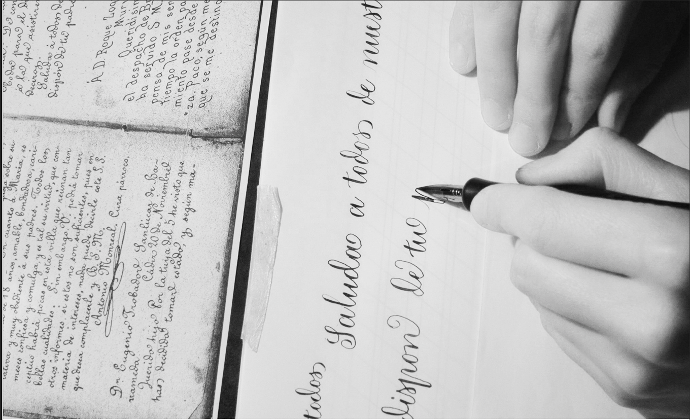
A comfortable writing position for Lopez using her left hand.
|
|
|
MyFonts on Facebook, Tumblr, Twitter & Pinterest
Your opinions matter to us! Join the MyFonts community on Facebook, Tumblr, Twitter and Pinterest — feel free to share your thoughts and read other people’s comments. Plus, get tips, news, interesting links, personal favorites and more from the MyFonts staff.
|
|
|

|
Who would you interview?
Creative Characters is the MyFonts newsletter dedicated to people behind the fonts. Each month, we interview a notable personality from the type world. And we would like you, the reader, to have your say.
Which creative character would you interview if you had the chance? And what would you ask them? Let us know, and your choice may end up in a future edition of this newsletter! Just send an email with your ideas to [email protected].
In now past, we’ve interviewed the likes of
Mika Melvas, The Northern Block, Matthew Carter, Ulrike Wilhelm, Maximiliano Sproviero, Dave Rowland, Crystal Kluge and Steve Matteson. If you’re curious to know which other type designers we’ve already interviewed as part of past Creative Characters newsletters, have a look at the archive.
|
|
|
|
MyFonts Inc. 600 Unicorn Park Drive, Woburn, MA 01801, USA
MyFonts and MyFonts.com are trademarks of MyFonts Inc. registered in the U.S. Patent and Trademark Office and may be registered in certain other jurisdictions. Other technologies, font names, and brand names are used for information only and remain trademarks or registered trademarks of their respective companies.
© 2015 MyFonts Inc.
|
|
|