|
We’ve undertaken a number of journeys through Scandinavia in pursuit of Creative Characters for our monthly newsletters, yet for reasons we can’t fathom our paths have only ever wound their way through Sweden’s lakes and the Finland’s forests. This month we finally get to explore Denmark — with the help of two Danish typeface designers born a generation apart. The 27-year age gap between Ole Søndergaard (b. 1937) and Morten Rostgaard Olsen (b. 1964) means their foundry has witnessed much of their country’s evolving type scene, which they have parsed into a rich and diverse collection of font families that are steeped in Danish identity and culture. We present to you Fontpartners.
|
|
|
|
|
Where and when did you start noticing letters as typography, as shapes and rhythm, instead of just things to be read?
Morten: My passion for letters goes back to my teenage years. Though our family never owned a car, I had an obsession with petrol stations when I was about 15. They were spread out in the country, with commercial signs and advertising lighting up their surroundings. The colorful letters almost falling over each other, mixed with the inebriating smell of gasoline, had a magical appeal. I think this made me realise how to use letters in a creative way.
Ole: I gained my interest in graphic forms early in my apprenticeship as a sign painter. Skilled craftsmen and inspiring teachers taught me to appreciate letter design, which sparked my love for the alphabet. Once my apprenticeship was completed in 1957, I worked as a sign painter in London. At that time I had no desire yet to become a typeface designer.
After a long stay in Greece working with watercolors, I enrolled at the Royal Danish Academy where I studied under legendary type designer and architect Gunnar Biilmann Petersen. For several years I worked as a graphic designer at an architectural studio and simultaneously taught graphic design at the Danish School of Architecture.
How did you meet, and how did your collaboration start?
Morten: Ole was my supervisor at the Danish School of Art & Design in 1997/98. Upon graduating in 2000, I was headhunted by Ole’s office to collaborate on FF Signa. We share the same passion for letters and typography, and Ole has been a fantastic teacher and mentor. Founding Fontpartners in 2006/07 was a natural consequence of our love for letters.
There is a gap of almost three decades between you two, so your design education and formative years must have been quite different. How does that influence the dynamic of your collaboration?
Morten: I have never really seen our age difference as an obstacle. Of course we have contrasting approaches to technology, software and the like, but I think Ole’s work clearly reflects that he has always been able to successfully navigate through the so-called zeitgeist. Regarding the artistic side of type design, I think we both subconsciously seek out timelessness in our typefaces.
Our design educations were very different, yes. While architectural education may have experienced less restructuring over the years, design education has been through major overhauls. Unfortunately, those changes have not all been equally successful. Today, there is a tendency to neglect the artisanal approach and instead focus disproportionately on theoretical and academic aspects. In my opinion, this is a big mistake and detrimental for the entire movement of design as a craft.
Ole: My professional background lies in the craft of drawing and painting letters by hand. Digital development came too late in my career for me to become familiar with it. Morten has mastered this part of type production so well, and in that way we complement each other perfectly during the development of font families.
|
|
|
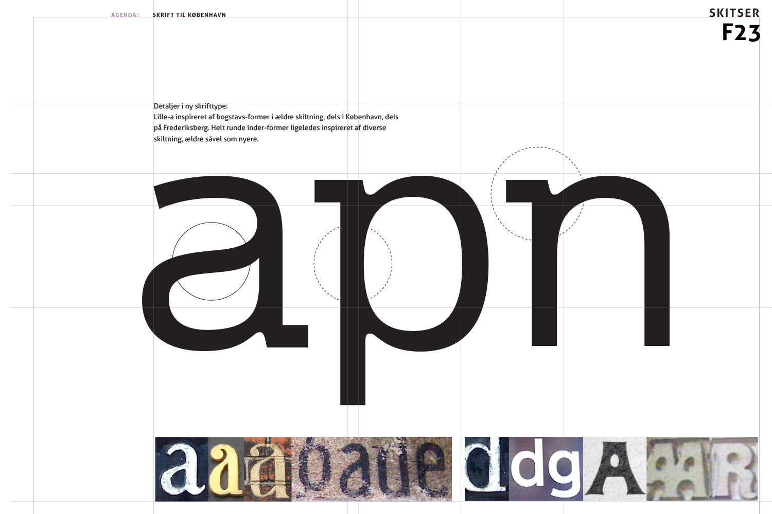
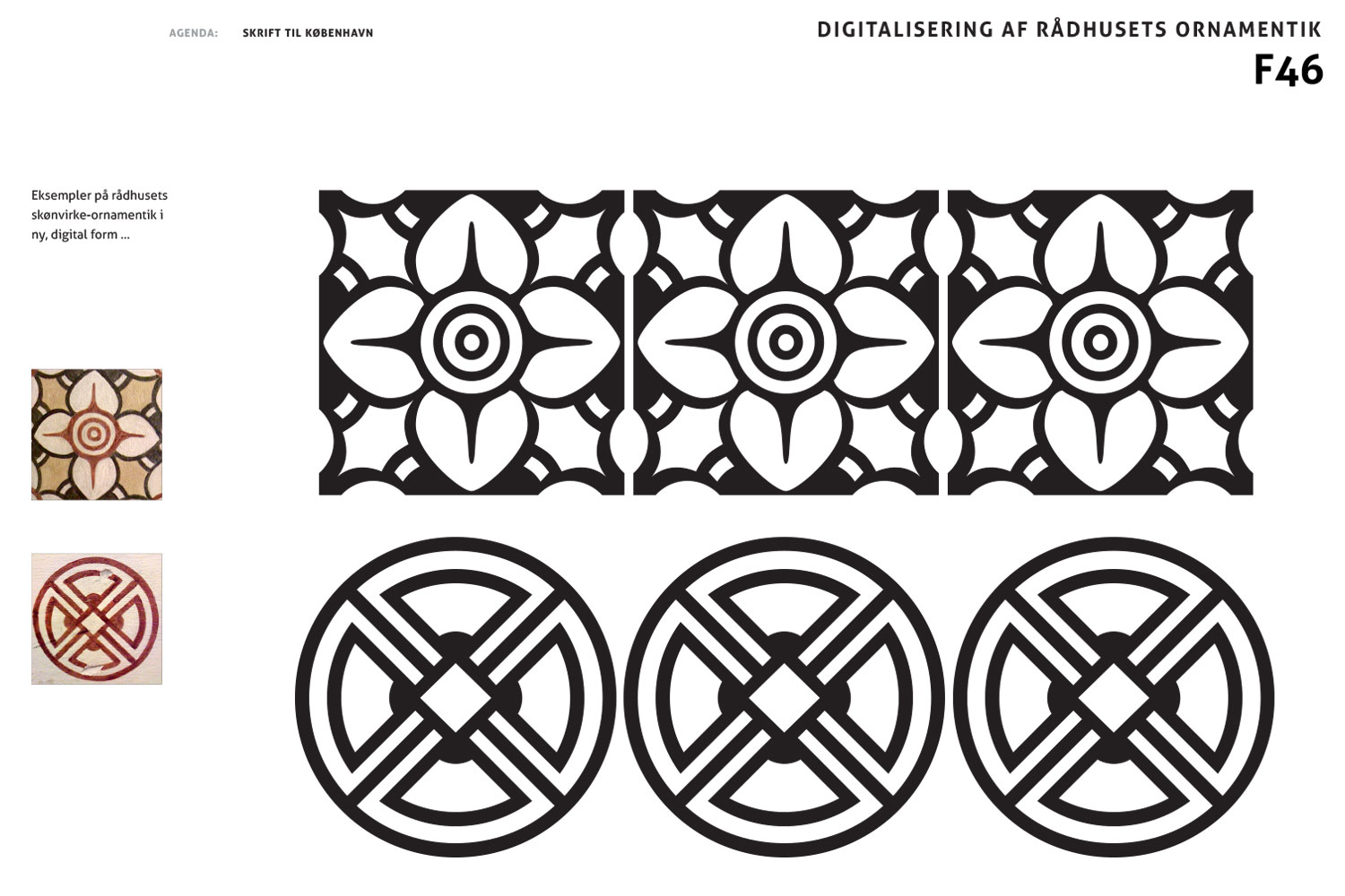
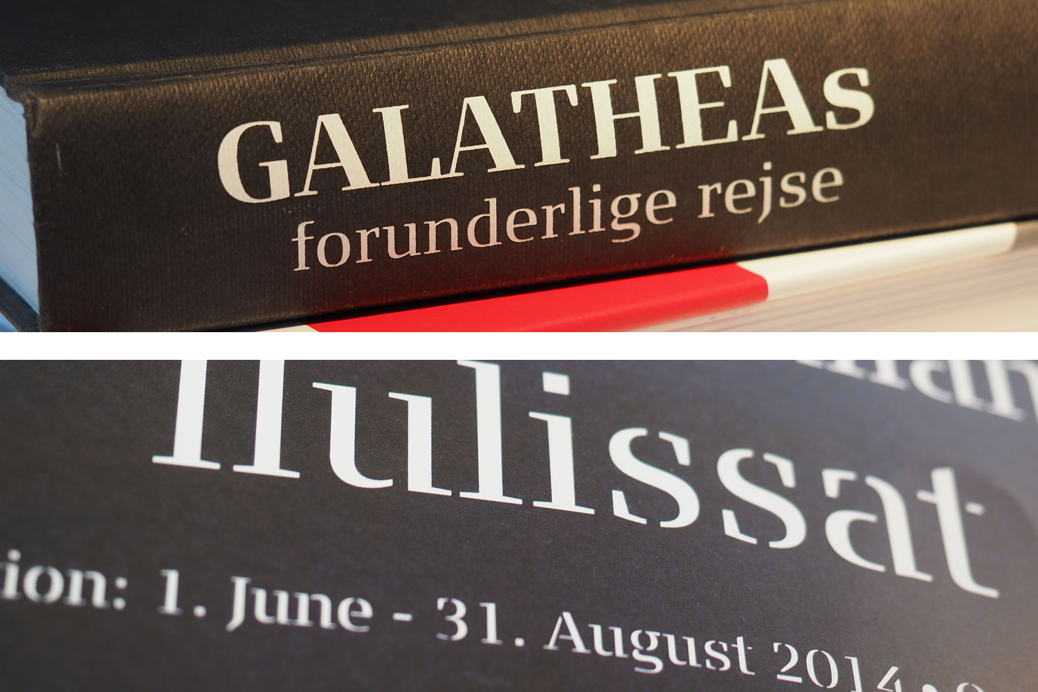
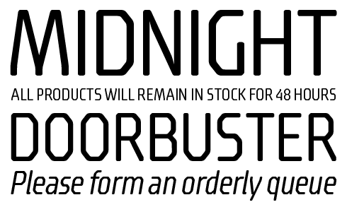
FP København is the family created for, and inspired by, Copenhagen. Drawing on the city’s culture and visual language, the design reflects Danish typographic tradition from the 20th century. The shapes exude a warm glow, are generous and wide, with soft corners and top serifs that add balance to the letter forms, while the large x-height aids their legibility. The lowercase ‘a’ and signature ‘g’ with truncated loop also have single-story variants, and the extended ligature set and small caps for all five weights and matching italics will charm even the most exacting typographer. The extra Pictos font features arrows, ornaments, and a number of the city’s landmarks.
|
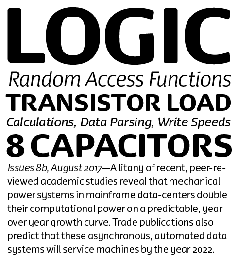
Of all the Fontpartners designs, FP Head Pro captures the essence of the nordic super-ellipse the most. Extra wide characters and lavishly open corners imbue texts set with the typeface with an architectural heft, even in the lighter of the five weights. Companion italics round out this display family that will be especially useful for large settings or as three-dimensional sculptural components in a physical building project.
|
|
|
|
|
|
|
Research showing some of the visual background to the development of the København typeface.
|
|
|
The typefaces you’ve both designed exude a common visual atmosphere. Is there a Danish style in typeface design?
Morten: Absolutely! Much of Danish type design can be traced back to the work of Knud V. Engelhardt, an architect and industrial designer from the days before the term “design” even existed in the Danish language. You could say that first and foremost, Danish typeface design is characterised by simplicity and “no nonsense” approach, similar to other Nordic design. In any case, you can clearly see the difference between typefaces by southern European designers versus the work produced in Scandinavia. The design of fonts is generally more rooted in handwriting the further south you go, while here in northern countries letter forms are more constructed, I think.
Ole: The high typographic tradition that existed in France and England did not come to Denmark — the Roman Empire did not reach as far north. Beginning with the work of Engelhardt, a few Danish architects like Gunnar Biilmann Petersen, Claus Acton Friis and Naur Klint created a distinct typographic style. I was taught this architectural approach in my youth while studying at Petersen’s and Klint’s studio, and now I am trying my best to honour and uphold this tradition together with Morten. Even though it must be said this does not apply to some of our display fonts, which we created just for fun.
Morten: In Denmark, it was mainly the previous generation of architects who took type design seriously. Today, other groups have challenged them with their own take on Nordic / North European design.
You have quite a few designs with generous proportions and soft, rounded corners. What do you think this adds to a typeface?
Morten: I love the softness that fonts with curves communicate, but visually and design-wise they prove to be quite challenging to draw. So I think next time I may do away with the rounded forms.
Ole: These typical rounded corners and generous proportions are also at the heart of the Danish tradition. They were pioneered by Engelhardt; his letter design work was predominantly used for signage.
Almost all of your typefaces are credited to only one of you. Do you give input on each other’s typefaces behind the scenes, or do you design completely separately?
Morten: It’s probably half and half. We regularly inspire each other, but we mostly make type independently.
Ole: Sometimes we jointly sketch the same typeface, such as our collaboration on København with Henrik Birkvig, who also participated in its development.
What made you decide to start your own foundry Fontpartners?
Morten: It came quite naturally and organically. You have to realise Denmark had no foundries at all in 2006. Some advertising agencies periodically slap letters on their sites, but that doesn’t make them type foundries!
Fontpartners is a virtual foundry, since we do not have our own shopfront: we sell our fonts solely via FontShop and MyFonts. We prefer to concentrate on the creative part of producing typefaces rather than have to bother with the commercial side of the business. We think we offer a healthy mix of typefaces. Not all of our fonts are big and complex workhorse families; we also have single-weight display fonts with only the essential character set. It is not the amount of characters that makes a typeface interesting, but rather its design and the impression/expression it gives!
|
|
FP Dancer Pro, together with its companion Serif family is an excellent solution for those typesetting situations that demand the expressiveness and informality of an italic, yet need the rigour and readability of a conventional upright face. Olsen designed Dancer’s characters using the skeleton of an italic, creating a warmth and friendliness not normally associated with even the most human of humanist type, without ever veering into novelty. Dancer Tango is an angular companion face intended for headlines and titles, but which is also pleasantly readable at smaller sizes as well.
|
|
|
|
You initially released your typefaces under the FontFont banner. What were your experiences with working with the foundry?
Morten: Our collaboration over the years has been very satisfying. I experienced the staff as both highly professional people and also good colleagues. As a designer, I was always treated with great respect, and the FontFont Type Department was always there when we needed advice and guidance. It was a superb relationship.
FF Olsen was originally the corporate typeface for the Danish Ministry of Education. Are there different criteria for a corporate face than for a commercial face?
Morten: FF Olsen is a continuation of my graduation project at the Danish School of Art & Design. It was originally called “Union,” as it is a serif face that incorporates sans features. Union was purchased by The Danish Ministry of Education, and hinted by Monotype. Afterwards I continued its development, which was renamed “Olsen” by the FontFont TypeBoard. As FF Olsen, it gained a weight and italics.
As the name implies, a corporate typeface is made for a specific company or institution and as such may have to adhere to specific criteria. You have more freedom when you develop a commercial font. As I see it, the main difference is the brief, but both kind of projects need to start with a solid concept, which then needs to be taken to a higher level by the hand and mind of the designer.
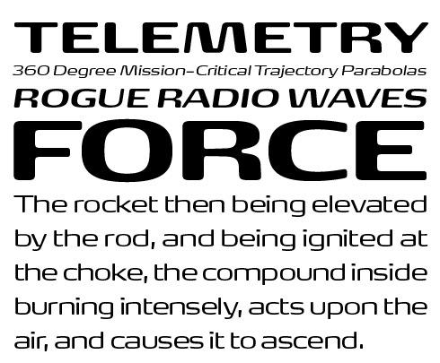
FF Signa has a very atypical appearance. What is the background story behind this large type family?
Ole: The original version was developed for signage under the name of “Signage”. The final form it eventually acquired was born from my desire to go beyond the model established by the classic grotesques. I tried to come up with an even more pared-down and contemporary design, which I think I managed.
As the first fonts looked promising, it felt natural to expand the family. Just like when playing poker: the more that’s at stake, hopefully the greater your gain will be. Signa Serif, released in 2005, was the first expansion. I wanted to take on the challenge to create an entirely new neo-classical typeface, built on the skeleton of the original FF Signa and with no ties to historical models. Much later we decided to expand the FF Signa family even further, adding FF Signa Slab and FF Slab Stencil. And it is not the end yet — soon FF Signa Round will follow.
Morten, how did you come up with the design for FF Max?
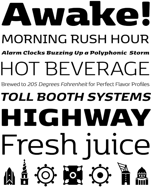
Morten: Max type? Type Max! The Max family stems from my fascination with the Eurostile typeface, a design that is still rock solid so many years after it was created! The idea behind Max was to simplify the shape and optimise the expression while drawing the typeface in a slightly futuristic style. FF Max was published at the right time. Judging by its overwhelming success I must have done something right. And remember: you also need some luck when you publish new stuff.
The super-ellipse shape in many of your and Ole’s designs seems to be recurrent in Scandinavian design. Do you think it is a cultural thing?
Morten: Think about Piet Hein and his super-ellipse table! I definitely think it’s a cultural issue. Blending two forms into one and eliminating all that is superfluous to achieve maximum impact is typically Nordic, I think. Although there is a risk that this rarified Nordic idiom can be perceived as barren and monotonous.
The difference between FF Max and FF Max Demi Serif is very subtle. Why did you create this variant, and what does it add to the family?
Morten: With the Demi Serif version I wanted to inject some playfulness into the serious shapes of the FF Max family. I regard the Demi Serif as an exploration into how far I could go with this design.
FP Dancer originated from an experiment — introducing an italic structure into an upright constructed face. How difficult was it to make that work?
Morten: With FF Dancer I wanted to break away from my usual method, and at the same time introduce a southern idiom into my type design. After doing some tests, trying out ideas concerning italic vs. upright letter structures, I designed FF Dancer Sans first, but I personally prefer the Serif versions! The whole concept of the family comes across quite clearly, I think.
Your latest project is København, the typeface you created for the Danish capital. You collaborated with Henrik Birkvig. How did the addition of a third designer affect your team dynamic?
Morten: It was important for me to get Henrik Birkvig involved because it was critical that the group communicate exactly what the project was about. He has a great knowledge of the history of type and is an expert in his field, but he also is extremely design-educational in his approach, so it was one of his tasks to explain the project in writing. Ole contributed with excellent advice and his considerable experience, and I drove the creative direction and built the fonts.
|
|

Since FF Signa was first released in 2004, Sondergaard has gone on to add a wealth of complementary families, with Serif and Slab versions forming the core of this expansive type system that also includes stencil variants and different widths, taking the super family some way beyond its originally envisioned function in signage systems.
|

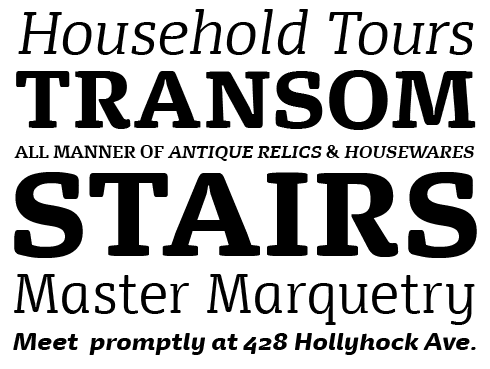
With its pleasingly chunky wedge serifs, low stroke contrast and tall x-height, FF Olsen is a solid six-font text family whose design details mark it out as particularly suitable for small settings. There’s an earthiness to its simplicity that speaks of a practical approach and tried and tested experience, making it a great choice for conveying substantial content in a straightforward tone.
|

FF Max and his twin sister FF Max Demi Serif may owe their origins to the squarish outlines of Aldo Novarese’s Eurostile®, but this pair have a tactile softness that is missing from the older design. They are well suited to branding projects; wordmarks set using its generously rounded forms will be smart matches for the latest generation of logo designs.
|
|
|
|
|
|
|
|
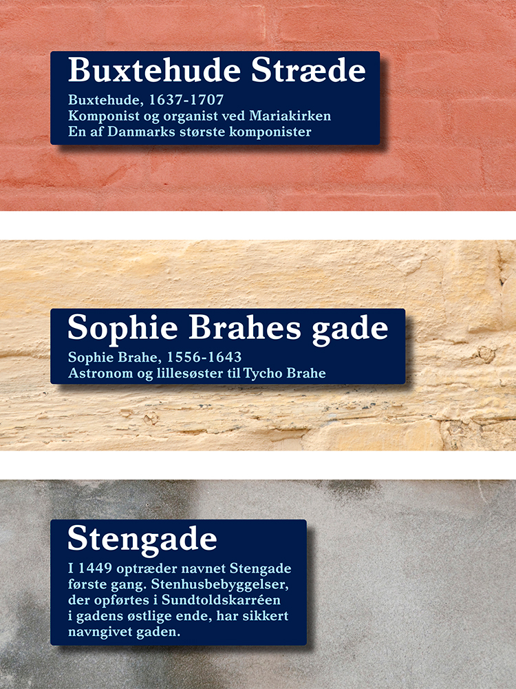
From left: Mock-ups for signage using FP Elsinore; FF Signa Serif & Signa Serif Stencil in use on different projects; FF Signa in use on packaging.
|
|
|
You mentioned earlier that the Nordic idiom can perhaps be perceived as something barren and monotonous. With that in mind, what are your strategies to inject some personality into your typefaces?
Morten: I think that if you deliberately seek to create something unprecedented, focusing too much on personal expression, the resulting typeface is very often too self-conscious. It is much better if the personality of the fonts take care of themselves, so to speak, and emerge naturally and organically during the creation process. With regard to what inspires me personally, nature and traveling have always been valuable sources of inspiration for me. Maybe it’s the peace and quiet that generates ideas. Does this state of mind lend my typeface designs a personality? That is for others to judge, but I certainly hope so.
Can you give some insight into your workflow, from early sketches through character drawing to the technical aspect of building the fonts?
Morten: Much of my early work was drawn by hand, and then scanned and further processed in Fontographer, a lovely, simple kind of software that I used for quite some time. Today I mostly sketch directly on the computer, as the letters end up there anyway. I am slow to change my tools, so actually I am still working in Fontlab 5, but I have also begun completing fonts in Glyphs. The technical aspect of font production interests me, but there’s a risk that I’ll become completely absorbed and get lost in all the technical details. This is why I try the best I can to use the software for what it was intended: creating fonts. I wish that the completion and production of fonts could be speeded up considerably, because it is still a lengthy and cumbersome process to create larger font families. But scripts, custom programming, and so on can help a little bit.
Just like many other type designers and foundries, you combine retail fonts and custom work. What is the importance of each side of your business, how do you find the perfect balance, and how do you see Fontpartners evolving?
Morten: Well, corporate typeface projects are important and can be rewarding, but the challenge for many type foundries today is that these projects are often taken on by large advertising agencies that offer a complete package to their clients. This not only means custom fonts, but the entire branding with all the trimmings. The challenge for type specialists is to make potential customers aware that typeface design is specialist work, and that we specialists are years ahead of the advertising agencies when it comes to creating and producing professional, high-performing font families.
Retail fonts not only help to run and develop our business, but they also simultaneously are a promotion of our skills, and show off our capabilities. How do we see Fontpartners evolve? Perhaps at some point it could become interesting to collaborate with another foundry, and maybe a merger in the long run? I don’t know… We have a number of options, some things in the pipeline, but let’s just say these things must always stay under wraps until they’re ready. Watch this space.
Thank you Ole and Morten, it was a pleasure to meet you
|
|
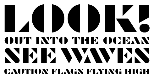
FP Palina is a strikingly simple, intensely graphic and geometric all caps stencil font. Its clean lines set it apart from the more militaristic or gritty urban strains of the genre; use it for a neo sci-fi board game or to brand a range of hobbyist camera drones.
|
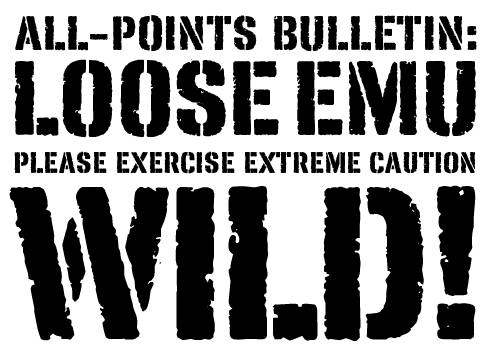
The name FP Fragile reflects not so much the character of the design — which is actually satisfyingly rugged and robust — but rather the contents of the crates it’s used to label. Suitable for well traveled, globetrotting packaging designs and posters for exotic destinations.
|
FP Stage brings to mind the seedy venues and backstreet theatres of Victorian London — posters wilting in the eternal smog and grime of the high industrial revolution, yet promising adventure, fantasy and revels galore!
|
|
|
This edition of Creative Characters was edited by Yves Peters
Bald Condensed, né Yves Peters, is a Belgian-based rock drummer known for his astute observations on the impact of letterforms in the contemporary culture-sphere. A prolific writer on typography, he has a singular knack for identifying the most obscure typefaces known to man.
|
|
|
|
|
Who would you interview?
Creative Characters is the MyFonts newsletter dedicated to people behind the fonts. Each month, we interview a notable personality from the type world. And we would like you, the reader, to have your say.
Which creative character would you interview if you had the chance? And what would you ask them? Let us know, and your choice may end up in a future edition of this newsletter! Just send an email with your ideas to [email protected].
In now past, we’ve interviewed the likes of
Mika Melvas, The Northern Block, Matthew Carter, Ulrike Wilhelm, Maximiliano Sproviero, Dave Rowland, Crystal Kluge and Steve Matteson. If you’re curious to know which other type designers we’ve already interviewed as part of past Creative Characters newsletters, have a look at the archive.
|
|
|
MyFonts on Facebook, Tumblr, Twitter, Instagram & Pinterest
Your opinions matter to us! Join the MyFonts community on Facebook, Tumblr, Twitter, Instagram and Pinterest — feel free to share your thoughts and read other people’s comments. Plus, get tips, news, interesting links, personal favorites and more from the MyFonts staff.
|
|
|
Colophon
This edition of Creative Characters was guest-edited by Yves Peters. Managing editor and designer: Anthony Noel. Editorial assistant: Michael Pieracci. .
The Creative Characters nameplate is set in Tabac Slab and Rooney; the foundry’s name is set in Dancer Pro and FP Dancer Serif ; the quote is set in Olsen Pro and the large question mark is in Tabac Slab. Body text, for users of supported email clients, is set in the webfont version of Rooney Sans. |
|
Comments?
We’d love to hear from you! Please send any questions or comments about this newsletter to [email protected]
|
|
Subscription info
Get our monthly designer interviews, popular new fonts, the latest trending promotions and free font goodness to your inbox. Sign up here: MyFonts Mailing Lists
|
|
Newsletter archives
Know someone who would be interested in this? Want to see past issues? All MyFonts newsletters (including this one) are available to view online here.
|
|
|
|