
The third quarter of 2008 brings possibly the most varied – and largest – number of new additions we have seen in quite some time. From delicate calligraphic scripts to mannered and complete families of sans-serif text faces, MyFonts continues to bring you the most (and most unique!) type in the world.
Over two dozen new foundries have been added since the last issue of In Your Face. Some designers bring a single face – although we hope they continue to produce interesting new work and bring it to you through MyFonts – while others come already full-grown, with multiple faces and in many cases a surprising amount of maturity, sophistication and technical precision.
One mature new foundry we’re particularly pleased to feature is Tilde: based in Latvia, it’s the only typefoundry in the Baltics, and licenses many Bitstream faces to localize Central, Eastern European, Baltic & Cyrillic fonts in both OpenType and Postscript formats. This past May, they brought a number of these faces to MyFonts – including localized versions of Futura, Humanist 521 (aka Gill Sans), Zapf Humanist 601 (aka Optima), Alternate Gothic and dozens of other favorites that commercial typesetters throughout Europe and elsewhere rely on every day.
Another special new addition is Peter Fraterdeus, the man behind seminal digital foundry Alphabets Incorporated. After a long hiatus from publishing digital type, Fraterdeus is back with full-featured OpenType releases of some of his most influential designs, chief among them the delicate text family Prospera and his workhorse sans Quanta. We hope he’ll be bringing many of his other original designs, which include a variety of text and display faces (and one of the best Koch revivals ever digitized, his AI Koch Antiqua!) as well as many excellent and fun dingbat faces.
Designer and design educator Steve Mehallo, recently president of Sacramento’s Art Directors and Artists Club, brings us five original faces. One that really shines is his Escoffier Capitaux, a playful ligature- and alternate-laden display face named for French culinary icon Auguste Escoffier. The link between the namesake and the face is not especially convoluted: Mehallo takes his inspiration from classic French food advertising (and, as illustrated, the work of Escoffier’s contemporary, commercial artist and fashion designer Ernst Dryden, perhaps the greatest German poster designer of his era).
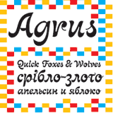
Active and well-known since the mid-’90s as a print and interactive design agency in Moscow, Art. Lebedev Studio has recently begun to release original display type. They come to MyFonts with a number of attractive and useful display faces, most of which include Cyrillic and Roman alphabets. Their first eight releases with us include Agrus, an intricate and friendly decorative script; Mirta, a high-contrast slab-serif text face, and several edgy and modern sans families.
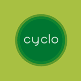
Another new addition whose first releases show exceptional technical skill is French typefoundry Cubo: their two monoline faces, the script Maline Book and the geometric, circle-based Cyclo, are as fun to set type with as they are extremely readable. Maline Book and Cyclo both come with alternates, work quite well together, and would be a fine addition to any identity designer’s toolbox.
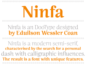
The “modern semi-serif” Ninfa is the first release from Brazilian designer Eduilson Wessler Coan; while it works quite well at small sizes, its calligraphic underpinnings – most notable in its bold weight – really shine at larger sizes.
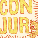
Utah designer and illustrator Chris Metcalfe introduces three fun hand-drawn faces, all especially (old) Western in their design: Trappers and Traders brings a rough-hewn and slightly surreal approach to Tuscan wood type; Conjur is weird and organic and comes straight out of a six-year-old’s vision of hairy monsters, and Dot Face’s inconsistent shadows and detail are a sort of Broadway marquee sign on crack.
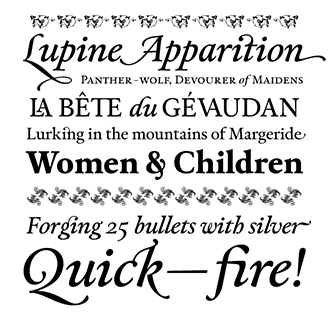
Another recent standout is Prop-a-ganda, creators of faces based on lettering from international propaganda, advertising and packaging design and a division (along with Flat-It) of Japan’s Dharma Type. So far, Prop-a-ganda has two of their 18 fonts available on MyFonts: PAG Auto is an extra-bold Art Deco titling face, and PAG Bankas draws its inspiration from English advertising of the 1930s through 1960s. Ryoichi Tsunekawa, who is responsible for most of the Flat-it and Prop-a-ganda faces, somehow fits type design in between his professional duties as architect and graphic designer; we hope he’ll continue to bring his energies to MyFonts for many years to come.
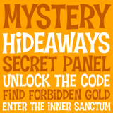
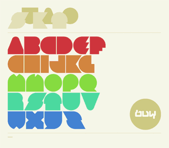
Foundry Pink Broccoli is Pratt Institute graduate Phil Bracco’s personal brand, and promises to bring many more “creatively festive” faces to MyFonts. First up are several of informal fun faces, all of which would be wonderful for poster work, children’s books and a whole range of similar projects. Some favorites from the initial six include Hideaway channels surf guitar and Beach Blanket Bingo, Astronaut Jones sits somewhere between Apollo 13 and Gilligan’s Island, and Fat Rhino says – well, yeah: overweight rhinocerous.
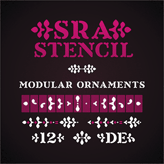
New stencil (and stencil-like) faces are available from several new foundries: Sergio Ramírez’s Sardiez typefoundry brings us Sra. Stencil, and German Librito.de’s Segmenta is based on grids similar to those used in train station and airport signage.
Another new foundry doing really interesting work is Portugal’s yrmk, who come to us with three accomplished releases by Joel Santos: the soft and fleshy Rounded Teen, Rosley, a heavy display face which seems to be almost overdosing on ball terminals, and Hausi, an interesting geometric face that succeeds where similar experiments have failed.
Words+Pictures designed dozens of faces, ranging from deconstructed and Frankensteinian experiments to historically-informed slabs, in the 1990s. They’ve finally brought this library to MyFonts and we are very happy to have them, and hope this signals that they’ve returned to type design after too much time away.
Silas Dilworth’s Breuer Text, recently released by TypeTrust, is an impressive sans family from an impressive new foundry. A companion to the excellent Breuer Headline, this rigid, upright sans text face comes in four weights, both upright and italic; it includes a wide variety of diacritics and is well-suited for corporate and advertising use. The headline style is excellent for poster work and is especially authoritarian in all-caps settings. TypeTrust’s other faces, though, are just as impressive: the fleshy Fatty, storybook Everafter, and Heroic Condensed, a large and extremely useful family that is ‘the graphic embodiment of the idealized, no-nonsense, narrow grotesque’ all present a bright new talent among MyFonts foundries.
Sci-fi, space age, techno – whatever you want to call it, the style is very well represented among these new additions: Derek Vogelpohl’s Nebraska-based ShyFoundry brings us the futuristic Animatron, and two large display families: the 70s-inflected Groove Machine Pro, and the smooth, rounded-edge Quartzite Pro.
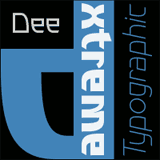
Thailand’s Chantra comes to us with one family, but what a typeface it is: sharp-edged Dee is a roman alphabet strongly inspired by Thai script, and comes in 5 weights, from light to XT, and includes italics.

Definitely not techno but rather very much retro, Mark van Bronkhorst, the type and publication designer behind MVB Fonts, has embarked on a new project with Adobe alumna, fine printer and calligrapher (and Hermann Zapf student) Linnea Lundquist. Their Sweet Fonts Collection is a “growing range of engraving lettering styles from the (early) 20th century,” and will continue to revive obscure lettering styles which have never before been translated to phototype or digital formats. Their first release is Sweet Upright Script, a decorative script with a bit of Parisian jazz-era flair and a rather unusual style of connecting its characters.

Some of our new foundries have their own narrow focus and specialty: Vladislav Ivanov’s distressed faces include the three-dimensional Jamaistevie and the extremely narrow Lost Souls; two of Albatross’ first three releases are similarly distressed, hand-drawn and three-dimensional (Blox and Tire Shop); Domenico Mazza’s playful BoxyBlocks is another new dimensional hand-drawn face from a new designer; James J. Connell’s two faces are about simplicity – Paine, named for writer & revolutionary Thomas, is an understated sans best for continuous text, and Sumi Strokes is comprised of a series of brushstrokes that evoke the spare organic qualities of Japanese ink and wash painting.
Other new faces from new foundries include Anton Novik and his disintegrating X
Story; Font-o-Rama’s 6 faces, including Nina Hons’ very attractive Herzchen, Sweet
Home, based on hand-stitched sampler lettering, and Liebling, with its
unorthodox ligatures and swash expert set; Albion
Signature is a 2,200-glyph (!) high-contrast and extremely complex script
from Canadian TofinoType; Another new Canadian typefoundry is Charles Leroux’s Grype,
which comes to us with two distressed and condensed releases, Condemned and the old western Banished.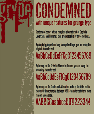
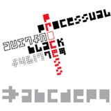
Child’s handwriting face First Grade from Richard Moore and his m u r foundry; Montreal’s Urban Pixel has several faux-pixel faces available in TrueType format; and finally Processual, the first release from Brazilian foundry Letra Um, which is based on pixel-font designs but takes those forms to their extreme with a range of 10 faces perfect for multi-color layering
JMA Marketing brings us two polished faces from Canadian designer Sandy Cerovich: Alexandar is a spare, simple slab-serif ideal for exceptionally small settings; the opposite is true for the incised JoAnne Display, whose details shine best when writ large.
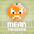
Speaking of pixel fonts, MyFonts has pulled of a bit of a coup by recently adding the entirety of the Mean Tangerine typefoundry’s stock of 110 pixel font families (and more than 180 individual faces!) to our catalog. Whether you are an interface designer or just looking for the right font for your next Flash project, this extensive range of fonts – all optimized for use at 8 point size – will have just the thing to make your next job really shine.
Finally, Fontry West is a new project from James Stirling and Mike Adkins, the type designers behind The Fontry. Their first five releases include the kinetic inline Keetoowah, a bouncy face ideal for greeting cards and similar projects, and Ghixm, a ghostly halloweenish face just in time for costume and candy season.
Of course, the majority of new faces introduced since the last issue come from designers already established on MyFonts – which is what you’d expect when we have 433 different foundries listed (so far; the number grows every week)!
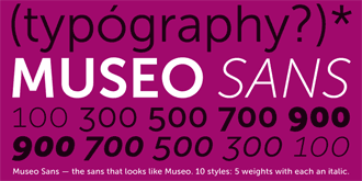
Dutch foundry exljbris continues to impress with Museo Sans, a simplified version of the flexible Museo family, which – for the time being, at least – includes several free fonts. His beautiful but as-yet unfinished text face Calluna, and its sans counterpart, should be available soon as well.
We are very happy to offer several new faces from the excellent Portuguese foundry DSType, operated by the extremely productive and talented Dino dos Santos, whom you may remember for his award-winning Estilo and Estilo Script. The Prelo family - including Regular, Condensed, Compressed and Slab variants, each in several weights, is a terrific investment should you be looking for a full sans system; it is appropriate for a wide range of uses, from display to book work and advertising, and is extremely easy on the eyes at both very small and very large settings. Prelo’s extensive character sets, including multilanguage support, lining and old-style numerals, ligatures, alternates, small caps and such a large range of widths and weights make it undeniably useful and a pleasure to set type with.
The recent DSType release Capsa, too, includes a large range of ligatures and alternates, including some very attractive swash italic caps, two sets of ornaments, and borders ideal for making attractive calligraphic patterns.
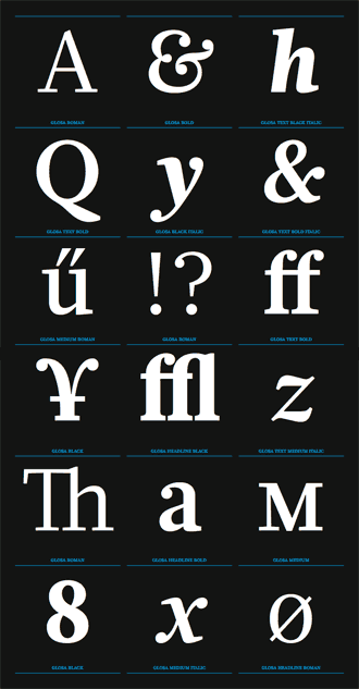
DSType’s third recent release is Glosa, available in Text, Display and Intermediate versions, and is a great complement for Prelo and a clear attractive text face in its own right. Just like other DSType releases, it includes all the alternates, accents, variant numerals and other extras that make a family like this so useful for such a wide variety of applications.
Cm5dzyne’s Christopher Miller brings several modern sans faces to his collection: Edgewater, Edgewater Serif, Edgewater Square and the attractive Ellisea. Other new smooth and modern faces include IHOF/P22’s Platten Neu, Colin Kahn’s revisiting and expansion of geometric P22 Platten and the the German fountain pen practice alphabets & books of the 1920s.
ActiveSphere brings us Jekatep and Mecatoque, which would both be at home in outer space, and The Fontry’s new Earth A.D. family is as indebted to Russian Constructivist lettering as the Japanese science fiction of the 1960s.
At the other end of the historic spectrum, we’ve got a number of useful historic revivals, some of which are replicas of historic type, such as GLC fonts’ several recent additions. The Type Fetish brings us Grimm, a sort of German expressionist lowercase melded with a blackletter uppercase that works well and is less severe than it sounds. 066.font is Piotr Wozniak’s one-man operation, based in Konskie, Poland; Wozniak now brings us Longinus Pro, an attractive 17th century Garalde with a wide array of alternates, ligatures and swash characters.
ARTypes, known for excellent revivals of lesser-known faces (their Hiero-Rhode-Antiqua – based on a design by Rhode which was first cut by great punchcutter Johannes Wagner – is very much underrated), present Curwen Initials, a new digitization of van Krimpen’s 1925 design, and Forum II, a new digitization of Georg Trump’s 1952 dimensional all-cap display face.
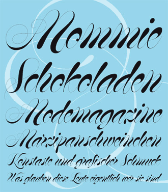
Scripts are equally well represented. Hubert Jocham has the softly flowing MommieBrush and Mommie, an extremely high-contrast variant for very large settings; the always-productive Rob Leuschke brings us several new releases, including the wild SassyFrass, Ruthie, Oh Ley and the more conservative Imperial Script; and Nanette, Fajardo’s second release, is as attractive as it is useful and comes with a face full of alternates as well as a rough version. Alison Argento’s Bender Script is an economical advertising script based on incomplete sketches by Charles Bluemlein, and includes contextual alternates, swash caps and support for a number of European languages; Minnesota’s Bergsland brings us their third script, Auntie Pat , an interesting connecting script with small caps and both lining and old-style numerals.
Canada Type has several new scripts, including Philip Bouwsma script Mirabel (based on his mother Beverly’s handwriting using a broad-edged Osmiroid fountain pen), and Adams, a revival and expansion of Dolf Overbeek’s Studio typeface, originally published in 1946.
Mexico’s Jonahfonts brings us several new typically casual and friendly brush scripts; Medalist,
in particular, is an attractive condensed face suitable for greeting cards,
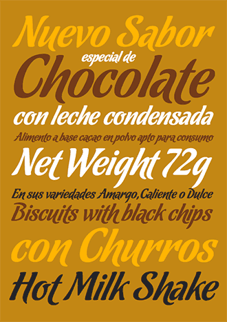
advertising and similar uses. Finally, Alejandro Paul and Angel Koziupa’s Sudtipos brings us two new typically superb faces, a script
(Chocolate,
in three “flavors”) and Eli Castellanos’ Barricada,
a very heavy yet friendly non-script display face that still manages to contain
much of the swashy character of many Sudtipos scripts.
The angular and almost-uncial style of Newcomen is a bit of a departure for regular MyFonts contributors Insigne.
Its spikiness and Victorian character are quite a bit different from the playful
French scripts and cool display faces they’ve been making up until now, and it
is a wonderful addition for any designer with invitations and other similar
formal documents as their bread and butter – its 87 alternates and 38 ligatures
make it a real display workhorse. Other new Insigne releases include Mahalia,
a swooshy script which includes connected and non-connected alternates, Xalapa,
a rough-edged hand-drawn face with African and Central American influences, and Dienstag,
an extended sans that comes in a variety of weights.
Nick Shinn (whom we recently interviewed) is one of our most accomplished type designers and we’re very lucky to be able to offer two of his newest projects: Figgins Sans, a complete and extremely utilitarian sans family, is appropriate for titling and text in both display and longer settings. It includes a large selection of accented characters, ligatures and other typographic necessities. Shinn also brings us his excellent Scotch Modern — with “all the bells and whistles,” which in this case includes bold & regular weights in roman & italic styles, plus a typically beautiful display weight; also in the release are full Cyrillic and Greek alphabets and Eastern and Central European diacritics. Figgins Sans and Scotch Modern, which pair extremely well, are available as a set of 9 extremely full-featured fonts for just under $400.
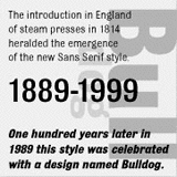
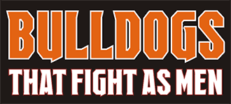
Shinn’s type is named for Vincent Figgins,whom – along with William Caslon – was one of the most important typefounders of the 17th and 18th centuries. Historians put Figgins right at the beginning of a chain of events that led to the development of sans-serif type, and Adrian Williams’ Bulldog (designed in 1989 but only now available at MyFonts) was created to commemorate the 100-year anniversary of this style. It is inspired by these early sans faces, principally the earliest gothic and grotesque sans faces. It is one of four new releases from England’s Club Type – along with Monkton, Congress Sans and the exceptionally clear slab-serif Admark.
Re-Type returns from a year-long hiatus with Yomar Augusto’s big, fat & eye pleasing modern Bauhaus face Lasagna and Ramiro Espinoza’s Constructivist Bellucci, a redesign and four-weight expansion of Mabella, an earlier type.
Alex Haigh’s Thinkdust has a new geometric display face, a complement to February 2008’s BAQ Rounded. Sukato is more angular and melds organic Deco forms with more contemporary shapes to great effect. Described as “a neue rave typeface,” its “Pac-man style” is bold and graphic and perfect for poster work.
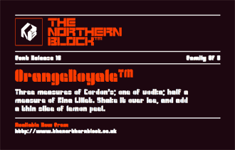
If you drew a Venn diagram charting the intersection of techno faces & stencil fonts, a good portion of the font output by England’s The Northern Block would sit right in the middle. OrangeRoyale, CorTen and QueueBrick are all especially interesting and more useful for techno club flyers and high-end electronics packaging than, perhaps, children’s birthday parties.
This quarter has been packed with hand-drawn, humorous & other light fare. Jessey Tilley unveils a new cartoony hand-drawn face, the obese Blubber; Pizzadude.dk shows off several new faces, including the Comic Sans alternate Aprilfuel, the condensed display face Sqweash, curlicued Intense Eve, ransom note font Drunken Shower and others, and Columbian designer Manuel Corradine brings us Happy Day, the unearthly Espectro, Furia and more.
Other new kinetic hand-drawn faces include Scholtz Fonts’ Queen, Leah, and Sage (and the much more mannered Girl Script ), and a good portion of the many original faces from new German foundry Autographis, such as Juliana, Simona, Isara, not to mention their more calligraphic work.
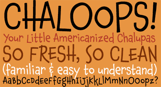
Resident Fonts has the shaky but friendly Prin, Andinistas’ several new releases include the three styles of Heleodora, which could have been written with an open shutter and a flashlight; and Chank Diesel, aka Charles Anderson of Minnesota, returns to form with the bouncy and whimsical Chaloops.
To add to those, Blambot, aka Nate Piekos, comic font creator extraordinaire, has Blambot FXPro – built for sound effects, the more explosive the better – and Krakhead, whose motto is “Big. Bold. Blocky.” It succeeds at all three.
Misprinted Type — Eduardo Recife’s Brazilian purveyors of some of the most distressed type anywhere — have three new releases, their first since 2004. Toscography looks like it was cut from wood or linoleum; LeKing’s overwrought initials come from 19th-century decorated caps (the font comes with a set of 24 EPS ornaments), and HandMade is a diverse mix of detailed, decorated ornaments from a wide variety of different 19th century display types, which comes with 16 EPS ornaments and frames.
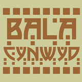
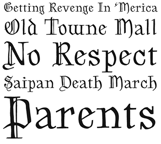
Nick Curtis has been busy as usual, with over a dozen new releases. Standouts include the extremely bold geometric stencil face Geodezyx and Bala Cynwyd, a revival of great Arts & Crafts-era designer Dard Hunter’s signature lettering.
Another new Arts & Crafts influenced face is Ray Larabie’s tribute to the lettering on Led Zeppelin’s Houses of the Holy sleeve, Carouselambra, which is chock-full of alternates and ligatures; Larabie’s interest in that movement extends to another new face: Raincoat, as wide as Carouselambra is tall, also includes a number of ligatures and alternates, and is perhaps one of the most contemporary Arts & Crafts-based types available.
Another perennially productive contributor, Jeff Levine, has been busy with the deco-tinged Bal Harbour, old west Homesteader, Constructivist Squarity, and over a dozen other faces from all over the historical and stylistic map.
Another strongly deco-infused face is John Bomparte’s Sidewalk Cafe, a caps-only display face that comes right from travel posters of the 1920s.
Picture and dingbat fonts abound, as well: Brazilian foundry Just in Type’s hilarious Pixel Zoo, Lián Types’ Miscelanea, great for pattern-making, Gerald Gallo’s floral Blooming Ornaments, Outside the Line’s Wedding Doodles, Hearts & Swirls, and Party Doodles 2, and Chank’s thematic 4-font Chankbats are just some of the highlights in this genre.
Finally, please note that Tomas Brousil’s hard rocking Metalista can now be had for the low price of zero dollars, in conjunction with the designer’s recent interview in the July / August issue of our Creative Characters newsletter.
It’s been an exciting few months for typographers and type designers alike. It’s election season in the United States, and the amount of attention given to that country’s two largest political campaigns – including their choice and use of type – is staggering. In Canada, of course, it’s not so much an election season as a few weeks, but there, too, graphic designers dissect the minutiae of campaign identities.
As always, there are some tempting type-related events on the horizon, with a bit of something for everyone – should you be in the neighborhood or willing to take a (not-so-short) trip…
- September 11–November 26: AIGA’s 50 Books / 50 Covers event at their National Design Center in NYC
- October 10–12: Saving the History of Printing, this year’s American Printing History Association conference in NYC, with a sneak preview screening of Typeface, a new documentary about the Hamilton Wood Type & Printing Museum.
- November 7: Letterpress, A Celebration at London’s excellent St. Bride Printing Library
- August 21 2008–February 9 2009: Joseph Churchward’s World of Type at Te Papa Museum in Wellington
- September 4– October 15: The Seattle-Tehran Poster Show, Daniel Smith and Iman Raad’s uniting of two very different design communities, premiered at Seattle’s Bumbershoot Festival, and is now on display at Seattle’s Design Commission; it will travel to Tehran – and throughout the world – in 2009.
- February 11–15 2009: TypeShed 11 in Auckland will include speakers like Christian Schwartz, Donald Beekman, Sarah Maxey, Holland’s Experimental Jetset and plenty of others.
And for eye candy: Cartel Agency recently attempted to gather the best-designed Criterion Collection DVDs; Axel Peemoeller found this unique angle on forced-perspective directional signage at Australia’s Eureka Tower car park; Bryan Wu brings us post-ironic Helvetica & Cooper Black shirts. Although personally, I like my president the way I like my coffee – typeset in Gary Gillot’s 1966 Carousel, of course.
Finally, Gary Hustwit, director of the terrific Helvetica, is working on a new film. Sadly, it’s not about type, but it is about design – industrial design, to be precise. The found type-based logo for Objectified should bring a smile to any typographer’s face.
[email].
If you no longer wish to receive this newsletter, you may change your subscription settings at: http://www.myfonts.com/MailingList