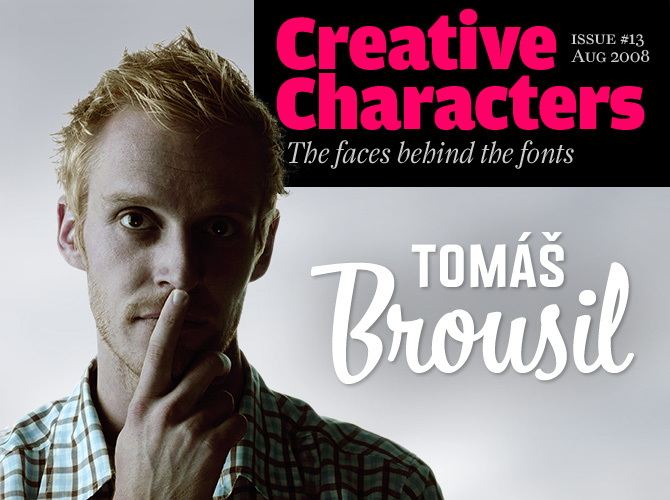
photo by Radeq Brousil
It’s been a year since we began this series of interviews with the people behind the fonts. In the past twelve months we have introduced you to the typefaces, the methods and the motives of some of the most prolific and original type designers in the business. We have had great reactions, including hundreds of votes on future interviewees. So we’re all set for another year of enlightening conversations.
This month’s interviewee is Tomáš Brousil of Prague. His Suitcase Type Foundry is one of those great one-person font foundries that have been instrumental in raising the bar for emerging type designers. Brousil's fonts are intelligent and original, well-made and useful. He also masters a amazing range of styles. Meet Tomáš Brousil, a man of many faces.
Tomáš, were you always interested in type and lettering? Or did you have in mind a completely different kind of career when you began your design education?
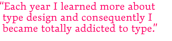
After graduating from what we call “middle school” I started my career as a graphic designer in a small agency. My plan was to learn about the technical details of print production and pre-press technologies first, and then after one or two years enroll into Jan Solpera's typographic studio at the Prague Academy of Fine Arts, which holds admission exams every year in January. Of about 30 people that usually sign up, only one to three people get through. I was not accepted until five years later. Each year I learned more about type design and consequently I became totally addicted to type. When I finally began my studies at the academy, I had a clear idea of what I wanted to do – start up my own type foundry.
You were a student of František Štorm, whom we interviewed a year ago. What are the main things you learned from him?
František began teaching at the Academy in the same year when I began studying there. He took over the typographic studio from Solpera one year later. I owe the majority of my design skills to him; he also taught me the technical ins and outs of glyph construction and the necessary production know-how.
Gloriola
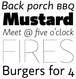
The number of all-purpose sans-serifs is steadily increasing. So what we look for in each of them are those unique properties that make them special - and Gloriola has plenty. Clear-cut yet attractive, it comes in a wide range of styes including four extreme weights specially drawn for display purposes. Add the friendly small caps, the open italics and the beautifully drawn figures, and the result is one of the decade’s most distinctive and usable monolinear sans faces.
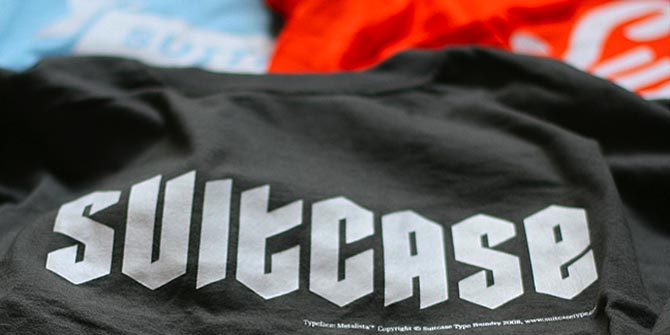
The Suitcase t-shirt: apparently as exclusive as a Chanel evening gown. Don't even enquire!
František Štorm has developed a very personal, idiosyncratic style of type design. Your typefaces seem to be less emphatically expressive, more neutral. Is this simply a question of personality, or did you consciously move away from your master?
It is probably a combination of several elements. One of my concerns when I started my foundry six years ago was that my catalogue would somehow be complementary to Štorm’s. He mainly produced fonts for book-setting at the time and I missed quality fonts for designing posters, corporate styles or logotypes – simply contemporary typefaces. I don't have the same special interest in baroque or renaissance styles as he does. I am more fascinated by the innovative typography of the 1950s and ’60s and its simplicity and coldness.
As a former student of František, I feel I am under constant scrutiny from other designers. As soon as I do something that remotely resembles his work, I am told it is “too Štorm”. It is frustrating sometimes, because my approach to type design is completely different.
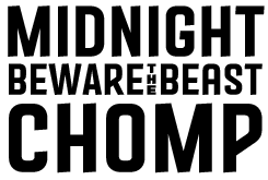
Fishmonger
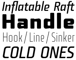
Fishmonger originated as a custom-made font for a seafood shop. As soon as Brousil had sketched its basic principles, the idea arose to expand it into an extensive series with a large number of styles. The result is a family of five widths in five weights, each with its respective italics: 50 fonts in all. With its unmistakable silhouette, Fishmonger is a functional, clean design that is ideal to lend a unique identity to an arts event or a trendy product.
Would you say that there are aspects of your work that are typically Czech or Central European? Has the massive amount of diacritic signs in Czech or Slovak influenced the structure or proportions of your letters?
I don't think that today our typefaces are specifically Czech. One could think of typefaces that refer to our classic 20th-century designers like Preissig or Menhart, but this has already been done and it could become a bit boring. In fact, there have been more interesting type designers in the past, even though their designs were not as expressive.
The frequent usage of diacritics in Czech accounts for longer ascenders and lower capitals in many of our alphabets. But what is important to me here is a high sensitivity to the placing of diacritic marks – not just for Czech but for all languages. Too often, graphic designers who want to use fonts from foreign foundries for Czech or similar languages need to have them furnished with new quality diacritic marks.
What is it you like most about designing type?
I really love the early stages of a typeface: sketching, looking for shapes, and arranging the basic characters. To me, those are the best moments of designing type. The rest is more or less routine, and not much fun. And what is really hard for me is to come up with a name for each new typeface.
You belong to a generation that has more or less grown up with computers. How about manual work: techniques like drawing, calligraphy, and woodcut… Is it still important?
I begin most typefaces by sketching and hand-drawing. It’s not necessary for all typefaces, but it usually helps to establish the basic ideas. All the other steps are simpler when done by computer; the mouse and the keyboard are natural tools for me to work with. But I certainly think drawing is important. I have hundreds of sheets filled with character studies. I am convinced that this helps to grasp the construction of an alphabet and the relationships within the font.
BistroScript
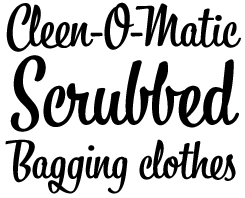
BistroScript was selected by MyFonts designer Nick Sherman as one of Typographica’s Typefaces of 2007. Here is what he wrote:
…There is no doubt that this face got its inspiration from mid-century ‘retro’ handlettering, but BistroScript moves beyond what John Downer would call a revival, instead holding its own as a contemporary tribute to the script styles of yore. Like Underware’s Bello, BistroScript is one of few typefaces born from classic cursive brush scripts which can hold its ground in contemporary contexts without seeming gaudy or revivalist. Brousil also overcame the potential sterilization of BistroScript's calligraphic charm by supplying plenty of ligatures and glyph variants (my favorites are the ‘St’, ‘gg’, and ‘tt’ ligatures, the connecting ‘@’ variant, and the alternate ‘A’) … and making sure that all the characters connect perfectly.

Sketches from Tomáš' notebook for what would eventually become BistroScript.
Considering that your Suitcase Type Foundry was founded merely five years ago, your output has been quite impressive. Do you use special methods or techniques to keep up a high production?
It is really quite simple. Most of my fonts were originally developed during my studies at the Academy. My production was imposed by the rhythm of the school: twice a year we had to show a minimum of one or two typefaces, or rather type families. This compelled me to make optimum use of my time, simplify the process of creation, think forward and work on more than one font at a time.
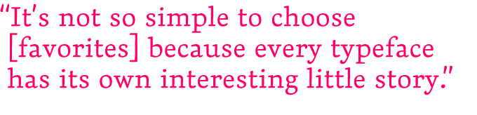
Of your own typefaces, which are you favorites, and why?
It could be RePublic, a typeface originally named Public and designed by Stanislav Maršo in 1956, which I redesigned in 2004. Public was closely linked to an era of standardization in our society; one of its main uses was for the communist party newspaper Rude Pravo. So for an older generation of designers the typeface had negative connotations and they advised against reviving it. I did it anyway, and today RePublic is wide-spread and quite popular. I think I managed to rehabilitate an interesting typeface.
Or it could be Sandwich, the first font with automatic vertical aligning of glyphs. Or maybe my first typeface Katarine, which is named after my fiancée and which I redesigned last year, when my daughter was born. It’s not so simple to choose because every typeface has its own interesting little story.
Sandwich
Sandwich is another clever toolkit to build a visual identity. This all-caps display face comes with some very special features. In the lowercase area there’s a series of alternate, rounded characters for letters like A, E, M, N and Y, which give the typeface a radically different look. The font’s most unusual feature is a series of about forty “ligatures” or vertical catchwords – articles and prepositions in several languages. Better still, the font allows you to compose your own vertical two- or three-letter words (provided no accented characters are used). For that purpose, Sandwich includes five versions of each letter.
Could you mention some typefaces that you wish you had made?
This really is the hardest question of all. For a recent discussion, I wrote down a list of typefaces that I’m kind of envious of. There was Bryant by Eric Olson, Enigma by Jeremy Tankard, Lapture by Tim Ahrens, Merlo by Mario Feliciano, Moderno from Font Bureau, Omnes by Joshua Darden, Plumero Script by Diego Giaccone. I later thought of two more typefaces, Olga by Christina Bee and Tisa by Mitja Miklavčič.
You have designed a display font called Metalista, which you have made available for free and which you describe as “an expression of undying admiration for the persistence of the metal culture”. Are you a metalhead? Apart from Metalista, has music influenced your type designs?
Oh no, I am not a metalhead. I just admire people who manage to conform their own life style to some style of music. Heavy metal has a long history and a strong position in my country and the fans look the same today as when I was a child. I find that incredible. Otherwise I play music non-stop while working, but I don't think it has some special impact on my typefaces.
What is you biggest ambition for the foreseeable future?
My next project is a typeface that can change style within the framework of the family. It could be a great typeface for setting magazines or newspapers. Other than that, I don't have any special long-time ambitions. What I do plan is to produce printed catalogues to support the foundry. I have a type specimen in its final stage in my computer, and I am looking forward to printing it.
Thanks so much for your time, Tomáš. We'll look forward to seeing the printed specimen book soon.
Dederon Sans & Serif
Dederon Serif is a beautifully drawn typeface for book typesetting. Some of its characteristics can be traced back to the Liberta typeface published by TypoArt in former Eastern Germany; but its details are wholly original and contemporary.
There’s no better companion to Dederon than Dederon Sans – a matching sans-serif based on the same principles but sufficiently different to stand out, creating the perfect dynamics between the various sections or levels of a design.

Who would you interview?
Creative Characters is the MyFonts newsletter dedicated to people behind the fonts. Each month, we interview a notable personality from the type world. And we would like you, the reader, to have your say.
Which creative character would you interview if you had the chance? And what would you ask them? Let us know, and your choice may end up in a future edition of this newsletter! Just send an email with your ideas to [email protected].
During the past year, we've interviewed the likes of Christian Schwartz, David Berlow, Dino dos Santos, Ronna Penner, and Underware. If you’re curious to know which other type designers we’ve already interviewed as part of past Creative Characters newsletters, have a look at the archive.
Credits
This month’s interview was conducted & edited by Jan Middendorp and designed by Nick Sherman.
Supporting fonts
The Creative Characters masthead is set in Amplitude and Farnham; the intro image features Sandwich and BistroScript; the pull-quotes are set in Dederon Serif; the large question mark is set in Farnham, and the small URL at the top is set in Unibody 8.
Unsubscribe info
This message was sent to:
[email].
It is never our intention to send unwanted e-mail. If you no longer wish to receive this newsletter, you may change your subscription settings at: www.myfonts.com/MailingList
Comments?
We’d love to hear from you! Please send any questions or comments about this newsletter to [email protected]