
s you can see, Rising Stars are speeding up. Here we are yet again, only a few weeks after the July edition. As some of you may have noticed, we had some catching up to do. From now on, we’ll seriously try to get each Rising Stars newsletter out to you in the first week of the month.
Atmosphere is the keyword in this issue of Rising Stars. Each of the new fonts we selected stands for a particular period or mood – and each is a great character actor that will lend a unique yet vaguely familiar voice to the headlines you choose to set in them.
This month’s Rising Stars

Confection is yummy. It’s frosted with swirling peaks of whipped cream and whimsical stems of pulled taffy. The OpenType version is caramel filled with delicious ligatures and alternates. Designer Jess Latham took his inspiration from copperplate script, but gave his typeface a dynamism which connects it to the advertising and record sleeves of the 1950s. The result is a charming, non-connecting and flexible script, which you can teach to hop and dance by playing around with the baseline.
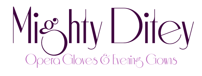
The New York company Photolettering was a source of delightful advertising and magazine typefaces in the 1970s. One such alphabet was a delightfully different typeface named Aphrodite, designed by Richard Nebiolo. Nick’s Fonts now brings this graceful period piece to your desktop with Nick Curtis’s new digital version, wittily renamed Mighty Ditey. It’s ideal for tasteful yet unusual headlines.
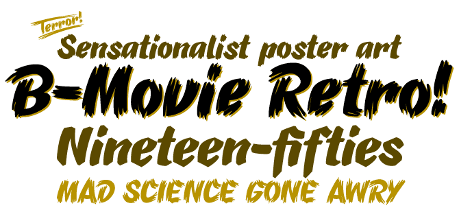
Across the world, cheap cinemas played cheap movies throughout the 1950s and early ’60s. Talented draughtsmen and designers took out their brushes each week to picture a key scene from the latest flick, oozing romance, violence and/or terror, with expressive lettering to match. This is the atmosphere that B-Movie Retro from Die Typonauten captures so admirably. The font comes in three brush styles, each suggesting its own type of bad movie. The outrageous list of key words speaks volumes: from beast to zombie, from bomb to zorro. And don’t forget the fancy set of catchwords! Surely, no plot is too bizarre for this typeface.
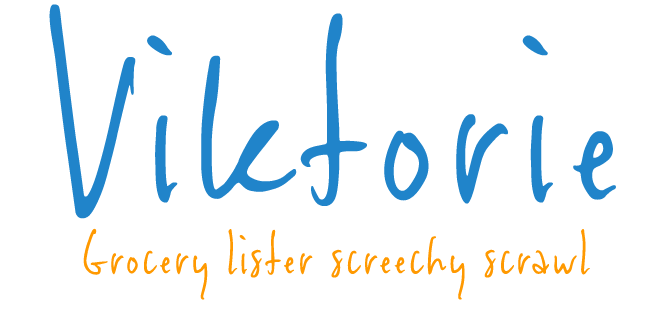
There are many informal scripts, and new ones are released almost on a daily basis. But Viktorie, with its carefully calculated casualness, stands out. Its energetic characters pay little heed to such arbitrary constraints as baseline or x-height – they seem to have been jotted down hastily and almost without thinking. Viktorie’s forms are both curiously legible and inspiringly unleashed. Check out the other fonts from Three Islands Press for many more handwriting fonts, both historical and contemporary.
Text family of the month
For those Rising Stars regulars who happened to miss last month’s edition: there have been a few changes. The type designer interviews that used to be part of this newsletter now have their own platform – the monthly Creative Characters. This will allow us to introduce even more bright young typefaces in Rising Stars. “Text Family of the Month” is our new section dedicated to the workhorses of the printed page.
Introducing this month’s text family:
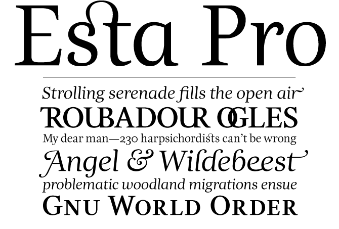
Dino dos Santos from Portugal has been releasing an impressive range of font families these past few years. To mention just a few recent ones: Estilo and Estilo Script were among last year’s most successful newcomers. The sophisticated Leitura type system is an amazingly versatile superfamily. And now there is Esta Pro: the extended version of Dino’s award-winning Esta typeface.
Esta Pro belongs to a new breed of text fonts with a Mediterrean-Latino soul: spirited, dance-like, smart. Its surprising details make it an interesting font for large sizes, but when used for body text, the font’s idiosyncrasies modestly blend in with the overall image. Esta Pro comes in two weights only – Regular and Bold – but offers small caps, oldstyle and lining figures, as well as two adventurous sets for titling purposes: Esta Display and Esta Swashes.
Be quick: for another week or so, all DSType fonts come with a 50% discount!
Follow-Up
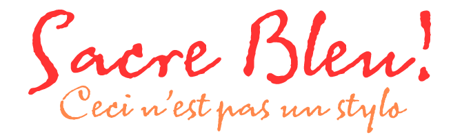
Last month we featured Mark van Bronkhorst’s Sacre Bleu as one of our four Rising Stars. It’s been doing very well on our Starlets bestseller list of recent fonts. Sacre Bleu is one of those script fonts that are based on a genuine piece of handwriting and have been carefully designed to retain the spontaneity of the original. Its outlines have just the right shakiness, its dynamics are completely convincing – deceptively simple, it’s nevertheless a sophisticated work by a seasoned type magician.
If you like this font by MVB, check out some of their other fonts:

MVB Calliope
Like Sacre Bleu, Mark van Bronkhorst’s Calliope is based on informal handwriting, but it could hardly be more different. While the former is based on a schoolish French hand, Calliope is confident and contemporary. It’s so clear, it could be a comics font; yet it lacks the embarrassing self-consciousness these alphabets often have. Menus, book covers, price tags: the possibilities are endless.
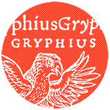
MVB Gryphius
Gryphius is different from many other digitizations of 16th century typefaces in that it retains all of the irregularities of type on the printed page. Some people may find that too romantic – but it’s great for lending an atmosphere and a sense of ancient craftsmanship to your digital page. Plus, the font comes with a fine set of small caps as well as an amazing collection of ligatures. The designer is credited as ‘Otto Trace’. Pronounced in English, that name will give you an idea of the kind of software Mark’s studio used to digitize that typeface...

MVB Chanson d’Amour
Chanson d’Amour is described by MVB as a ‘rustic script’. It has an ephemeral kind of beauty, capturing the modest yet elegant handwriting of somebody who might have been a teacher at a village school 100 years ago. But then again, there have been metal typefaces designed to emulate that kind of script as well; so Chanson d’Amour is also part of a marginal yet age-old typographic tradition.
Have your say
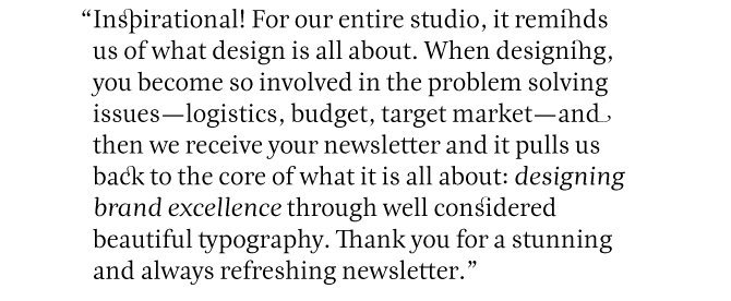
— Carmen Lerm from South Africa, July 18th 2007
This issue’s font credits
featured fonts
Comments?
Please send any thoughts you'd like to share with us about this newsletter to: [email protected]