
ome great new fonts have shown up on our Starlets list this month. Scripts are big as always – witness the success of newcomers like Sacre Bleu, Ambassador Script, Confection and Viktorie. Insigne’s bestseller Aviano was given a sans serif companion which quickly became the number one Starlet. Fleurons V, as its name indicates, is the fifth set of lovely embellishments by German designer Gert Wiescher.
Meanwhile, we've made a few changes here in the Rising Stars newsletter. For starters, we have let go of the Know your type designer interview to allow it to spread its wings as a separate newsletter (arriving in your inbox soon!). Secondly, we're introducing a new section to showcase those workhorse font families which tend to be less trend-sensitive: text faces. Enjoy!
This month’s Rising Stars
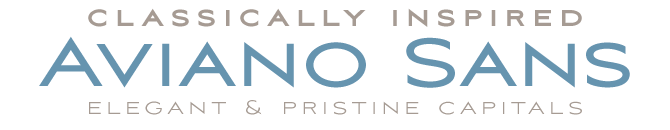
Earlier this year Jeremy Dooley released Aviano, an extended titling face with the timeless appeal of classical letterforms. Based on the same proportions, this recently published sans serif variant is wide, geometric and clean. Aviano Sans is ideal for a job that calls for a dignified all-caps alphabet.
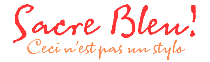
Californian Mark van Bronkhorst has designed lettering and typefaces for Disney, Warner Bros and the Bank of America, to mention just a few. He’s also the maker of Conduit, a best-selling, rule-breaking sans serif from ITC. He is a master of many styles, and some of his best alphabets are scripts. Sacre Bleu is one of his most recent offerings in the popular genre of informal script fonts. Inspired by a sample of 1930s French handwriting, it recalls Roger Excoffon’s Mistral – but with less polish, and more spontaneity.
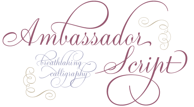
Aldo Novarese was one of the great innovators of type design, working in an amazing range of styles and genres. His “tipo inglese” Juliet (1955) was a remarkable venture indeed – a typeface based on English roundhand scripts, but with a more upright silhouette in order to facilitate the punchcutter’s work. Thanks to its legibility and friendly color it became an immediate favorite with magazine and advertising designers and was even imitated by calligraphers.
Ambassador Script is Canada Type’s digital version of Novarese’s elegant masterpiece. Going above and beyond its duty as a revival, it is the result of more than a thousand hours of work! The font has been expanded with a huge number of alternates, swashes, beginning and ending forms, as well as accompanying flourishes and snap-on strokes. Whenever lush curves and calligraphic opulence are called for, Ambassador Script is what you need.
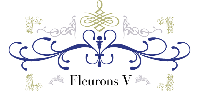
If the the swashes and swirls of Ambassador Script are still too tame for your taste, try combining it with one of Gert Wiescher’s sets of Fleurons. Fleurons V is his fifth series: charmingly drawn as always, and especially well-suited to be combined with roundhand scripts. Wiescher himself suggests the companionship of his lovely Nadine and Ellida (though we've shown it here with Bodoni Classic)
Know your type designer (even better)
The world of type is continually changing, and so are the MyFonts newsletters. We’re glad that so many of you appreciated the new editorial approach in our latest Special Edition. Now we’ve made some changes to Rising Stars as well. The “Know your type designer” interviews that would normally appear here now have their own monthly platform – a newsletter dedicated to type designers, called Creative Characters.
We were quite impressed by the thoughtful, informative and witty answers provided by our designers in the past months – and we expect that the new format will allow our readers to appreciate these Creative Characters even more. The first issue will land on your desktop soon.
Text family of the month
With the aforementioned interviews moving on to bigger and better things, we introduce this new section to Rising Stars: Text family of the month. New text faces – fonts created to be read in longer text settings – don’t often make it into our Rising Stars newsletter, simply because they sell slower and are less trend-sensitive. In order to showcase some of those great new ‘serious’ typefaces (which are often among our personal favorites), we proudly give them their space to shine here.
And with that, we introduce to you…
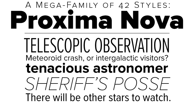
The original version of Mark Simonson’s Proxima Sans has been around for a while as a small family of six fonts. With Proxima Nova, Simonson has now published a complete reworking of his design: Proxima has been expanded to a superfamily of 42 full-featured OpenType fonts, spanning seven weights and three widths: Normal, Condensed and Extra Condensed.
Stylistically, Proxima Nova bridges the gap between typefaces like Futura and Akzidenz Grotesk. The result is a highly original hybrid combining humanistic proportions with a somewhat geometric appearance.
Mark Simonson is not only a prolific lettering artist and type designer with more than 70 fonts on the market, he is also a contributor to typography forums such as Typophile. To put into perspective his work on Proxima Nova, read his well researched article on two other sans serifs, Arial and Helvetica.
Follow-Up
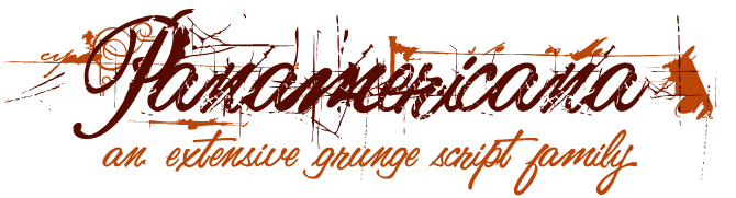
Panamericana is a family of rough-and-tumble fonts of calligraphic origin designed by Andinistas from Bogotá, Colombia. Its ten styles offer energetic handwriting in various grades of decay and deconstruction, plus a set of dingbats and flourishes. Having been featured in last month’s Rising Stars, this intriguing set continues to catch the attention of designers in search of an evocative script with darkly romantic overtones.
If you like this typeface by Andinistas, check out some of their other fonts:
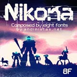
Nikona
This family of futurist fonts is Carlos Fabián Camargo’s typographic interpretation of the three robotic laws created by science fiction writer Isaac Asimov. Its three weights, called Blanca, Gris and Negra, can be combined with their destructive counterparts X1, X2 and X3 Nikona to dazzling effect. Nikona Stencil and Dingbats are perfect for printing (and graffiti!) techniques based on templates. Use big.
Hiroformica
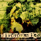
Hiroformica by Carlos Fabián Camargo Guerrero is described as a family of fonts “configured for integrated combat”. By combining the heavily damaged characters from different fonts, each with its own type of mutilation, you can lend a unique identity to your destructively inspired designs. The font family comes with an extensive range of dingbats referring to fire, war and bloodshed. Enjoy!
Denedo
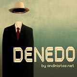
Just like the optical illusions conceived by the Dutch graphic artist M.C. Escher, Denedo is a font that is impossible to construct in three dimensions: it can only exist as a drawing. The family is based on a set of numerals published by Nedo Mion Ferrario in the “Letromaquia” exhibition shown in Caracas, Venezuela, in the 1970’s. Denedo is a type family in three styles that can be combined to emphasize the carefully balanced incongruity of its shapes.
Have your say
— Adriana Waterston from Horowitz Associates, Inc in Larchmont, NY
Your opinion matters to us! Feel free to share your thoughts or read other people’s comments at the MyFonts Testimonials page.
This issue’s font credits
featured fonts
supporting fonts
- “MyFonts / July 2007”: Bryant
- “Rising Stars” masthead: Auto 3
- drop-cap “S”: B-Movie Retro
- Have your say quote: Proxima Nova
Comments?
Please send any thoughts you'd like to share with us about this newsletter to: [email protected]