n many parts of the world, spring is in the air. What better way to celebrate the rebirth of nature than with a bunch of fresh flowers? At MyFonts, we contribute our share by featuring yet another great set of floral ornaments – apparently they’re more than just a passing trend. Also, check out the festive Deco and script fonts we have on display. And don’t miss the Text Font of the Month – a welcome addition to one of the most popular Portuguese families. Curious? Then read on.
This month’s Rising Stars
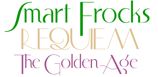
The prolific Nick Curtis has mastered the art of time travel like few other designers of his generation. On one of his trips to 1930s London he noticed a sign in a storefront announcing “smart frocks” (frock, for the non-English speakers among us, usually means ladies’ dress, but can also designate various other garments). Seeing the sign in the window was one of those “Eureka!” moments that must happen to Nick almost on a daily basis: another great idea for another cheeky display face. Describing Smart Frocks as “singularly stylish, hip and haughty and decidedly Deco,” the designer is confident that this font is the new way to outsmart the competition. Also included in Nick’s irresistibly priced Feb 2008 6-Pack.
With his 1993 Bodoni Classic Ornaments, Munich designer Gert Wiescher pioneered a genre that recently has become phenomenally popular. It comes as no surprise that Wiescher has continued to produce ornament packages. His output is impressive, and his latest releases include his sixth collection of Fleurons as well as five sets of ornamented borders called Ornata. Wiescher’s most successful recent font is Floralissimo. Like most of his other ornamental fonts, it is based on vintage material from old catalogs. The flowery ornaments are an elegant addition to any design that is meant to exude romance, nostalgia... or subtle irony.
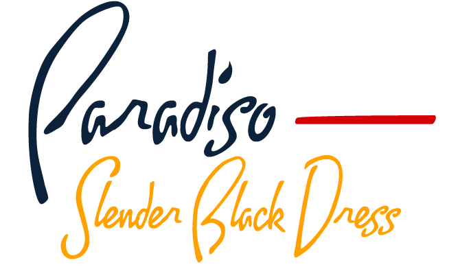
Brian J. Bonislawsky’s successful script font Montelago was based on a logo from one of Las Vegas’ casino hotels. On a stroll across his home town, the Vegas-based, self-proclaimed “Professor of Fontology” found a similar source of inspiration in the Paris Resort and Casino. Its logo has a high “ooh-la-la” factor, with a capital P that is decidedly lustful. Taking his cues from just that one cap and four lowercase letters, Bonislawsky drew a lively, frisky alphabet with huge initial capitals. Paradiso is great for packaging, book covers and magazine headlines.
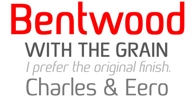
During the post-1945 decades, Scandinavian furniture designers and manufacturers perfected the art of bending plywood into gracious curves (they weren’t alone: stateside, Charles and Ray Eames worked similar wonders). Czech-born Australian designer Jan Schmoeger has captured the dynamic tension of Scandinavian chairs in his stylish sans-serif, Bentwood.
He reduced the alphabet to its simplest forms: no extra corners, no stems, connections or hooks. In spite of these drastic measures, the font’s legibility is surprisingly good, even at text sizes. You may want to add a little extra spacing at 10pt and below.
Text family of the month
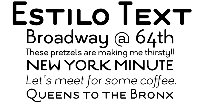
With Estilo and Estilo Script, Portuguese designer Dino dos Santos created one of the most professional and widely appreciated Art Deco-inspired display families available. Despite the geometric simplicity of its characters, The Estilo display fonts look elegant and classy, with a wide range of alternates, ligatures and swashes.
The latest addition to the Estilo family is Estilo Text, a three-weight family with small caps and italics. True to its pedigree, Estilo Text is a face with plain and simple forms, with rounded stems that soften the sternness of its consistent geometry. As the curves in letters like e, m, n, G and U are based on the circle and semicircle, the font is relatively wide; at the same time, its low x-height makes it look about 30% smaller than, say, Helvetica at the same point size. In other words, Estilo Text’s unusual proportions work both ways and may need some experimenting to get used to. Good things come to those with patience, though: a legible piece of text that looks absolutely unique.
Follow-Up
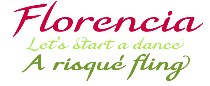
Insigne’s Jeremy Dooley designed one of last year’s most successful display font families – Aviano. He hasn’t given himself much of a break since, releasing one typeface after another. His brush script Florencia was one of last month’s Rising Stars and it has continued to do well. It’s fierce and spicy, and moves across the page with grace and pace. It’s also got a wealth of OpenType extras, including swash alternates, old style figures and special ligatures.
If you like this font by insigne, check out some of Jeremy’s other typefaces:
Terfens
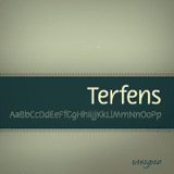
Terfens is a wonderful hybrid: it has the hand-made feel of a script font, but the precision and legibility of a text face. It’s also been expanded recently: it now has super- and subscript numerals. Previous buyers have been invited to download the update for free.
Lourdes
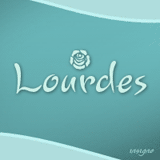
If you like Florencia, you’ll probably love Lourdes too. While Florencia flows forward with determination, Lourdes hops and bounces about and is clearly having a good time. It is a rhythmic alphabet – a good start for a logo, or a mouth-watering ingredient for food packaging.
Sommet
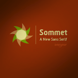
Sommet is arguably the most ambitious of Jeremy Dooley’s sans serifs. With its subtly futuristic appearance, it is a striking headline face for magazines, brochures and flyers. But it can do more: used with care and generous leading, it will also work as a text face with a unique atmosphere.
Have your say
—Chloë from London
25 Feb, 2008
Your opinion matters to us! Feel free to share your thoughts or read other people’s comments at the MyFonts Testimonials page.
Font credits
The Rising Stars masthead and subheading are set in Auto 3 and Bryant, respectively. The drop-cap I in the introduction is set in Teeshirt, and the “Have your say” quotation in Estilo Text. The small pixel typeface used at the very top is Unibody 8.
Unsubscribe info
This newsletter was sent to [email]. You may unsubscribe at any time at: www.myfonts.com/MailingList
Want more?
All of our previous newsletters are available online at myfonts.com/newsletters/
Comments?
Please send any questions or comments regarding this newsletter to: [email protected]

