his year is very different from last year. How can we be so sure? Well, for instance, we clearly remember declaring April a month of nostalgia when presenting the Rising Stars newsletter a year ago. Now look at the April selection of successful new fonts this time around: each alphabet a collection of fresh, contemporary letterforms, each font more original than the next.
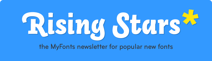
This month’s Rising Stars
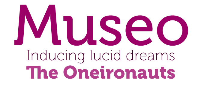
Dutch designer Jos Buivenga decided to take a risk when submitting his first type family to MyFonts: he wanted three out of the five weights to be offered free of charge. His daring strategy paid off; many users noticed the spirited Museo and liked it so much they bought the other weights as well, pushing the new face straight to number one on our Starlets list. Museo is a lucid semi-serif family with simple, open forms and highly original details. It makes for striking headlines, but is also very readable in medium-sized texts. Museo supports a wide range of languages and comes with several extra ligatures and alternates.
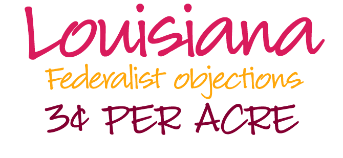
Lettering artist Charles Borges de Oliveira has published a handful of beautifully drawn brush script fonts in the best American signpainting tradition. Check out his energetic Sarah Script or the cheeky Bounce Script. Louisiana is different. Based on the lovely handwriting of Melanie Snedeker, it is less fancy, but just as confident. It’s informal and natural, while having just the right kind of regularity to make for comfortable reading. It’s one of those legible handwriting fonts that come in handy for many design jobs ... but also for writing a letter or invitation that looks personal without being sloppy.
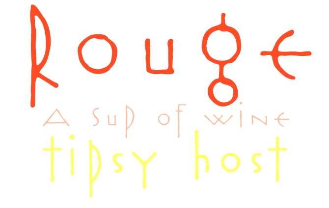
Rouge is what you might call a “novelty typeface”: witty and surprising, an alphabet that defies categorization. You can imagine members of a future tribe scribbling it on a stone wall in some apocalyptic science fiction movie. Rouge’s forms are eclectic and paradoxical: they are geometric while having a hand-made feel; several lowercase letters have uppercase shapes; some characters are strangely symmetric and simplified. If you allow us a little speculative theorization: Rouge is the alphabet remade as a set of pseudo-ritual symbols — just like the children’s myths based on an old View-Master reel in the third Mad Max film. But if you prefer to think it’s just a nice wacky font that is fun to play with — that’s fine with us.
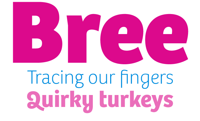
Veronika Burian and José Scaglione met while completing their MAs in Type Design at the University of Reading, UK. They struck up a lasting working relationship, founding Type-Together, based in José’s native city of Rosario. The foundry’s output so far, with great text faces like Ronnia and Karmina, has been very promising. Bree is their most original font family to date. Based on Type-Together’s attractive logo, it combines an upright structure with italic-style shapes — witness the one-storey ‘a’, cursive ‘e’, and fluid ‘g’, ‘y’ and ‘z’. Alternate versions of these letters are available when a more classical look is desired. Technically, Bree is highly professional: it is impeccably drawn and comes as an OpenType family with four sets of numerals, ligatures, alternate characters, fractions, scientific superior/inferior figures and language support for over 40 languages.
Text family of the month
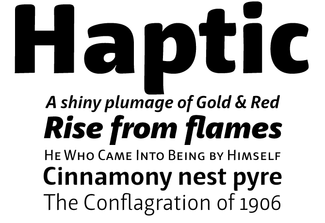
One of the major foundries that recently joined MyFonts is LucasFonts, led by Berlin-based Dutch designer Luc(as) de Groot. De Groot also teaches type design at the University of Applied Sciences in nearby Potsdam, and in doing so he is busy creating his own competition. Haptic by Henning Hartmut Skibbe was originally developed under Luc(as)’ supervision as a graduation project. Its retail version comes in an impressive range of seven weights — from Light to Black — each with matching italics, small caps and italic small caps.
Haptic was the result of a challenge. Henning Skibbe asked himself: “How much character can a typeface bear before losing legibility?” The answer is a delicate type family that offers maximum warmth and personality, yet meets all the requirements of an all-purpose text face. It was optimized for use in small sizes, but thanks to its soft shapes and subtle details it will work wonders as a headline face as well.
Follow-Up
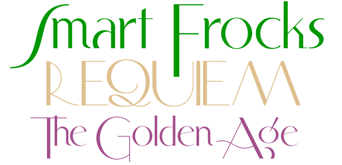
Based on a piece of commercial lettering from the 1930s, Smart Frocks is hip and haughty and decidedly Deco. Having been featured in last month’s Rising Stars, it has risen to further fame and glory in the past few weeks. It even made it to the second spot in our general Bestsellers list, which is an impressive career for a former Starlet. The stylish Smart Frocks is included in Nick’s Fonts’ irresistibly priced Feb 2008 6-Pack.
If you like this typeface from Nick’s Fonts, check out some of their other fonts:
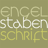
Engel Stabenschrift
An elegant uncial face based on a work by German type designer Ernst Engel from 1927. It is unicase — no separate upper- and lowercase forms — and monolinear — it has almost no contrast between thin and thick strokes. A curious combination of Art Deco sensibilities and medieval letterforms.
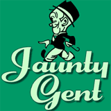
Jaunty Gent
Based on the 1936 Rheinhold Kräftig by Erich Mollowitz, Jaunty Gent was one of last year’s most striking display fonts. The original letterforms were extended and beefed up a bit, and the result is a rollicking script-like retro font.
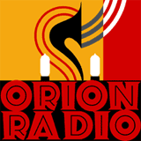
Orion Radio
Nick Curtis is one of the hardest working revivalists in the business. A few weeks ago he presented the follow-up to his Feb 2008 Six-Pack — that’s right, the March 2008 Six-Pack. Our favorites from the package are the delicious Calamity Jane, and this one: an ultrabold cheeky display face inspired by a 1930s ad for—believe it or not—Orion radios.
Have your say
—Captain Clay-Mate from Guildford, England
6 March, 2008
Your opinion matters to us! Feel free to share your thoughts or read other people’s comments at the MyFonts Testimonials page.
Font credits
The Rising Stars masthead and subheading are set in Auto 3 and Bryant, respectively. The drop-cap T in the introduction is set in Bruce Flourished, and the “Have your say” quotation in Haptic. The small pixel typeface used at the very top is Unibody 8.
Unsubscribe info
This newsletter was sent to [email]. You may unsubscribe at any time at: www.myfonts.com/MailingList
Want more?
All of our previous newsletters are available online at myfonts.com/newsletters/
Comments?
Please send any questions or comments regarding this newsletter to: [email protected]